Creating an organizational chart in Google Docs isn't just a handy skill. It's practically a necessity for anyone needing to visualize team structures, project hierarchies, or company workflows. Fortunately, with a few straightforward steps, you can build a clean and effective chart using the tools Google Docs provides. Whether you're a seasoned pro or a curious beginner, understanding how to create these charts will definitely make your document presentations more dynamic and informative.
Why Use Google Docs for Organizational Charts?
Before we get into the nitty-gritty of making an organizational chart, let's talk about why you might want to use Google Docs for this purpose. You might be wondering, "Why not use a dedicated diagram tool like Lucidchart or Visio?" Well, Google Docs has its own set of advantages:
- Accessibility: Google Docs is accessible from any device with an internet connection. This makes it perfect for teams who work remotely or are constantly on the move.
- Integration: Since Google Docs is a part of the Google Workspace suite, it integrates seamlessly with other Google tools like Sheets, Slides, and Drive.
- Collaboration: Google Docs allows for real-time collaboration, meaning multiple people can work on the chart simultaneously without needing to pass files back and forth.
- Cost: For most users, Google Docs is free, which is a significant plus compared to other software that requires a subscription.
These benefits make Google Docs a practical choice for creating organizational charts, especially if you're working in a team environment. But enough about the why. Let's move on to the how.
Starting with Google Drawings in Google Docs
Google Docs doesn't have a built-in feature specifically for creating organizational charts, but don't let that discourage you. The secret sauce here is Google Drawings, a tool within Google Docs that allows you to create charts and diagrams. Here's how to get started:
- Open Google Docs: Navigate to your Google Docs homepage and open a new or existing document where you want to insert the chart.
- Access Google Drawings: Click on Insert in the menu, then hover over Drawing, and select + New. This will open a new Google Drawings window.
- Start Drawing: In the Drawings window, you'll find a toolbar with options for shapes, lines, and text boxes. These are your building blocks for creating an organizational chart.
At this point, you might start feeling a bit like an artist with a blank canvas. But don't worry, we'll cover the steps to create an organized and professional-looking chart in the next section.
Building the Structure of Your Chart
Now that you have Google Drawings open, it's time to start building your organizational chart. Here's a step-by-step guide to creating its structure:
- Add Shapes: Click on the Shape icon in the toolbar, select the rectangle shape, and click on the drawing area to place it. This will represent one position in your organization.
- Label Each Shape: Double-click inside the shape to add text. Typically, you'll include the person's name and their role. For example, "John Doe - CEO".
- Duplicate Shapes: To add more boxes, simply click on the shape you've created, press Ctrl + C to copy, and Ctrl + V to paste. This keeps the size and formatting consistent.
- Arrange the Boxes: Click and drag each shape to arrange them in the hierarchy you desire. Start with the top-level roles and work your way down.
Building your chart's structure is like laying the foundation for a house. Get this part right, and you'll find that the rest of the process becomes a lot smoother.

Connecting the Dots with Lines
With your chart's structure in place, the next step is to connect the roles with lines. These lines help illustrate the relationships between different roles and departments. Here's how you can do that:
- Select the Line Tool: Click on the Line icon in the toolbar. You can choose straight or elbow connectors based on your preference.
- Connect the Shapes: Click on the edge of one shape, drag the line to the edge of another shape, and release. This creates a connection between the two.
- Adjust the Lines: Click on a line to move it or adjust its length. You can also change its color or thickness by selecting the line and using the options in the toolbar.
Connecting your chart with lines is like weaving a web that shows how everyone fits into the bigger picture. It's a crucial step in making sure your organizational chart is easy to understand.
Adding Colors for Clarity
Color can be a powerful tool in an organizational chart. It helps differentiate departments, highlight certain roles, and make your chart more visually appealing. Here's how to add colors effectively:
- Select a Shape: Click on a shape to select it. Then, click on the Fill Color icon in the toolbar.
- Choose a Color: Pick a color for the shape. You might use different colors for different departments or levels in the hierarchy.
- Apply Consistently: Ensure that your color scheme is consistent throughout the chart. This makes it easier to read and understand.
Adding colors is like adding the final touches to an art piece. While optional, it can greatly enhance the readability and attractiveness of your organizational chart.
Integrating the Chart into Your Document
Once your chart is ready, it's time to bring it back into your Google Doc. Integrating it can be done in just a few steps:
- Save and Close: In the Google Drawings window, click Save and Close. This will insert the chart into your Google Doc.
- Resize and Position: Click on the chart to resize or reposition it within your document. You can drag the corners to make it larger or smaller.
- Edit If Needed: If you need to make changes, click on the chart and select Edit to reopen Google Drawings.
Integrating your chart into the document is like placing a puzzle piece into its perfect spot. It completes your document and makes your information more accessible to readers.

Collaborating with Team Members
One of the greatest advantages of using Google Docs is the ability to collaborate in real time. Whether you're working on the org chart with your team or seeking feedback, here's how to collaborate effectively:
- Share the Document: Click the Share button in the top-right corner of your document. Enter the email addresses of your collaborators and set their permissions.
- Comment and Suggest: Encourage team members to use the Comment feature to leave feedback directly on the chart. They can also use Suggesting mode to propose edits.
- Use Chat or Comments: Use the built-in chat feature or comments to discuss changes in real time.
Collaborating on your organizational chart is like jamming with a band. Everyone brings their own skills and perspectives to make the final product better than it would be alone.
Saving and Sharing Your Final Chart
Once your chart is perfect, it's time to save and share it. Here's how you can ensure your organizational chart is ready for distribution:
- Export as PDF: If you need a standalone version, click on File, select Download, and choose PDF. This lets you share the chart without giving access to the entire document.
- Share a Link: If you prefer to keep it digital, use the Share link option. Adjust the sharing settings to control who can view or edit it.
- Embed in Other Platforms: Copy the chart and paste it into other platforms like Slides or Sheets if needed.
Saving and sharing your chart is like putting the cherry on top of your cake. It ensures that all your hard work is preserved and easily accessible to those who need it.


Embracing AI with Spell for Streamlined Creation
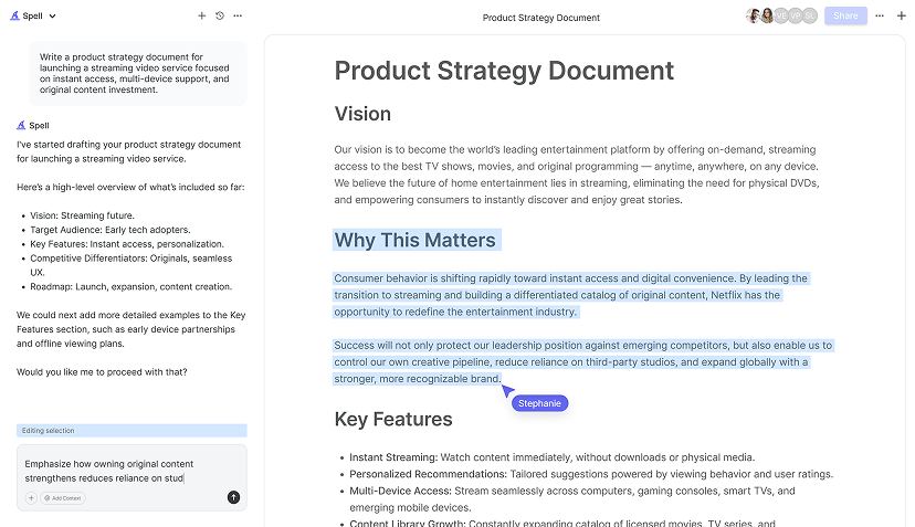
Creating an organizational chart in Google Docs is straightforward, but it can still be time-consuming, especially if you're doing it regularly. This is where Spell comes in. With Spell, you can streamline the process of creating documents, including charts, by leveraging AI. Here's how Spell can make your life easier:
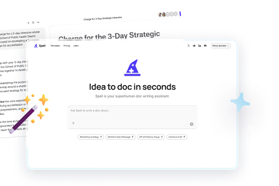
- Quick Drafts: Spell can generate drafts of documents, helping you move from idea to a polished piece in seconds.
- Real-Time Editing: Collaborate with your team in real time, just like in Google Docs, but with AI-enhanced editing capabilities.
- Seamless Integration: With Spell, you don't have to switch between platforms to harness AI capabilities, making it a one-stop shop for creating quality documents.
Using Spell is like having a co-pilot. It helps you navigate the complexities of document creation, making the process smoother and more efficient.
Final Thoughts
Creating an organizational chart in Google Docs is a process that enhances your ability to visualize team structures and workflows effectively. The steps outlined here aim to simplify that process, making it accessible whether you're tech-savvy or just starting out. For those looking to make document creation even more efficient, Spell can offer a streamlined experience with its AI-powered tools. By integrating drafting and editing capabilities, we make creating high-quality documents faster and easier than ever before.


