Creating a hierarchy chart in Google Docs might sound daunting if you haven't done it before, but trust me, it's not as tough as it seems. Whether you're mapping out your company's structure or organizing a project, a clear hierarchy chart can be a game-changer. So, how exactly do you build one in Google Docs? Let's walk through the process step-by-step and explore a few handy tips along the way.
Setting the Stage: Why Use a Hierarchy Chart?
First off, let's talk about why you'd even want a hierarchy chart in the first place. These charts are fantastic for visually breaking down complex systems, whether it's a corporate structure, a family tree, or a project plan. They help everyone see who's responsible for what and how different roles or tasks relate to each other. Plus, having a visual representation can make understanding and communicating these structures a whole lot easier.
In business, for instance, a well-defined hierarchy chart can streamline communication and clarify reporting lines. Everyone knows who reports to whom. This saves time and avoids confusion. For projects, it can help team members understand their roles and how their work fits into the bigger picture. This is crucial for effective collaboration.
Now that we've established why these charts are so useful, let's get into the nitty-gritty of how you can create one in Google Docs.
Choosing the Right Tool in Google Docs
Google Docs doesn't have a built-in feature specifically for creating hierarchy charts, but don't worry. There are a couple of ways to get around this. The most straightforward method is using Google Drawings, which integrates seamlessly with Google Docs. You can create your chart in Google Drawings and then insert it into your document. Alternatively, you could use Google Slides, which offers similar functionality.
Here's how to start with Google Drawings:
- Open a new Google Doc where you want your hierarchy chart.
- Go to the "Insert" menu, hover over "Drawing," and click on "+ New."
- This opens a blank canvas in Google Drawings where you can start creating your chart.
Using Google Drawings is a flexible way to create a chart because it lets you insert shapes, lines, and text boxes to build your hierarchy. You have control over the layout and design, so you can customize it to fit your needs.

Building Your Chart: Adding Shapes and Lines
Now for the fun part. Actually building your hierarchy chart. In Google Drawings, you'll mostly be working with shapes and lines to construct your chart.
Here's a step-by-step guide:
- Start by inserting shapes to represent each position or role in your hierarchy. You can do this by clicking on the "Shape" icon in the toolbar and selecting a shape. Rectangles or circles work well for this purpose.
- Once you have your shapes in place, add text to each one to label them. Double-click on a shape to start typing.
- Next, connect the shapes with lines to show the relationships between them. Click on the "Line" tool, then click and drag between shapes to draw lines.
- To make your chart more readable, use arrows to indicate direction or hierarchy. You can adjust line styles in the toolbar to add arrowheads.
Remember to keep your chart organized and easy to read. Align shapes neatly and use consistent spacing. This not only makes the chart look professional but also ensures that anyone viewing it can understand the structure at a glance.
Formatting Tips for a Professional Look
Once you've got the basics down, it's time to make your hierarchy chart look polished and professional. Here are some formatting tips to help you out:
- Color Coding: Use different colors to differentiate between departments, levels, or roles. This can make the chart easier to navigate and more visually appealing.
- Consistent Fonts: Stick to one or two fonts to keep the look cohesive. Use bold or italic styles sparingly for emphasis.
- Line Styles: Experiment with different line styles (solid, dashed, dotted) to convey different types of relationships or hierarchies.
- Alignment and Spacing: Make sure everything is aligned and evenly spaced. Google Drawings has alignment guides to help with this.
- Text Size and Placement: Ensure text is large enough to be readable but not so large that it overwhelms the shapes.
These small tweaks can make a big difference in how professional and clear your chart appears.
Inserting Your Chart into Google Docs
Once your hierarchy chart is complete in Google Drawings, it's time to insert it into your Google Docs document. Here's how:
- In Google Drawings, click "File" and then "Save and close."
- Your drawing will now be inserted into the Google Docs document where you started.
- If you need to make changes, just click on the drawing in your document and select "Edit" from the top-right corner of the drawing.
Inserting the chart directly into your document means you can easily update it later if needed. It stays right where you need it, integrated into your text. This is especially handy if you need to make adjustments on the fly during a presentation or meeting.

Adding Interactivity with Google Docs' Features
Google Docs offers some cool features that you can use to add interactivity to your hierarchy chart. For instance, you can add links to different parts of the chart, making it easy for someone to jump to related sections or documents.
Here's how you can do it:
- Click on a shape or text box in your chart.
- Click the "Insert link" icon in the toolbar, or press
Ctrl + K(orCmd + Kon a Mac). - Enter the URL or select a document or slide from your Google Drive.
This feature is particularly useful if your chart is part of a larger document or presentation, as it allows viewers to navigate easily between connected information.
Collaborating with Others
One of the best things about using Google Docs is the ease of collaboration. You can share your document with others and work on the hierarchy chart together in real time. Just click the "Share" button at the top right of your document, and enter the email addresses of your collaborators.
You can control permissions, allowing others to view, comment, or edit the document. This is great for team projects where input from multiple people is needed to create an accurate hierarchy.
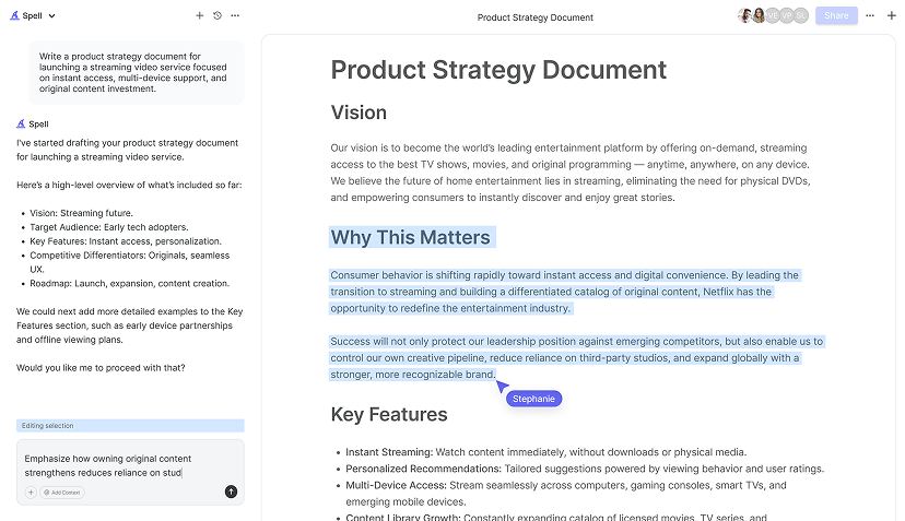
Interestingly enough, if you're using a tool like Spell, you can streamline this process even further. Spell allows you to draft documents quickly with AI and collaborate in real time, making it a breeze to work with others on creating your hierarchy chart.


Saving and Sharing Your Document
Once your hierarchy chart is ready, you'll want to save and share your document. Google Docs automatically saves your changes, so you don't have to worry about losing your work. For sharing, you have a few options:
- Share Link: Generate a shareable link that you can send to others.
- Email Invite: Send an invitation directly from Google Docs to specific email addresses.
- Export Options: Download your document as a PDF or Word document if you need to share it in a different format.
These options ensure that your hierarchy chart is accessible to anyone who needs to see it, whether they're part of your organization or external partners. And when you use Spell, sharing and collaborating is even more seamless, as it can handle everything from drafting to finalizing documents with ease.
Conclusion: Keeping Your Chart Up-to-Date
Finally, it's important to keep your hierarchy chart updated as roles and responsibilities change. Regularly reviewing and updating your chart ensures that it remains a reliable resource. With Google Docs, it's easy to make these updates. If you're using Spell, you can do it even faster, thanks to its AI-powered editing capabilities.
By following these steps, you'll have a hierarchy chart that's not only accurate but also professional and easy to understand. Happy charting


