Creating a circle graph, or pie chart, in Google Docs can be a real timesaver when you want to visually represent data in a neat and engaging way. Whether you're working on a school project, business report, or just trying to make sense of some numbers, a circle graph can help illustrate your points clearly. Let's walk through the steps to create one in Google Docs. I'll throw in some handy tips along the way!
Start with Your Data
Before you can make a circle graph, you'll need some data to work with. This might seem obvious, but getting your data organized is the first step. Imagine you're working on a project tracking the number of hours you've spent on different activities in a week. Your data might look something like this:
- Work: 40 hours
- Exercise: 5 hours
- Leisure: 10 hours
- Sleep: 56 hours
- Other: 15 hours
Having your data in a clear, organized format like this can make the whole process much smoother. If you're using a spreadsheet to keep track of your data, you're already ahead of the game. Google Sheets is a great tool for organizing data that you plan to visualize in Google Docs.
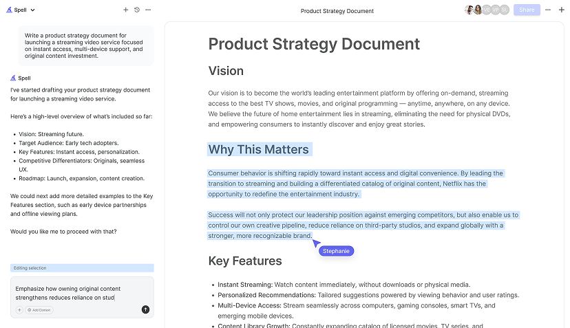
In case you're wondering, you can also use tools like Spell to draft your document more efficiently. Spell is a fantastic AI document editor that helps you create polished documents quickly, which can be a lifesaver when you're juggling multiple tasks.
Use Google Sheets for the Graph
Interestingly enough, while Google Docs doesn't have a built-in feature to create charts. Google Sheets does. So, the trick is to create your chart in Sheets and then transfer it to Docs. Here's how you can do it:
- Open Google Sheets and enter your data in two columns. For example, Column A could have the categories (Work, Exercise, Leisure, etc.), and Column B could have the corresponding numbers.
- Highlight the data you've entered.
- Go to the "Insert" menu and select "Chart."
- In the Chart Editor that appears on the right, change the chart type to "Pie chart."
- Customize your chart as needed. You can change colors, add labels, and adjust other settings to make the chart fit your preferences.
Once your chart looks good, you're ready to move it over to Google Docs. But before we do that, let's talk about some customization options.
Customizing Your Pie Chart
Google Sheets offers several options to tweak your pie chart. You might want to adjust the colors to match your document's theme or make certain sections pop. Here's a quick rundown of what you can do:
- Slice Colors: Click on a slice in your chart to change its color. This can help differentiate between categories, especially if some are closely related.
- Labels and Legends: Under the "Customize" tab in the Chart Editor, you can choose to display category labels on the slices or adjust the legend's position to make your chart more readable.
- Title and Style: Don't forget to give your chart a title. It's under the "Chart & Axis Titles" section. You can also play around with different fonts and text sizes here.
These small tweaks can make your chart not only informative but also visually appealing.

Insert the Chart into Google Docs
Now that you've got your pie chart ready. It's time to bring it into Google Docs. Here's how you can do it:
- Click on your chart in Google Sheets to select it.
- In the top-right corner of the chart, click on the three dots and select "Copy chart."
- Open your Google Docs document.
- Place your cursor where you want to insert the chart.
- Go to the "Edit" menu and select "Paste."
Google Docs will then ask if you want to link the chart to the spreadsheet. If you choose to link it, any updates you make in Sheets will automatically reflect in Docs. This is super handy if you're planning to update your data frequently.
Unlinking the Chart
If you prefer to have the chart as a static image, you can choose to unlink it. This means changes in Sheets won't affect the chart in Docs, which might be ideal for final reports or documents that won't need further edits. Simply click on the chart in Docs, then click "Unlink" in the toolbar that appears.
Formatting Your Google Docs Chart
Once your chart is in Google Docs, you might want to do a bit of formatting to ensure it fits well with the rest of your document. Here are some tips:
- Resizing: Click on the chart to select it, then drag the corners to resize it. Make sure it's not too big or too small compared to your text.
- Text Wrapping: Click on the chart, then click on the "Wrap text" option in the toolbar. This allows you to adjust how text flows around the chart.
- Positioning: You can drag the chart to different parts of your document. It's often helpful to have it near the text that explains or references it.
These adjustments can make a big difference in how your document looks and reads.

Updating Your Chart
Let's say you need to update your data. If you've linked the chart, any changes made in Google Sheets will automatically update in Google Docs. Here's how you can do it:
- Go back to your Google Sheets document.
- Make the necessary changes to your data.
- The chart in Sheets will update automatically.
- Switch back to Google Docs. If your chart is linked, you'll see an "Update" button above the chart. Click it to refresh the chart in Docs.
And just like that, your document reflects the most current data. This feature is particularly useful for ongoing projects or reports that require frequent updates.
Using Spell for Document Creation
While creating charts and graphs can be time-consuming, drafting the rest of your document can be just as tedious. That's where Spell comes in. This AI document editor helps you create, edit, and polish your documents quickly. You can generate drafts, refine your writing using natural prompts, and collaborate with others in real time.
For example, if you need to write a detailed report to accompany your circle graph, Spell can help you draft it in seconds. You simply describe what you want, and Spell creates a high-quality first draft. This can save you hours of work, especially when you're under a tight deadline.


Collaborating with Others
Google Docs is already a great tool for collaboration, but when combined with Spell, it becomes even more powerful. You can share documents, edit together, and see updates live. Here's how collaboration works:
- Sharing: Click on the "Share" button in the top-right corner of Google Docs to invite others to view or edit your document. You can set permissions to control who can make changes.
- Real-Time Editing: When you're working with others, you can see their edits in real time. This is great for brainstorming sessions or group projects.
- Comments and Suggestions: Use the "Comments" feature to leave notes for your collaborators. You can also suggest edits instead of making direct changes, which is useful for keeping track of revisions.
Real-time collaboration can make working with a team much smoother, and it ensures everyone is on the same page.
Exporting Your Document
Once you've finished creating your document with the circle graph, you might need to export it for sharing or printing. Google Docs offers several export options:
- PDF: This is a widely used format for sharing documents. It preserves your formatting and can be opened on almost any device.
- Microsoft Word: If you need to send your document to someone who prefers Word, you can download it in this format.
- Plain Text: This is a simple format without any formatting, useful for text-only documents.
To export your document, go to the "File" menu, select "Download," and choose your preferred format. It's that easy!
Final Thoughts
Creating a circle graph in Google Docs might seem like a small task, but it can make a big difference in how you present your data. Whether for a business report or a school project, a well-crafted chart can communicate your message effectively. And if you need to streamline your document creation, Spell can help you draft, edit, and refine your work in a fraction of the time. It's like having a personal assistant for your writing tasks


