Creating a pie chart in Google Docs is a bit like cooking up a delightful dish. It's all about understanding the ingredients and mixing them just right. Whether you're summarizing survey results or presenting your business data, pie charts can make your data pop visually. This guide breaks down the process into easy steps, ensuring you can whip up your own pie chart without a hitch. Ready to get started? Let's dive right in!
Why Pie Charts Matter
Pie charts are fantastic for visually representing data in a way that's easy to digest. They help break down each category's contribution to the whole, making it simple to see which sections take up the largest share. Think of them as the visual equivalent of giving each piece of your data pie its rightful place on the plate. But why are they so effective?
- Visual Simplicity: Pie charts are straightforward. They provide a clear picture of proportions, which is perfect when you want to compare parts of a whole.
- Immediate Impact: With just a glance, viewers can assess the major players in your dataset. This makes pie charts particularly useful in presentations where you need to convey information quickly.
- Versatility: Whether it's showing the breakdown of market share, dividing budget categories, or simplifying survey results, pie charts fit a wide array of data-visualization needs.
Interestingly enough, while pie charts are perfect for displaying proportions, they aren't always the best choice for every dataset. For instance, if you have too many categories, the chart can become cluttered. But when used appropriately, they can transform complex data into a digestible form.
Setting Up Your Data
Before you can create a pie chart, you need to prepare your data. Picture your data as the ingredients of a pie. You need to have everything measured out and ready to go before you start baking.
- Organize Your Data: Make sure your data is organized in a two-column format. The first column should contain the categories, and the second column should have the corresponding values. For example, if you're displaying survey results, Column A might list the survey options, and Column B their respective counts.
- Check for Completeness: Ensure all the necessary data is included and that the values are correct. It's like making sure you haven't forgotten any ingredients before you start mixing.
- Keep It Simple: Avoid including too many categories. Stick to around 5-7 categories to keep your pie chart readable. Too many slices can make it look more like a mess than a masterpiece!
Once your data is ready, creating the chart becomes much easier. Just like with cooking, preparation is key to a smooth process.
Creating a Pie Chart in Google Docs
Now that your data is ready, it's time to bring it into Google Docs and create your chart. The process is straightforward and doesn't require any advanced skills. Here's how to do it:
- Open Google Docs: Start by opening a new or existing document in Google Docs. You can do this by heading to Google Docs in your browser.
- Insert a Chart: Click on Insert in the top menu. From the dropdown, select Chart, then choose Pie. Google Docs will insert a placeholder pie chart in your document.
- Edit the Chart: Click on the chart to bring up the options menu, then select Open source. This opens the linked Google Sheets document where you can input your data.
- Input Your Data: In the Google Sheets document, replace the placeholder data with your own. Make sure your categories and values are correctly inputted as discussed in the data setup section.
- Customize Your Chart: Once your data is entered, you can customize your chart by clicking on the chart and selecting Chart editor from the side pane. Here, you can change colors, labels, and other elements to suit your needs.
- Update the Chart in Google Docs: After editing, head back to your Google Docs document. The chart should automatically update, reflecting the changes you made in Google Sheets.
And just like that, your pie chart is ready! It's not much different than baking a pie. Once you've done it a few times, it becomes second nature.

Customizing Your Pie Chart
Customization is where you can let your creativity shine. Just as you might add sprinkles or a glaze to your pie, you can tweak your pie chart to make it look just right. Google Docs offers several options to tailor your chart's appearance:
Color and Design
Changing the colors of your pie chart can help emphasize specific data points. You might choose a color scheme that matches your brand or simply opt for colors that make each category stand out.
- Chart Style: In the Chart editor, under the Customize tab, you can select Chart style to adjust the chart's background color and border. A good tip is to choose contrasting colors for better visibility.
- Slice Colors: Under Pie slice, you can change the color of each slice individually. This is particularly useful for highlighting specific data points you want to draw attention to.
Labels and Legends
Labels and legends are crucial for understanding what each slice of your pie chart represents. They're like the recipe card that tells you what each ingredient is.
- Slice Labels: In the Customize tab, under Pie slice, you can choose to display labels inside the slices. This can be set to display percentages, values, or both, depending on what best suits your needs.
- Legend Position: You can also adjust where the legend appears. Under Legend, choose between positions like right, left, top, bottom, or none, depending on what looks best with your layout.
Through customization, your pie chart not only becomes more informative but also more visually appealing. It's all about finding that perfect balance between aesthetics and functionality.
Using Pie Charts for Different Purposes
Pie charts aren't just for business reports. Their versatility makes them suitable for various scenarios. Whether you're in academia, business, or even planning a community event, pie charts can help convey your message effectively.
- Business Analysis: Use pie charts to display market shares, sales distribution, or budget allocations. They're great for showing which products or services are performing best and which need more attention.
- Educational Presentations: Teachers and students can use pie charts to present statistical data in a classroom setting. Whether it's showing the results of a classroom survey or breaking down historical data, pie charts make it engaging.
- Community Projects: Organizers can visualize funding sources or demographic data to communicate effectively with stakeholders and the community.
By applying pie charts to various contexts, you can make data more relatable and easier to understand for your audience. It's like serving the right dish for the right occasion.

Common Mistakes and How to Avoid Them
As with any tool, there are pitfalls to watch out for when using pie charts. Here's a quick rundown of common mistakes and tips on how to steer clear of them:
- Too Many Slices: Overloading a pie chart with too many categories can make it hard to read. Aim for no more than 5-7 slices for clarity.
- Misleading Proportions: Ensure the values accurately represent the data. Misleading proportions can easily confuse or misinform your audience.
- Poor Color Choices: Avoid using colors that are too similar. Contrast is crucial to differentiate each slice and make the chart readable.
By keeping these points in mind, you can create pie charts that are both accurate and effective. It's all about delivering the right message clearly and concisely.
Integrating with Other Tools
Pie charts aren't just standalone visuals. They can be integrated with other tools to enhance your presentations and reports. Google Docs, for instance, allows seamless integration with other Google Workspace tools.
- Google Slides: Transfer your pie chart into a presentation for stronger visual impact. Simply copy and paste from Google Docs to Slides. Your chart will retain its interactive properties.
- Google Sheets: As mentioned earlier, the source data for your pie chart is stored in Google Sheets. This makes it easy to update or manipulate data without starting from scratch.
Integrating pie charts with other tools amplifies their effectiveness, ensuring your data communicates exactly what you intend. It's like pairing your pie with the perfect drink. Each enhances the other.


Collaborating with Team Members
Google Docs excels at collaboration, making it easy for team members to work together on pie charts. When everyone's involved, the final product is likely to be more accurate and comprehensive.
- Real-Time Editing: Multiple team members can work on the same document simultaneously, making it easy to incorporate different viewpoints and expertise.
- Commenting and Feedback: Team members can leave comments and suggestions directly on the document, streamlining the feedback process.
Collaboration turns data visualization into a team effort, ensuring that the final chart reflects a well-rounded view of the data. It's like having multiple chefs perfecting the same dish. Everyone adds their unique touch.
How Spell Can Help
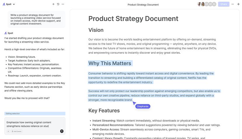
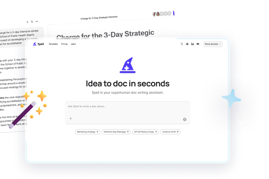
While Google Docs provides a robust feature set for creating pie charts, Spell can take your document creation to the next level. It offers AI-driven tools that streamline the writing and editing processes, saving you time and effort. Imagine having an AI assistant that can help you craft the perfect narrative to accompany your pie charts.
- Drafting and Editing: With Spell, you can generate high-quality drafts in seconds. This is particularly useful when you need to explain your pie chart's data in a succinct and engaging manner.
- Collaborative Editing: Just like Google Docs, Spell allows real-time collaboration, but with the added benefit of AI that refines your content as you work.
Spell turns what could be hours of work into minutes, letting you focus more on interpreting your data rather than just presenting it.
Final Thoughts
Creating a pie chart in Google Docs is not just about visualizing data. It's about storytelling through visuals. With the steps outlined here, you're well-equipped to turn your data into engaging graphics. And when you pair these skills with Spell, the process becomes even more streamlined. Spell enhances your ability to craft documents efficiently, allowing you to focus on what really matters - your message. So go ahead, try it out, and see the difference it makes


