Editing graphs in Google Docs can be a game-changer for making your documents more visually appealing and informative. Whether you're preparing a report for work, school, or personal use, knowing how to tweak and refine your graphs can make a huge difference. So let's dive into the ins and outs of graph editing in Google Docs and uncover how you can transform your data from bland to brilliant.
Creating a Graph in Google Docs
Before we get into editing, you need to have a graph to work with. Fortunately, creating one in Google Docs is straightforward. You'll start by using Google Sheets, a familiar tool for anyone who's spent time with spreadsheets. Here's how you can get started:
- Open Google Sheets by navigating to sheets.google.com.
- Enter your data in the spreadsheet, ensure your data is well-organized in columns or rows.
- Select the data range you want to include in your graph.
- Click on the "Insert" menu and select "Chart." Google Sheets will automatically create a chart based on your selected data.
Once you've got your chart, you can customize it within Google Sheets itself. This step is crucial because the more you can tailor your chart here, the less work you'll have to do later in Google Docs.
After your chart looks the way you want it, you can easily add it to your Google Doc. Head over to your Google Doc, click "Insert," choose "Chart," and then "From Sheets." Select the chart you just created. Your graph will appear. Ready for further tweaking.
Understanding the Basics of Graph Editing
Editing a graph in Google Docs might seem a bit daunting initially, especially if you're not a data person. But fear not. The tools Google provides are intuitive, even for beginners. Let's break down some essential parts of graph editing:
Choosing the Right Chart Type
The first step is to ensure your data is being represented in the most effective way. Google Sheets offers several chart types, including:
- Bar Charts: Great for comparing quantities across different groups.
- Line Charts: Perfect for showing trends over time.
- Pie Charts: Ideal for displaying proportions and percentages.
- Scatter Plots: Useful for illustrating correlations between variables.
Each of these chart types has its own strengths. Choose one that aligns with the story you want your data to tell.
Customizing Your Graph
Once your graph is in Google Docs, you can customize it further by double-clicking on it. This action opens the Chart Editor, where you can modify various aspects such as:
- Titles: Add or change the chart and axis titles to provide context.
- Colors: Modify the colors of your data series to make them pop or match your document's theme.
- Legends: Adjust the position and content of the legend for clarity.
Understanding these basics will empower you to make your graphs not just functional, but also visually appealing.
Adding Labels and Legends
Labels and legends are crucial for making your graph understandable at a glance. They clarify what the data represents, helping viewers quickly grasp the information you're presenting. Here's how to tweak them in Google Docs:
Editing Labels
Labels are the text elements that describe your data points. To modify these:
- Double-click on the graph to enter the Chart Editor.
- Go to the "Chart & axis titles" section.
- Here, you can edit the main chart title, as well as the horizontal and vertical axis titles. Be descriptive but concise.
Remember, labels should be clear and direct. Avoid jargon unless it's necessary for your audience.

Adjusting Legends
Legends help identify different data series within your graph. To adjust your legend:
- In the Chart Editor, navigate to the "Legend" section.
- You can change its position (right, left, top, bottom, or none) based on what looks best for your document.
- Ensure the legend is not overlapping with any data points or labels for maximum readability.
Strategically placed labels and legends can make your graph far more digestible, especially for readers who might not be familiar with the data.
Refining Axis Options
The axes of your graph are like the backbone. They hold everything together. Ensuring they're set up correctly is vital for accurate data representation. Let's look at how you can refine your axis options in Google Docs.
Setting Axis Scale and Range
Sometimes, the default axis range doesn't truly reflect your data. Especially if you have outliers. Here's how you can customize it:
- Double-click your graph to open the Chart Editor.
- Go to the "Customize" tab and select "Axes."
- Here, you can adjust the minimum and maximum values for both the horizontal and vertical axes.
Setting an appropriate scale ensures that your graph accurately represents the trends or comparisons you're trying to highlight.
Formatting Axis Labels
Axis labels can also be adjusted for better readability:
- In the Chart Editor, under "Axes," select either the horizontal or vertical axis.
- You can modify the font, size, and color of the labels to fit your document's style.
- Make sure the labels are legible and not overlapping with other elements of the graph.
Properly formatted axes provide clarity and can significantly enhance the graph's effectiveness in communicating your data.
Incorporating Data Points and Gridlines
Data points and gridlines are often the unsung heroes of a graph. They help the viewer pinpoint specific values and trends, making data analysis much more manageable. Let's see how you can tweak these elements in Google Docs.
Highlighting Data Points
To make individual data points stand out:
- In the Chart Editor, go to the "Series" section.
- Check the "Point size" option to adjust how prominently your data points appear.
Highlighting specific data points can draw attention to critical values or trends, making them easier to identify.
Working with Gridlines
Gridlines provide a reference framework that helps in interpreting the data:
- Open the Chart Editor and select "Gridlines and ticks."
- Here, you can choose to show or hide gridlines for both axes.
- You can also adjust the gridline color to make it more subtle or pronounced, depending on your preference.
While gridlines are helpful, too many can clutter your graph. Use them judiciously to maintain clarity.

Using Spell for Efficient Editing
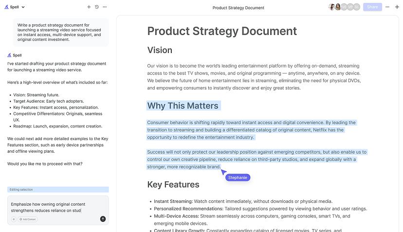
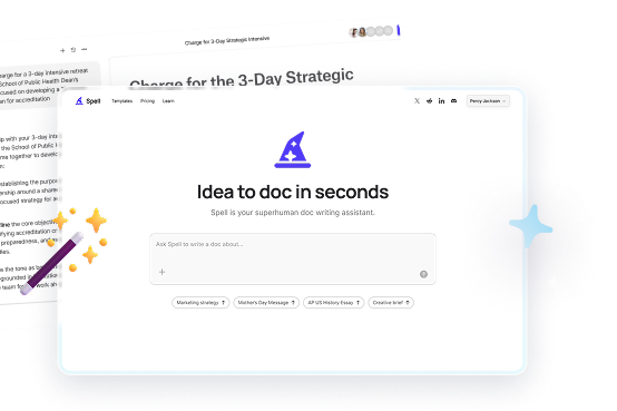
Now that you know the ropes of editing graphs in Google Docs, what if you could streamline the whole process? That's where Spell comes into play. Imagine having an AI-powered tool that helps you create, edit, and refine documents in a fraction of the time. With Spell, you can go from a simple idea to a polished document in seconds. It's like having Google Docs, but with a smart assistant built right in.
Spell allows you to generate drafts and edit them using natural language. This means you can make changes to your document as you go, without switching between multiple tools. It's perfect for collaborative projects where you need to share and update documents in real time. With Spell, you can focus more on the quality of your content and less on the tedious formatting tasks.
Making Graphs Interactive
Static graphs are great. But what if you want to take it a step further? Making your graphs interactive can engage your audience more effectively. While Google Docs doesn't offer direct interactivity, you can incorporate elements that mimic it:
Interactive Features with Google Sheets
One way to add interactivity is by using linked Google Sheets:
- Ensure your chart is linked to a Google Sheets document.
- Share the document with your audience, allowing them to interact with the data.
- They can make changes to the data in Sheets, and your graph in Google Docs will update automatically.
This setup is perfect for collaborative projects or presentations where the data might need real-time updates.
Using External Tools
For more advanced interactivity, consider using external tools:
- Tools like Datawrapper or Tableau offer embeddable charts that can be interactive.
- These can be linked in your Google Docs, providing a richer data interaction experience for your audience.
Interactive graphs can make your document stand out, especially if your audience needs to explore data from different angles.


Sharing and Collaborating on Graphs
Editing graphs is one thing, but sharing them effectively is another. Google Docs makes collaboration a breeze, allowing multiple users to work on the same document simultaneously. Here's how you can make the most of these features:
Sharing Your Document
To share your document with others:
- Click on the "Share" button in the top-right corner of your Google Doc.
- Enter the email addresses of the people you want to share the document with.
- Choose their level of access: Viewer, Commenter, or Editor.
By controlling access, you ensure that your document is both secure and collaborative.
Collaborating in Real Time
Once shared, multiple people can edit the document in real time:
- Everyone with editing access can make changes simultaneously.
- Use the comment feature to discuss changes without altering the actual content.
- Track changes to see who made what edits and when.
Real-time collaboration is a powerful feature, especially for team projects or group assignments.
Integrating Spell for Enhanced Collaboration
While Google Docs offers robust collaboration features, integrating Spell can take your collaborative efforts to the next level. With AI-driven document editing, you can create, edit, and share high-quality documents faster than ever. Spell allows you to generate drafts and refine them using natural language, eliminating the need for cumbersome formatting tasks. It's perfect for teams that need to share and update documents in real time, combining the familiar interface of Google Docs with the efficiency of an AI assistant.
By using Spell, you can enhance your productivity and focus on what truly matters: delivering clear, concise, and impactful content. Whether you're working on a business report, an academic paper, or a personal project, Spell ensures that your documents are polished and professional.
Final Thoughts
Editing graphs in Google Docs doesn't have to be a chore. With the right tools and techniques, you can create visually appealing and informative graphs that enhance your documents. And with Spell, you can take your document editing to the next level, saving time and effort while delivering high-quality results. Whether you're a seasoned pro or a newbie, these tips will help you master the art of graph editing in Google Docs. Happy editing


