Editing pie charts in Google Docs is a skill worth mastering, especially if you're looking to visually display data in your documents. It's not just about creating a chart. It's about tailoring it to fit your needs and making sure it communicates your message effectively. This guide will walk you through the process of editing pie charts, ensuring they look just right for your audience.
Creating Your First Pie Chart
Before diving into edits, you need to start with a pie chart. It's like cooking. You can't season the soup until you've got it bubbling in the pot. In Google Docs, you can create a pie chart by embedding one from Google Sheets. Here's how you get started:
- Open Google Sheets: You'll need to input your data here since Google Docs relies on Sheets for chart functions.
- Enter Your Data: Make sure your data is organized. Typically, you'll want to have categories in one column and the corresponding values in another. For example, if you're showing market share, list the companies in one column and their market shares in the next.
- Select Your Data: Highlight the data you want to include in your pie chart.
- Insert Chart: With your data highlighted, go to the "Insert" menu, then click on "Chart." Google Sheets will automatically create a chart based on your selection.
- Choose Pie Chart: In the Chart Editor, select "Chart type" and choose "Pie chart." You'll see a preview immediately.
Once created, you can embed this chart into your Google Doc. Simply copy the chart from Google Sheets and paste it into your document. Now you're ready to make it your own with some fine-tuning.
Changing the Look of Your Pie Chart
Making sure your pie chart matches your document's theme or your personal style is important. Google Docs offers several options to customize the appearance of your pie chart, and here's how you can take full advantage of them:
- Access Chart Editor: Click on the chart in Google Sheets, then click on the three vertical dots in the upper right corner of the chart, and select "Edit chart."
- Customize Tab: Switch to the "Customize" tab in the Chart Editor. Here, you'll find all the options for changing the look of your chart.
- Slice Colors: Click on "Pie slice" to change individual slice colors. This is particularly useful if you want to match company colors or simply make the chart more readable.
- Chart Style: Under "Chart style," you can modify the chart's overall appearance, including background color and font style.
- Font Adjustments: Don't forget about your fonts! You can change the font type, size, and color under "Chart style" to ensure everything is legible and in line with your document's theme.
These small changes can drastically improve how your chart looks and feels. It's like giving your chart a personal touch, making it not only informative but also visually appealing.
Updating Data Points
Data isn't static, and neither should your charts be. If your numbers change, you'll want to update your pie chart to reflect the most accurate information. Fortunately, it's straightforward to update your data in Google Docs:
- Navigate to Google Sheets: Head back to the Google Sheet where your chart data resides.
- Edit Data: Make the necessary changes directly in the spreadsheet. Whether you're adding new data points or changing existing values, it's all done here.
- Refresh in Google Docs: Once you've updated the data, go back to your Google Doc. Click on the chart, and you'll see an option to "Update" in the top right. Click it, and your chart will refresh with the new data.
It's as simple as that. Like tending to a garden, keeping your data fresh ensures your charts remain accurate and reliable.

Adding Labels and Legends
Labels and legends are like the seasoning on your pie chart. They provide clarity and context. Here's how to ensure your chart is as informative as possible:
- Open Chart Editor: In Google Sheets, click on your chart and select "Edit chart."
- Customize Labels: Go to the "Customize" tab and find "Pie chart" section. Here, you can toggle data labels on and off, adjust their format, and choose where they appear.
- Legend Position: Under "Legend," you can decide the position of your chart's legend - top, bottom, left, or right. This helps in making your chart fit seamlessly into your document layout.
Remember, labels and legends are there to help your audience understand the chart at a glance. Keep them clear and concise.
Adjusting Chart Size and Position
Just like rearranging furniture in a room, sometimes your chart needs a little repositioning to fit perfectly into your document. Here's how you can do it:
- Resize the Chart: Click on your chart in Google Docs. Drag the corners to resize. This can be helpful if you need the chart larger for emphasis or smaller to fit more content.
- Position the Chart: Click on the chart and drag it to your desired location within the document. You can also use alignment options to center or justify the chart.
- Text Wrapping Options: Click on your chart and select "Image options." Here, you can choose how your text wraps around the chart, ensuring your document looks neat and professional.
These adjustments make sure your pie chart not only fits the page but also fits the flow of your document.
Integrating Charts with Spell
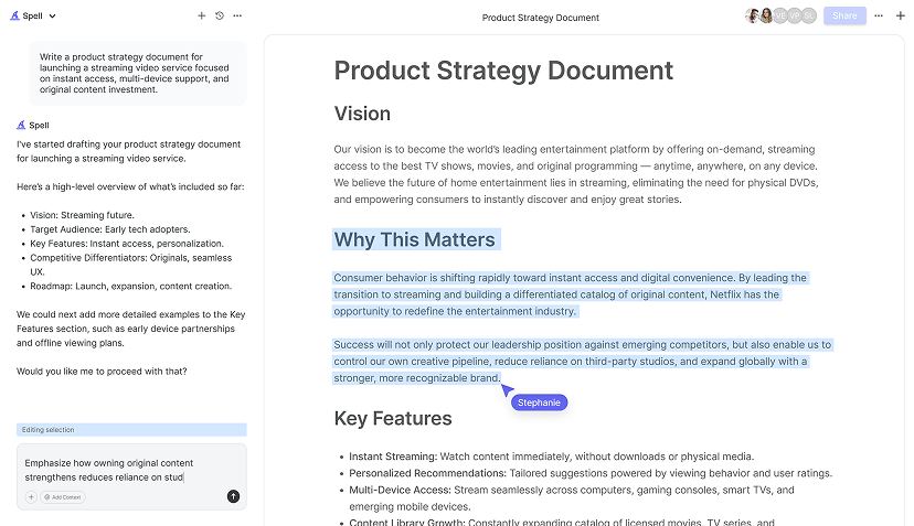
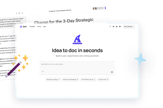
Here's a little secret. Tools like Spell can make your document editing process even smoother. With AI built into the document editor, Spell helps you create and edit documents faster than ever. While Google Docs allows you to manually adjust charts, Spell can help you draft and refine your document content, making sure everything flows seamlessly.
Imagine having the power to generate a draft in seconds and edit it using natural language. No more worrying about formatting issues or spending hours tweaking text. With Spell, your document editing process becomes much more efficient.

Customizing Data Range and Segments
Sometimes, you need to focus on specific data points or even exclude certain segments to tailor your pie chart to your needs. Google Docs, through Google Sheets, allows you to customize your data range easily:
- Select Data Range: In your Google Sheet, click on the range selection box (usually labeled with a small grid icon) in the Chart Editor.
- Adjust Range: You can manually enter the new data range or select it directly by dragging over the cells.
- Exclude Segments: If there are specific segments you don't want to include, you can simply remove the data from your selection.
This functionality ensures you're not just showing data, but telling a story that's relevant to your audience.
Exporting and Sharing Your Chart
Once you've perfected your pie chart, it's time to share it with the world. Or at least your team. Here's how you can export or share your chart directly from Google Docs:
- Export Options: Click on the chart, and in the menu that appears, select "Download." You can choose from formats like PNG, PDF, or SVG.
- Sharing Your Document: Click on "File" then "Share" to adjust sharing settings. You can share via email or link, setting permissions for who can view or edit.
- Collaborate in Real-Time: With Google Docs, you and your team can work on the document simultaneously, making real-time changes to the chart as needed.
Sharing your chart is the final step in ensuring your data-driven insights reach the right people.


Using Spell for Real-Time Collaboration
Speaking of collaboration, Spell takes it to the next level. With real-time collaboration features, you and your team can work on documents together, just like in Google Docs, but with the added bonus of AI assistance. This means you can not only edit charts but also refine your written content with ease.
Spell's AI capabilities let you edit using natural language, making it a breeze to make changes without the back-and-forth hassle of traditional editing methods. It's like having a supercharged version of Google Docs at your fingertips.
Final Thoughts
Editing pie charts in Google Docs doesn't have to be a chore. With these tips, you can create, customize, and share charts that effectively communicate your data. And when it comes to the document editing process, using tools like Spell can make the process even smoother. With AI built right into the editor, Spell transforms the way you create and refine documents, saving you time and ensuring high-quality results.


