The results section of a lab report is where the magic of your experiment comes to life. This is where you lay out what you found, in all its glory, and maybe a little messiness too. Let's dig into how you can craft this part of your report so that your data tells a clear, compelling story.
Understanding What Goes into the Results Section
The results section is all about facts. It's where you present your data without interpretation. That's for the discussion section. Here, you simply want to convey your findings in a straightforward manner. Think of it like setting the stage for a story. You‘re providing all the necessary details without jumping to conclusions.
In this section, you'll typically include:
- Data Presentation: All the numbers, figures, and results you obtained during your experiment.
- Figures and Tables: Visual representations of your data for clarity and impact.
- Descriptive Text: Brief explanations of what's shown in your figures and tables.
Remember, your job here is to present the data as clearly as possible, so your readers can understand what you found before you interpret it later.
Crafting a Clear Data Presentation
When you're presenting data, clarity is your best friend. You want your audience to understand your results without having to sift through a jumble of numbers and stats. Start by organizing your data logically. This might mean following the order of your experiment or grouping similar data together.
For instance, if your experiment measured the temperature effect on reaction rates, you might organize your data by temperature ranges. Here's a simple way to present such data:
Temperature (¬∞C)    Reaction Rate (s⁻¹)
----------------    -------------------
25                 0.05
30                 0.10
35                 0.15
40                 0.20
This table format keeps things neat and easy to digest. Always label your tables clearly so your readers know exactly what they‘re looking at.

Using Figures and Tables Effectively
Visual aids can be incredibly helpful in the results section. They not only break up the text but also make it easier for your audience to grasp complex data at a glance. However, using them effectively requires some strategy.
Here are a few tips for using figures and tables in your results section:
- Choose the Right Type: Decide whether a table or a graph better represents your data. Tables are great for precise data points, while graphs work well for showing trends or comparisons.
- Keep it Simple: Avoid cluttering your visuals with too much information. Highlight the key data points you want your audience to focus on.
- Label Everything: Every figure and table should have a clear title and labels for all axes and data sets. This ensures that readers can understand the visuals without needing additional explanations.
For example, a line graph showing temperature effects on reaction rates might look like this:
Graph Title: Reaction Rate vs. Temperature

Y-axis: Reaction Rate (s⁻¹)
X-axis: Temperature (°C)
Line: Showing the increase in reaction rate with temperature
Such visuals can make your data much more accessible and engaging.
Writing Descriptive Text for Clarity
While your tables and figures carry a lot of weight, the descriptive text around them plays an equally important role. This text should serve as a guide, helping readers navigate through the visuals you‘ve provided.
When writing your descriptive text, keep these pointers in mind:
- Be Concise: Your explanations should be brief and to the point, highlighting the main aspects of your data.
- Direct Attention: Use the text to point out significant trends or patterns that are evident in your figures and tables.
- Avoid Interpretation: Save the analysis for the discussion section. In the results section, stick to describing what the data shows.
As an example, you might say, "As illustrated in Figure 1, the reaction rate increases steadily with temperature, doubling between 25°C and 40°C."
Ensuring Consistency and Accuracy
Consistency is key in the results section. This means using the same units of measurement throughout and ensuring that all your data is accurate and complete. Double-check your numbers and make sure that any calculations you've done are correct. This might seem tedious, but accuracy here builds credibility for your entire report.
Another aspect of consistency involves the format. If you‘ve used a table for one set of data, try using a similar format for other data sets. This helps maintain a cohesive look and makes it easier for readers to compare and contrast different results.

Addressing Unexpected Results
Science can be full of surprises. Sometimes experiments don‘t go as planned. If you encounter unexpected results, it‘s important to report them honestly in the results section. Don‘t try to hide or alter these findings. Instead, present them as objectively as you would any other data.
When reporting unexpected results, you might simply say, "Contrary to our hypothesis, the reaction rate decreased at temperatures above 35°C." This sets the stage for a more detailed explanation in the discussion section, where you'll delve into possible reasons for these anomalies.
Integrating Spell for Efficient Writing
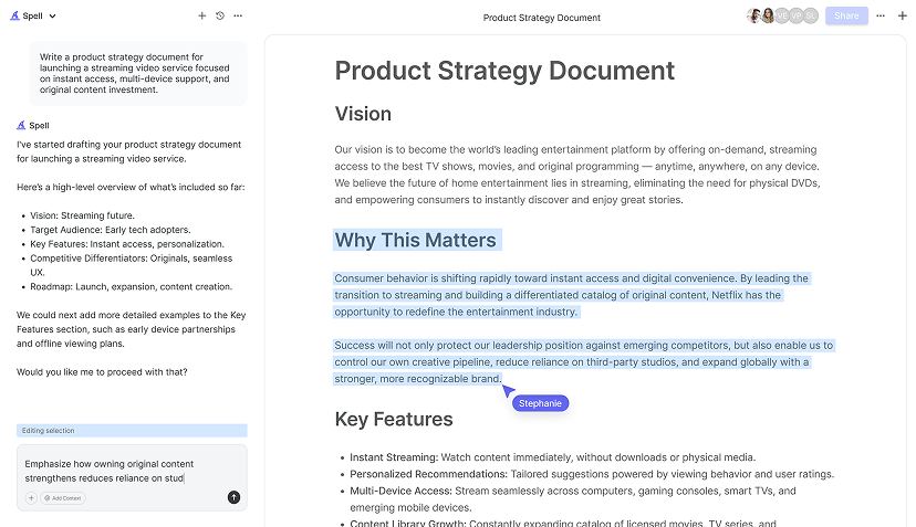
Writing a lab report, especially the results section, can be a meticulous process. Spell can help make this task quicker and more efficient. With its AI capabilities, Spell can assist in organizing your data and ensuring that your writing is clear and concise.
For instance, if you‘re struggling to find the right words to describe a complex data set, Spell can suggest phrasing and help you polish your report. This can save you a lot of time and help you maintain a consistent tone throughout your document.


Reviewing and Revising Your Results Section
Once you've drafted your results section, it's time to take a step back and review it. Look for any areas where the data presentation could be clearer or where the text could be more concise. Check for consistency in format and ensure that all figures and tables are properly labeled.
It can also be helpful to have someone else read your results section. Fresh eyes can catch things you might have missed and offer a different perspective on how your data is presented. Consider using Spell's collaborative features to share your document with peers and get real-time feedback. This can streamline the revision process and help you create a polished final product.
Final Thoughts
Crafting a clear and concise results section is crucial for effectively communicating your experiment‘s findings. By organizing your data logically, using visuals wisely, and writing descriptive text, you can ensure your results are presented in an understandable way. And with Spell, you can draft and refine your lab report more efficiently, making the process a whole lot smoother.


