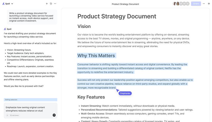
Creating a logo in Google Docs might seem like an unusual choice at first. After all, most folks think of Google Docs as a place for text-heavy documents, not graphic design. But if you're looking for a simple, no-cost way to craft a logo, it can actually be a handy tool. Today, we're going to walk through the process step by step. Breaking it down into easy-to-follow parts that'll help you create a unique logo right in your document.
Getting Started with Google Docs for Logo Design
Before you dive into designing your logo, it's essential to get familiar with the tools you'll be using in Google Docs. While Docs isn't a graphic design software, it does offer basic drawing tools that can be surprisingly versatile. Here's how you start:
- Open Google Docs: First, open a new or existing document in Google Docs. This is your blank canvas.
- Access the Drawing Tool: Click on "Insert" in the top menu, then select "Drawing" and "+ New." This opens the Drawing tool where you'll create your logo.
Now, the Drawing tool might seem basic at first glance, but it's packed with enough features to bring your logo vision to life. You'll find a range of shapes, lines, and text options to start playing with. Ready to get creative?
Choosing the Right Shapes and Lines
Shapes and lines are the building blocks of your logo. In Google Docs, you can choose from a variety of shapes to construct your design. Here's a little secret: the key to a memorable logo often lies in simplicity. Think about some of the most iconic logos you know. They're usually simple but effective.
- Explore Shape Options: When you open the Drawing tool, click on the shapes icon. You'll see options like rectangles, circles, arrows, and more. Select a shape that aligns with your brand or idea.
- Combine Shapes: Don't hesitate to mix and match. Combine different shapes to create something unique. For example, a circle paired with a triangle might form an abstract representation of your brand.
- Adjust Sizes and Colors: Click on the shape to resize it or change its color using the toolbar. A splash of color can make your logo pop!
The beauty of using shapes is that they can be manipulated to form endless designs. Experiment with different combinations until something clicks. Remember, you're not just drawing, you're crafting an identity.
Adding Text to Your Logo
Once you've got your shapes in place, it's time to think about the text. Text can be a powerful component of your logo, offering clarity and personality. Here's how to add and customize text in your logo:
- Insert a Text Box: In the Drawing tool, click on the "T" icon to insert a text box. Place it where you want the text to appear in your logo.
- Choose Your Font: Google Docs offers a range of fonts. Pick one that reflects your brand's voice. Whether it's modern, classic, or playful.
- Customize Text Attributes: Adjust the size, color, and style of your text. Make sure it's readable and complements the shapes you've chosen.
Consider the balance between your text and shapes. They should work together harmoniously to convey your brand's message. Play around with the placement and alignment until it feels just right.

Tips for Creating a Balanced Logo
Balance is crucial in logo design. A well-balanced logo feels stable and visually appealing. Here are some tips to achieve balance in your design:
- Symmetry vs. Asymmetry: Symmetrical designs are often perceived as harmonious, but don't shy away from asymmetry if it serves your brand better.
- Use White Space Wisely: White space, or negative space, helps your logo breathe and prevents it from feeling cluttered.
- Align Elements: Ensure that text and shapes are aligned properly. Misaligned elements can make your logo look unprofessional.
It might take a few tweaks to get the balance right, but it's worth the effort. A balanced logo can communicate professionalism and trustworthiness.
Incorporating Colors Effectively
Color can drastically change the perception of your logo. Different colors evoke different emotions and can influence how your brand is perceived. Here's how to use color effectively in your logo:
- Choose a Color Palette: Stick to 2-3 colors to keep things simple and cohesive. Consider your brand's personality and the message you want to convey.
- Use the Color Picker: In the Drawing tool, select a shape or text box, then use the color picker to apply your chosen colors.
- Experiment with Transparency: Adjust the transparency of shapes to add depth and interest to your design.
Colors should enhance your design, not overwhelm it. Make sure the colors you choose work well together and support your brand's story.
Saving and Exporting Your Logo
Once you're satisfied with your creation, it's time to save and export your logo for use. Here's how to do it in Google Docs:
- Exit the Drawing Tool: Click "Save and Close" to exit the Drawing tool and insert your logo into your Google Doc.
- Download Your Logo: To download your logo, click on the logo in the document, then go to "File" > "Download" and select your desired format (e.g., PNG or JPEG).
And there you have it. Your logo is ready to be used wherever you need it. Whether it's for a website, social media, or printed materials, your logo is good to go!

Using Spell to Enhance Your Logo Design Process
While Google Docs is a great tool for creating basic logos, sometimes you need a bit more power. Spell can be a fantastic companion in your design journey. Imagine having AI that can help you refine your logo design ideas or generate creative text elements for your brand. Spell does just that, allowing you to go from concept to completion with the help of AI.
With Spell, you can generate drafts and refine your document, ensuring your logo is as polished as your brand deserves. It's like having a creative partner by your side, ready to provide suggestions and edits in real-time. If you need to write a compelling brand story or brief to accompany your logo, Spell makes it a breeze.
Iterating on Your Logo Design
Logo design is an iterative process. Rarely will your first attempt be perfect, and that's okay! Here are some tips for iterating on your design:
- Seek Feedback: Share your logo with friends or colleagues to get their thoughts. Fresh eyes can offer valuable insights.
- Refine Elements: Based on feedback, tweak shapes, colors, or text until you're happy with the result.
- Test in Different Sizes: Ensure your logo maintains its clarity and impact at various sizes, from business cards to billboards.
Don't rush the process. Taking the time to iterate and refine will lead to a stronger final product that truly represents your brand.


Creating a Cohesive Brand Identity
Your logo is just one part of your brand identity. To create a cohesive brand, consider how your logo fits into the bigger picture:
- Develop Brand Guidelines: Create guidelines that include your logo, color palette, typography, and brand voice.
- Ensure Consistency: Use your logo consistently across all platforms and materials to build brand recognition.
- Expand Your Visual Identity: Beyond the logo, consider other visual elements like icons, patterns, or imagery that support your brand.
A strong brand identity helps build trust and recognition, making your brand memorable and professional.
Final Thoughts
Designing a logo in Google Docs is a creative journey that combines simplicity with functionality. With a bit of practice and some experimentation, you can craft a logo that truly represents your brand. If you're looking to enhance your document creation process, Spell offers AI-powered tools to help you refine and polish your work. It's like having a creative assistant on hand to make your design process smoother and more efficient.


