Charts and graphs are fantastic tools for visualizing data. Bar graphs, in particular, are quite popular thanks to their straightforward nature. Whether you're presenting quarterly sales figures, survey results, or any other data-driven story, knowing how to edit a bar graph in Google Docs can be incredibly handy. Here, we'll dive into the details of creating and modifying bar graphs so you can make your data pop!
Creating Your First Bar Graph
Let's start by getting a bar graph into your Google Docs. You might be surprised at how easy it is to create one. First, make sure you have your data ready in Google Sheets. It's the backbone of your graph!
- Open Google Sheets and input your data. You should have at least two columns: one for categories and one for values.
- Highlight the data range you want to include in your graph.
- Click on the "Insert" menu and select "Chart." This will open the Chart Editor.
- In the Chart Editor, choose "Bar chart" under the "Chart type" dropdown.
- Customize your chart as needed and click "Insert" to add it to your sheet.
Once your bar graph is ready in Google Sheets, you can easily add it to Google Docs. Here's how:
- In your Google Doc, go to "Insert" > "Chart" > "From Sheets."
- Select the sheet containing your bar graph.
- Choose the specific bar chart you want to insert and click "Import."
Tada! Your bar graph is now part of your Google Doc, ready for editing.
Adjusting Bar Graph Colors
Colors can make or break a bar graph. They not only make the graph more visually appealing but also help in distinguishing between different data points. Here's how to change the colors of your bars:
- Click on your chart in Google Sheets to open the Chart Editor.
- Navigate to the "Customize" tab.
- Look for "Series" and click on it.
- You can now choose the color for each series (or bar) by clicking on the color icon next to the series name.
Consider using a color palette that aligns with the theme of your presentation. If you're presenting in a professional setting, muted tones might be the way to go. For more creative projects, don't be afraid to use bold, vibrant colors!
Modifying Axis Labels
Axis labels provide context for your data, making them crucial for comprehension. You might need to tweak these labels to ensure clarity. Here's how to do it:
- In the Chart Editor, head over to the "Customize" tab.
- Click on "Chart & axis titles."
- Select either "Horizontal axis title" or "Vertical axis title" based on what you need to edit.
- Enter your new title in the provided box.
Make sure your labels are concise and specific. For instance, instead of "Sales," you might want to be more specific with "Quarterly Sales in Thousands."

Adding Data Labels
Data labels are those handy numbers that appear on top of each bar, indicating the exact value represented. Adding them can make your graph more informative:
- Open the Chart Editor and go to the "Customize" tab.
- Select "Series."
- Check the box labeled "Data labels."
Now, each bar will display its value, making it easier for viewers to interpret the data without having to glance repeatedly at the axis.
Changing the Chart Type
Sometimes, a bar graph might not be the best way to present your data. If you find that another chart type would better suit your needs, here's how you can switch it up:
- Click on your chart to open the Chart Editor.
- Under the "Setup" tab, you'll find the "Chart type" dropdown.
- Select the new chart type you want to use.
Remember, each chart type has its strengths. While bar graphs are great for comparing quantities, a pie chart might be better for showing percentages.
Resizing Your Bar Graph
Need to adjust the size of your graph to fit your document layout better? It's a breeze:
- Click on the chart in your Google Doc.
- Drag the corner handles to resize the chart as needed.
Make sure the graph isn't too small to read or so large that it dominates the page. Balance is key!

Linking and Unlinking a Chart
When you insert a chart from Google Sheets, it's linked by default. This means any updates to the chart in Sheets will reflect in your Doc. If you'd prefer to keep the chart static, you can unlink it:
- Click on the chart in your Google Doc.
- In the top-right corner of the chart, click the dropdown arrow.
- Select "Unlink."
Once unlinked, any changes in Sheets won't affect your Google Doc chart. This is useful if you want to keep a snapshot of data.
Using Spell for a More Efficient Workflow
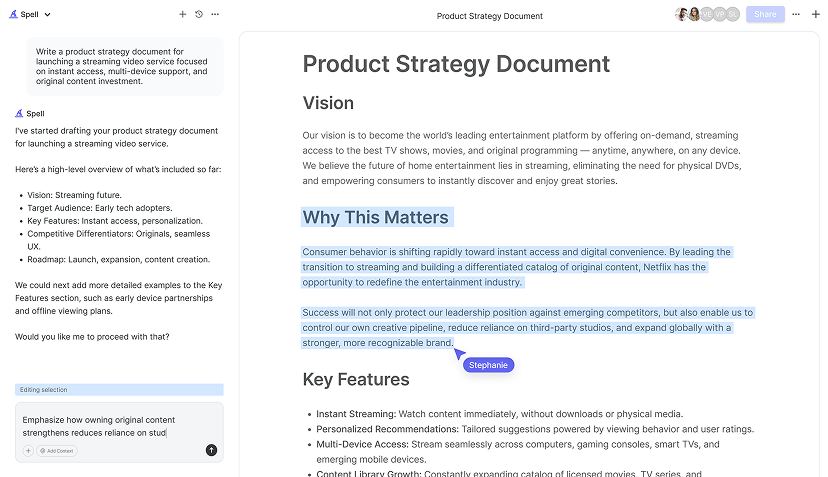
While Google Docs and Sheets have some neat features, they can't always keep up with the rapid pace of editing and drafting, especially if you're working on a tight schedule. That's where Spell comes in. Spell is like Google Docs but on steroids, with AI built right in to help you draft and refine documents faster than ever.
Imagine having the ability to not just create and edit documents but also generate content swiftly with AI assistance. Spell makes that possible, saving you time and letting you focus more on the data rather than the presentation mechanics.


Collaborating with Others
Sharing and collaborating on documents is one of Google Docs' strong suits. Here's how you can make sure everyone's on the same page with your bar graph:
- Click the "Share" button in your Google Doc.
- Enter the email addresses of folks you want to share the document with.
- Set their permission level (View, Comment, or Edit).
Now, your colleagues can view or edit the document, including the bar graph, based on the permissions you've set. For real-time collaboration, Spell offers a similar feature, letting you work together with AI support, ensuring everyone sees the most polished version of your work.
Final Thoughts
Editing a bar graph in Google Docs is more straightforward than it might seem at first glance. With these tips, you can adjust colors, labels, and more to create a graph that truly communicates your data. And if you're looking to boost your document editing efficiency even further, consider using Spell. It's like having an AI-powered assistant right there with you, helping turn your ideas into polished documents in no time.


