Creating a bar graph in Google Docs might sound like a task better suited to spreadsheets. But it's actually a pretty straightforward process. Whether you're a student trying to visualize data for a class project or you're in the workforce needing to present data in an engaging manner, a bar graph can be an incredibly helpful tool. So, let's break down how you can create one directly in Google Docs. We'll cover everything from setting up your data to customizing your graph for that extra polish.
Setting Up Your Data
Before you can make a bar graph, you need some data to work with. Now, don't worry, this doesn't mean you need to be a data scientist. Even simple data sets will work for this exercise. Let's say you're keeping track of your weekly coffee consumption, and you want to visualize it. Here's a quick guide on how to organize your data:
- Open a Google Sheet: Although we're working in Google Docs, the bar graph feature is accessible through Sheets. So, open a new Google Sheet.
- Enter your data: In our coffee example, you might have columns for "Day of the Week" and "Cups of Coffee." Fill in the data for each day, like so:
Day of the Week | Cups of Coffee
----------------|---------------
Monday | 3
Tuesday | 2
Wednesday | 4
Thursday | 5
Friday | 3
Saturday | 1
Sunday | 2
- Save your sheet: Google automatically saves your work, so no worries about losing it. Just ensure you name your sheet something you'll remember.
With your data ready, you're set to move on to the fun part. Creating the bar graph!
Creating the Bar Graph
Now that you've got your data set up, let's make that bar graph. This part is easier than you might think and doesn't require any advanced skills. Here's how you can do it:
- Select your data: Click and drag over your data to highlight it. This tells Google Sheets that this is the data you want to visualize.
- Open the Chart Editor: With your data selected, navigate to "Insert" in the top menu and click "Chart." This will open the Chart Editor on the right side of your screen.
- Choose your chart type: In the Chart Editor, you'll see a default chart type. Click on "Chart type" and select "Bar chart" from the dropdown menu. Voila! You should now see a bar graph representing your data.
And there you have it. A simple bar graph illustrating your coffee-drinking habits. If you're thinking that's all there is to it, think again. There's more you can do to make your graph not just functional but also visually appealing.
Customizing Your Bar Graph
Now, a basic bar graph is nice and all, but sometimes you want to add a personal touch. Customizing your graph can make it more readable and visually engaging. Here's how you can tweak your graph to perfection:
- Edit the title: Your graph's title is the first thing people will notice. Click on the title and type something that accurately describes your data, such as "Weekly Coffee Consumption."
- Change the colors: In the Chart Editor, go to the "Customize" tab. Here you can change the colors of your bars. Maybe you want Monday to be blue and Wednesday to be green. Knock yourself out!
- Adjust the axis labels: Still under the "Customize" tab, find the section for "Horizontal axis" and "Vertical axis." You can edit these labels to make them more descriptive, like "Days" and "Cups."
- Explore additional options: Google Sheets offers various other customization options like gridlines, trendlines, and data labels. Feel free to explore these to make your graph even more informative.
Customization not only makes your graph look better, but it also makes it easier to understand. It's like giving a little personality to your data.

Copying Your Chart to Google Docs
So, you've customized your chart, and it looks fantastic. Now, how do you get it into your Google Doc? Here's where you might worry about losing all your hard work. But fear not. It's a simple process:
- Select your chart: Click on your bar graph in Google Sheets to select it. You'll see a little dropdown menu in the top-right corner of the chart.
- Copy the chart: Click on the dropdown menu and select "Copy chart."
- Paste it into Google Docs: Go to your Google Doc and place the cursor where you want the chart. Use Ctrl+V (Cmd+V on Mac) to paste it in.
There you go! Your bar graph should now be in your document. The great thing about this method is that if you update your data in Sheets, you can easily update the chart in Docs as well.
Updating Your Graph
Data can change. And when it does, your graph should change too. Luckily, Google makes it easy to update your graph when your data changes. Here's how you can keep everything in sync:
- Update your data in Sheets: Simply go back to your Google Sheet and change the numbers in your data table.
- Refresh your chart in Docs: After updating the data, go back to your Google Doc. Click on your chart, and you'll see an "Update" button in the top-right corner of the chart box. Click it to refresh your graph.
This feature is a lifesaver for anyone who needs to keep their documents current without constantly recreating charts. Plus, it saves you a ton of time, which is always a bonus.
Using Spell for Faster Document Creation
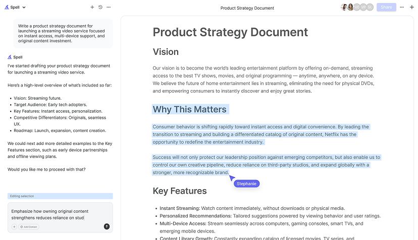
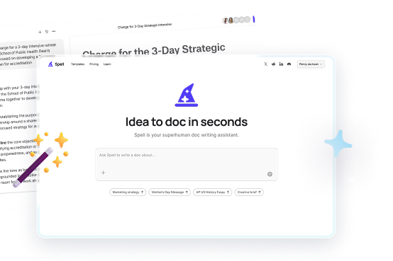
When working with documents, speed and efficiency are often essential. This is where Spell comes in. Imagine creating high-quality documents in a fraction of the time, with AI helping you every step of the way. Whether you're drafting a report or refining a presentation, Spell can make the process smoother and quicker.
Spell allows you to go from idea to document in seconds. You can generate drafts, edit them using natural language, and collaborate with your team in real time. It's like having AI built directly into your document editor. If you're tired of jumping between different tools or constantly reformatting text, Spell can make your workflow much smoother.

Sharing Your Document
Once your bar graph is in your Google Doc, you might want to share it with others. Sharing is easy, but there are a few things you might want to consider:
- Choose the right sharing settings: Click the "Share" button in the top-right corner of your Google Doc. You can then add people by email and choose whether they can view, comment, or edit.
- Use a sharing link: If you just need to send a quick link, click "Get link" and choose the sharing settings. You can then copy the link and send it via email or chat.
- Consider privacy: Make sure you're only sharing with people who need access. Double-check the permissions to ensure no one outside your intended audience can view or edit your document.
Sharing your work is a breeze with Google Docs, and it allows for real-time collaboration, making teamwork more efficient.
Printing Your Document
Sometimes, you need a hard copy of your document, including your bar graph. Printing your Google Doc is straightforward, but here's how to make sure it looks its best:
- Check your margins: Before printing, go to "File" > "Page setup" and check your margins. Adjust them if necessary to ensure nothing gets cut off.
- Use print preview: Click "File" > "Print" to see a print preview. This way, you can catch any issues before you waste paper.
- Choose the right printer settings: Make sure your printer settings are correct, especially if you're printing in color.
Printing might seem old school, but it's often necessary. Just a few extra steps can ensure that your printed document looks as good as it does on screen.


Exploring Advanced Features
If you're feeling adventurous, Google Docs offers a variety of advanced features that can make your document even more powerful. Here are a few things you might want to try:
- Add hyperlinks: Make your document interactive by adding hyperlinks to external references or other sections of your document.
- Use add-ons: Google Docs has a range of add-ons that can extend its functionality. Whether you need a citation manager or a grammar checker, there's likely an add-on for it.
- Incorporate images and diagrams: Besides charts, you can add images and diagrams to make your document more engaging and informative.
These features can add depth to your document and make it more than just a collection of text and charts. Experimenting with these tools can be both fun and rewarding.
Final Thoughts
Creating a bar graph in Google Docs is not only doable but can be a fun and informative way to present your data. From setting up your data to customizing your graph, you now have all the steps you need to make your information stand out. And when you're ready to speed things up, Spell can help you draft, refine, and collaborate on documents faster than ever. It's like having a little extra help in your back pocket.


