Creating an infographic can feel like an artistic endeavor combined with a puzzle-solving challenge. It‘s about transforming complex information into a visual format that‘s not only understandable but also appealing. If you‘ve ever wanted to know how to make your data pop and engage your audience in a single glance, you‘re in the right place. We‘re going to walk through what it takes to create an infographic that‘s both informative and visually captivating.
Start with a Clear Purpose
Before you dive into colors and charts, ask yourself: What‘s the story you want to tell? An infographic should have a clear purpose. Whether it‘s to educate, persuade, or entertain. Knowing this will guide every decision you make, from the data you include to the design elements you choose.
- Identify Your Audience: Who will see this infographic? Tailor the content and design to their preferences and needs.
- Define Your Message: What are the key points or insights you want your audience to walk away with?
- Set Goals: Are you aiming for increased engagement, more shares, or just to inform? Your goals will help prioritize how you present the information.
For instance, if you‘re creating an infographic for healthcare professionals, your focus might be on accuracy and clarity. Meanwhile, an infographic for a social media audience might prioritize eye-catching visuals and snappy headlines.
Gather and Organize Your Data
Data is the backbone of your infographic. But how do you make sure it‘s not just a jumble of numbers?
- Research Thoroughly: Collect data from reliable sources. Ensure your information is current and relevant.
- Organize the Data: Break down the data into digestible parts. Think about the flow of information from start to finish.
- Prioritize Key Points: What are the must-know facts? Keep your audience‘s attention by highlighting these.
Think of this stage like curating an art exhibit. You have a lot of pieces to choose from, but you only want to showcase the ones that tell the story best and fit together cohesively.
Choose the Right Design Tools
Now, onto the fun part. Designing! Picking the right tools can make the process smoother and more efficient.
- Canva: Known for its user-friendly interface and plethora of templates, Canva is a favorite among beginners.
- Adobe Illustrator: If you‘re comfortable with design software, Illustrator offers more advanced features and customization options.
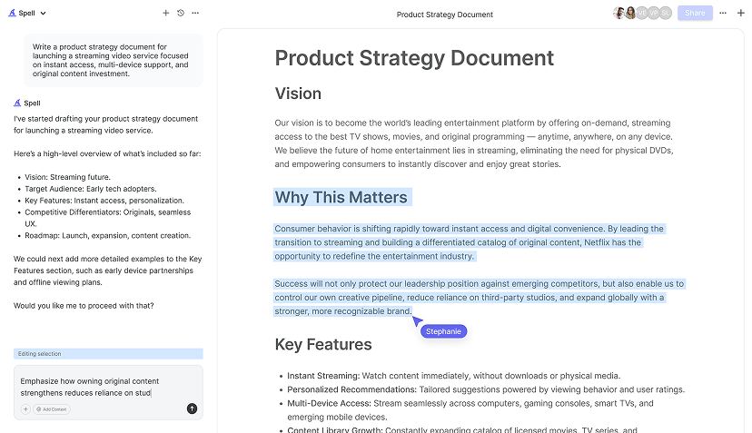
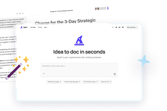
- Spell: Spell is an AI document editor that can streamline your design process by helping you draft and refine the text portions of your infographic, ensuring they‘re as polished as the visuals.
Each tool has its strengths, so consider what best fits your comfort level and the infographic‘s needs. For instance, if you‘re including a lot of custom illustrations, a more advanced tool might be necessary.

Crafting the Visual Design
This is where your data and narrative come to life. The design should complement the information, not overwhelm it.
- Pick a Color Palette: Stick to a limited color scheme to maintain cohesion. Tools like Adobe Color can help you find complementary colors.
- Choose Fonts Wisely: Use readable fonts and limit yourself to two or three different styles to keep the design clean.
- Use Visual Hierarchy: Guide the viewer's eye through the infographic. Make important information stand out with size, color, or placement.
Visual elements should enhance the data‘s story. If your infographic has a lot of statistics, consider using charts and graphs. For timelines, a clear linear layout can help convey the progression of events.
Incorporate Engaging Graphics
Graphics are what make infographics stand out from other forms of content. They should be engaging but also purposeful.
- Icons and Illustrations: These can simplify complex information. Use them to represent ideas or data points visually.
- Images and Photos: High-quality images can add depth to your infographic. Just make sure they‘re relevant and don‘t clutter the design.
- Whitespace: Don‘t be afraid of empty space. It can help emphasize key points and make the infographic more readable.
Remember, less can be more. Overloading your infographic with too many graphics can distract from the message.
Write Concise and Clear Text
While visuals are important, the text is what communicates your message. It should be concise, informative, and easy to understand.
- Keep It Simple: Use straightforward language. Avoid jargon unless it‘s necessary for your audience.
- Use Short Sentences: Long blocks of text can be daunting. Break them up to maintain interest.
- Proofread: Errors can undermine credibility. Use a tool like Spell to catch those pesky typos and refine your text.
Title: "The Rise of Electric Vehicles"

Introduction: "Electric vehicles are reshaping the automotive industry. Here's how they've grown over the past decade."

Data Point: "In 2010, EVs accounted for just 0.02% of global car sales."

[Conclusion](/resources/how-to-write-a-conclusion): "By 2020, that figure had risen to 4.6%, showcasing a remarkable shift in consumer preferences."
Incorporating direct, impactful text like this helps ensure your audience understands the core message without getting bogged down by excess words.

Review and Revise
Before you consider your infographic done, give it a thorough review. This isn't just about catching typos. It's about refining the entire piece.
- Check for Consistency: Ensure fonts, colors, and style are uniform throughout.
- Assess Clarity: Is the message clear at a glance? Get feedback from someone unfamiliar with the topic.
- Test Readability: Can key points be understood quickly? Revise any sections that seem too dense.
Getting a fresh perspective can be invaluable. Ask a colleague or friend to review your infographic and provide feedback. They might spot something you‘ve overlooked.
Optimize for Various Platforms
Your infographic may need to live in different environments. From social media to print. Make sure it's adaptable.
- Consider Size and Format: For social media, vertical infographics often work best. For presentations, a horizontal layout might be more suitable.
- Save in Multiple Formats: Export your infographic in high-quality PDF and image formats to ensure it looks great everywhere.
- Test on Different Devices: Make sure your infographic is legible on both desktop and mobile screens.
Remember, the platform can influence how your audience interacts with the infographic. Tailor it to fit seamlessly into its intended environment.


Promote Your Infographic
Once your infographic is ready, it‘s time to share it with the world. A great infographic deserves to be seen!
- Share on Social Media: Platforms like LinkedIn, Twitter, and Instagram are perfect for reaching a wide audience.
- Include in Blogs and Articles: Use your infographic to support written content. It can break up text and provide visual interest.
- Collaborate with Influencers: Partner with industry figures who can help amplify your reach.
Promotion is about more than just publishing. Engage with your audience‘s reactions and feedback to maximize your infographic‘s impact.
Final Thoughts
Creating a standout infographic involves a balance of creativity and strategy. By focusing on clear communication and engaging design, you can turn complex data into something your audience will love. And with Spell, you can streamline the process, ensuring your text is as polished as your visuals. Dive into your next project with confidence, knowing your infographic will not only inform but also captivate.


