Writing a survey report is like crafting a story that blends data with insights. You don't just want to present numbers. You want to tell a tale that engages readers and informs decisions. In this guide, we'll navigate the process of writing a survey report, from understanding your audience to weaving a narrative that brings the data to life.
What's the Point? Defining the Purpose of Your Survey Report
Before diving into tables and charts, take a moment to consider why you're writing the report in the first place. Is it to inform stakeholders about customer satisfaction, guide a new marketing strategy, or maybe influence policy changes? Knowing your purpose will help shape the report‘s structure and tone.
For example, if your report is meant for a group of senior executives, you'll want to be concise and focus on high-level insights. On the other hand, a report for a team of analysts might delve deeper into the data.
Aligning the Report with Audience Expectations
Think about the questions your audience wants answered. Are they interested in the big picture or do they crave the details? Aligning your report with their expectations ensures it will be both useful and engaging.
Here‘s a quick tip: create a brief outline listing the key questions your survey aimed to address. This outline will serve as a roadmap for your report, keeping it focused and relevant.
Gathering Your Data: The Backbone of Your Report
Data collection is where the magic begins. Whether you've used online tools like Google Forms or old-school paper surveys, having accurate and organized data is crucial. Check your data for completeness and consistency before diving into analysis.
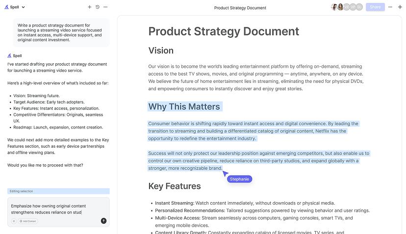
One practical approach is to use a spreadsheet to sort and filter the responses. This can help you easily spot trends and patterns, which will be invaluable when writing your report. If you're using a tool like Spell, you can streamline the process by quickly generating insights and summaries from your data.
Data Cleaning: Ensuring Quality
Nobody likes messy data. Take the time to clean your dataset by correcting errors and handling missing responses. This might mean removing duplicates, filling in blanks, or standardizing terms. Clean data not only makes analysis easier but also boosts the credibility of your report.

Crunching the Numbers: Analyzing Your Survey Data
Now that your data is tidy, it's time to analyze it. This doesn't mean you need to be a statistician. Even a basic understanding of averages, percentages, and trends will go a long way.
Begin by calculating response rates and looking for general patterns. What were the most common responses? Were there any surprising outliers? Use these insights to guide the narrative of your report.
Visualizing Data for Clarity
A picture is worth a thousand words, especially when it comes to data. Use charts and graphs to make your findings more digestible. Bar charts, pie charts, and line graphs can quickly convey trends and comparisons.
For instance, if you're reporting on customer satisfaction, a simple bar graph showing satisfaction levels across different demographics can be very telling. Just be sure to label your visuals clearly and provide context so they stand alone without explanation.
Structuring Your Survey Report: Building the Framework
With your analysis in hand, it's time to structure your report. A well-organized report not only looks professional but also makes it easier for your audience to find the information they need.
Typically, a survey report includes:
- Title Page: The first impression, including the report title, date, and author.
- Executive Summary: A snapshot of the report‘s purpose, key findings, and recommendations.
- Introduction: Background information and objectives of the survey.
- Methodology: Details on how the survey was conducted, including sample size and data collection methods.
- Findings: The main body of the report, presenting analyzed data with visuals.
- Conclusion: Summarizes the findings and their implications.
- Recommendations: Suggests actions based on the findings.
- Appendices: Additional information such as raw data, survey questions, or detailed calculations.
Crafting an Engaging Executive Summary
The executive summary is your elevator pitch. It's a brief overview of the report‘s purpose, findings, and recommendations. Keep it concise yet compelling to grab your reader‘s attention.
Here‘s a quick example of an executive summary:
Executive Summary:
The customer satisfaction survey conducted in Q3 2023 revealed a significant increase in satisfaction among our key demographics. The main drivers of satisfaction were product quality and customer service, as highlighted in the report. We recommend focusing on these areas to maintain and further improve customer satisfaction levels.
Writing the Introduction: Setting the Stage
Your introduction sets the context for the entire report. Here, you'll want to explain why the survey was conducted and what you hoped to achieve.
A good introduction might look something like this:
Introduction:
In an effort to better understand our customers‘ needs, we conducted a comprehensive survey in August 2023. The primary objective was to assess customer satisfaction and identify areas for improvement. This report presents the findings and offers actionable insights to enhance our customer experience.

Diving into the Methodology: Laying Down the How
The methodology section is where you explain how the survey was conducted. This includes details like the sample size, how participants were selected, and the tools used for data collection.
For example, your methodology section might read:
Methodology:
The survey was distributed online to a random sample of 1,000 customers, with a response rate of 60%. Data was collected using a structured questionnaire, and responses were analyzed using statistical software to ensure accuracy and reliability.
Presenting the Findings: Telling the Data's Story
Here‘s where you present your analysis. Use clear headings and subheadings to organize the data into digestible sections. Remember to include visuals to highlight key points.
A sample findings section might look like this:
Findings:
1. Customer Satisfaction Levels
   - 85% of respondents reported being satisfied with our services.
   - Satisfaction was highest among customers aged 25-34.

2. Product Quality
   - 78% rated product quality as excellent or very good.
   - Feedback highlighted the durability and design as standout features.

3. Customer Service
   - 82% expressed satisfaction with customer service interactions.
   - Many praised the responsiveness and professionalism of our support team.
Drawing Conclusions: Wrapping Up the Insights
The conclusion ties everything together. It recaps the main findings and discusses their implications. This is where you tell your audience what the data means and why it matters.
An effective conclusion might be:
Conclusion:
The survey results underscore the importance of maintaining high standards in product quality and customer service, as these are key drivers of customer satisfaction. By focusing on these areas, we can enhance customer loyalty and drive business growth.


Offering Recommendations: Taking Action on the Findings
Recommendations should be practical and actionable. They‘re your chance to translate data into plans that can make a difference.
Here‘s an example of how to formulate recommendations:
Recommendations:
1. Enhance Product Features: Invest in R&D to further improve product durability and design.
2. Boost Customer Service Training: Implement regular training sessions to maintain and elevate service quality.
3. Expand Customer Feedback Channels: Encourage more direct feedback through social media and email surveys to continuously monitor satisfaction levels.
Wrapping Up with Appendices: The Extra Mile
Appendices are where you include supplementary materials that support your report but are too detailed for the main body. This might include raw data, detailed calculations, or the survey questionnaire.
For instance, if you have a complex calculation that supports a key finding, include it here with a brief explanation:
Appendix A: Detailed Satisfaction Calculation
The satisfaction index was calculated using the following formula: [Insert Formula Here]. This approach ensures a comprehensive assessment of customer sentiments.
Final Thoughts
Writing a survey report may seem daunting. With a structured approach, it can be a rewarding process that yields valuable insights. By organizing your data, crafting a clear narrative, and offering actionable recommendations, you can create a report that truly informs and engages your audience. If the writing part feels overwhelming, consider using Spell to streamline the drafting and editing process, making it easier to go from numbers to narrative.


