Writing a data analysis report might seem overwhelming at first, but it's a skill that can be mastered with some guidance and practice. This piece will guide you through the process step by step, from understanding your data to crafting a compelling narrative around your findings. Whether you're new to data analysis or just need a few pointers to refine your reports, this guide has you covered.
Start with a Clear Objective
Before diving into the numbers, it's crucial to know what you're aiming to achieve with your report. Ask yourself: What's the main question you're trying to answer? Having a clear objective helps structure your analysis and keeps everything focused. This is your roadmap. Without it, you might find yourself lost in a sea of data.
For instance, if you're analyzing customer feedback, your objective might be to identify common complaints and suggest improvements. On the other hand, if you're looking at sales data, you might want to understand seasonal trends. Whatever your focus, make sure it's specific and actionable.
Here's a quick example of a clear objective:
Objective: Analyze Q4 sales data to identify the top-performing product categories and understand the factors contributing to their success.
With a well-defined objective, you're ready to dive into the data with purpose.
Gather and Prepare Your Data
Now that you know what you're looking for, it's time to gather the relevant data. This might involve pulling information from databases, spreadsheets, or even manual records. The key is to ensure the data you collect is accurate and relevant to your objective.
Once gathered, prepare your data for analysis. This involves cleaning up any inconsistencies, such as duplicates or missing values. Data preparation might feel like a chore, but it's essential for reliable results. Imagine trying to build a house on a shaky foundation. It just doesn't work!
For example, if you're working with sales data, you might need to:
- Remove duplicate entries
- Fill or remove missing values
- Standardize date formats
Once your data is clean and ready, you‘ll have a solid base to build your analysis on.
Choose the Right Tools for Analysis
Now that your data is ready, you'll need the right tools to analyze it effectively. The choice of tools depends on your familiarity and the complexity of the data. For simpler analyses, tools like Excel or Google Sheets might suffice. They offer various functions and charts to help visualize your data.
For more complex datasets or analyses requiring statistical methods, you might opt for tools like R, Python, or specialized software like SAS or SPSS. These tools provide advanced functionalities and are great for handling large datasets.
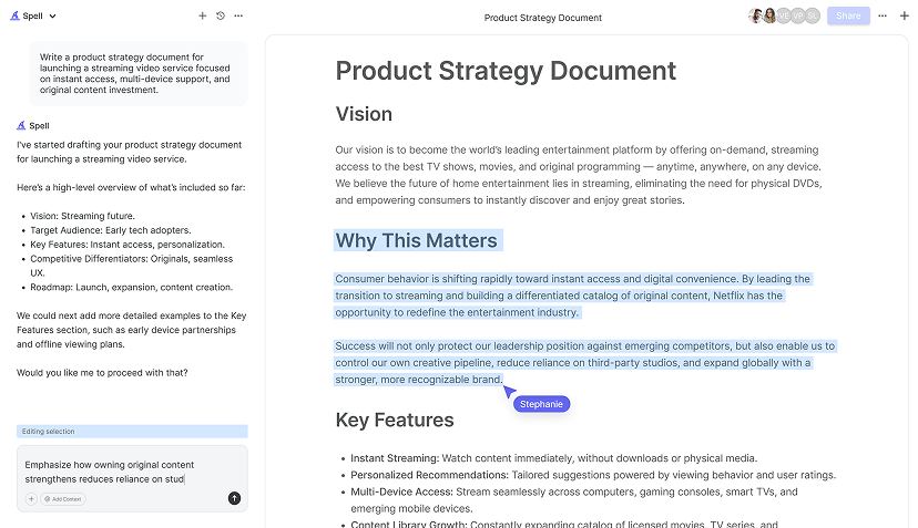
Interestingly enough, Spell can also assist in creating high-quality reports. With its built-in AI, you can generate drafts and refine them without the hassle of switching between different platforms. This can save you a significant amount of time, allowing you to focus more on the analysis itself rather than formatting issues.

Analyze Your Data
With your tools ready, it's time to dive into the analysis. This stage involves applying statistical methods and techniques to uncover insights from your data. Depending on your objective, you might conduct descriptive analysis, which involves summarizing the main features of the data, or inferential analysis, which allows you to make predictions.
For instance, if your goal is to understand sales trends, you might use time-series analysis to identify patterns over time. If you're examining customer feedback, sentiment analysis can help categorize feedback into positive, negative, or neutral categories.
Remember, the aim is to uncover insights that answer your objective. Stay focused and avoid getting sidetracked by interesting but irrelevant data. It's like peeling an onion. You want to get to the core without getting caught up in the outer layers.
Visualize Your Findings
Once you've extracted insights from your data, the next step is to visualize them. Good visualization helps communicate your findings clearly and effectively. Think of it as translating numbers into a story that everyone can understand.
Charts, graphs, and tables are your best friends here. For instance, bar charts are great for comparing quantities, while line charts can illustrate trends over time. Pie charts, although sometimes overused, can be effective for showing proportions.
Consider this simple example of a visualization:
Sales by Product Category (Bar Chart):
- Electronics: 40%
- Clothing: 25%
- Home Goods: 15%
- Books: 20%
Visualizations should simplify complex data and highlight the most critical insights. Choose your visuals wisely and keep them straightforward.
Interpret the Results
Now that you've visualized your data, it‘s time to interpret the results. This is where you explain what the data actually means in the context of your objective. Your interpretation should be clear and directly related to your initial questions.
For example, if your analysis shows that electronics are your best-selling category, explore why this might be the case. Is it due to seasonal demand, a recent marketing campaign, or perhaps a new product launch?
It's also important to acknowledge any limitations in your analysis. Maybe the data was limited or there were external factors you couldn't measure. Being transparent about these limitations adds credibility to your report.

Craft a Compelling Narrative
Data is just numbers without a story. To make your report engaging and memorable, craft a narrative that weaves together your findings and insights. This involves connecting the dots between your objective, analysis, and conclusions.
Start with a strong introduction that captures the reader's attention and outlines what they can expect. Then, present your findings logically, using visuals to support your points. Finally, conclude with actionable recommendations based on your insights.
Here‘s a brief example of structuring your narrative:
Introduction: The purpose of this report is to analyze Q4 sales data to identify top-performing product categories.
Findings: Electronics emerged as the top category due to a successful holiday campaign.
Conclusion: To capitalize on this success, we recommend increasing marketing efforts for electronics in the next quarter.
By telling a story, you make your data relatable and your insights actionable.
Review and Edit Your Report
Before finalizing your report, take the time to review and edit it. A fresh set of eyes can catch errors or inconsistencies you might have missed. Check for clarity, coherence, and conciseness.
Consider having a colleague or peer review your work. They might offer valuable feedback or point out areas that need clarification. You can also use tools like Spell to refine your document. With its AI capabilities, Spell can help polish your writing, ensuring your report is professional and error-free.
Remember, a well-crafted report reflects your professionalism and attention to detail. Take the time to get it right.


Present Your Report Effectively
The final step is presenting your report to your audience. This might involve sharing a physical or digital copy or delivering a presentation. Whatever format you choose, make sure your key points are clear and easy to digest.
If you're presenting, practice your delivery to ensure you're confident and engaging. Use visuals to support your points, but don‘t rely on them entirely. Your narrative should guide the presentation, with visuals serving as highlights.
When sharing a written report, ensure it's accessible and easy to navigate. Include a table of contents, headings, and page numbers to help your audience find the information they need quickly.
By presenting your report effectively, you maximize its impact and ensure your insights are understood and acted upon.
Final Thoughts
Creating a data analysis report involves several steps, but each one is crucial for delivering clear and actionable insights. From setting a clear objective to presenting your findings, each stage builds on the last to create a cohesive and informative report. And with tools like Spell, you can streamline the writing process, turning hours of work into minutes. Happy analyzing


