Creating visually appealing documents in Google Docs can elevate your presentations and reports, especially when you need to display data effectively. Putting two charts side by side is a great way to compare data directly. In this guide, we'll explore how to align your charts seamlessly in Google Docs, making your documents both informative and visually engaging.
Why Place Charts Side by Side?
Sometimes, one chart just doesn't cut it. You might have a need to compare two sets of data directly, or you might want to show the relationship between two variables. Placing charts side by side allows for a quick visual comparison without the reader having to scroll back and forth. This approach is particularly useful in reports, presentations, or any document where clarity and efficiency are paramount.
Think of it like a side-by-side taste test. You wouldn't want to taste one food, cleanse your palate, and then taste another. You want that instant comparison to see which flavor stands out. Similarly, placing charts side by side gives your audience an immediate, clear view that highlights differences or similarities at a glance.
Creating Your Charts in Google Sheets
Before you can place charts side by side in Google Docs, you'll need to create them in Google Sheets. Google Sheets provides a robust set of tools for generating charts, and the process is straightforward. Here's how you can do it:
- Open Google Sheets and enter your data into the spreadsheet.
- Select the data range you want to turn into a chart.
- Go to the menu and click on Insert > Chart.
- Google Sheets will automatically generate a chart based on your data. You can customize the chart type and style in the Chart Editor on the right.
Repeat these steps to create your second chart. Make sure both charts are based on data sets that you want to compare directly. Once your charts are ready, it's time to bring them into Google Docs.
Inserting Charts into Google Docs
Now that your charts are set up in Google Sheets, transferring them to Google Docs is simple. Here's how you can do it:
- Open your Google Docs document where you want the charts to appear.
- Click on Insert > Chart > From Sheets.
- You'll see a list of your Google Sheets documents. Select the one containing your charts.
- A window will pop up showing the available charts in that sheet. Select the first chart you want to insert and click Import.
- Repeat the process for the second chart.
Once both charts are in your Google Docs document, you can arrange them side by side. But, hold on. There's a trick to getting them aligned perfectly.

Aligning Charts Side by Side
Here's where the magic happens. Placing charts side by side requires a bit of finesse. You'll want them to look neat and organized, without one chart overshadowing the other. Here's the step-by-step:
- Click on the first chart to select it.
- Drag the chart to where you want it on the page. You can adjust its size by clicking and dragging the corners.
- Click on the second chart and repeat the sizing process if necessary.
- To align them precisely, you can use Google Docs' alignment tools. Select one chart, then hold down the Shift key and select the second chart.
- Right-click on one of the charts and choose Align vertically or Align horizontally from the menu. This will align the charts perfectly.
If manual adjustments are needed, use the arrow keys for fine-tuning. It might take a bit of tweaking, but soon enough, your charts will sit side by side, just the way you want them.
Using Tables for Better Alignment
For those who like a bit more control over alignment, inserting your charts into a table can be a lifesaver. This method provides a grid-like structure that makes it easy to keep things neat and tidy.
- Insert a two-column table into your Google Docs document by clicking on Insert > Table > 2x1.
- Click inside the first cell of the table and insert your first chart there.
- Do the same for the second chart in the next cell.
- You can adjust the width of the columns by dragging the borders, ensuring both charts fit well within their respective cells.
This approach not only helps with alignment but also ensures that your charts remain organized even if you add more content to the document. Plus, it just looks clean and professional.
Maintaining Chart Updates
One of the perks of using Google Docs and Sheets together is the ability to keep your charts updated automatically. If the data in your Google Sheets changes, your charts in Google Docs can reflect these changes instantly.
To ensure this happens:
- Click on the chart in your Google Docs document.
- In the top right corner of the chart, click on the link icon.
- Ensure the option Link to spreadsheet is enabled. This will sync the chart with any updates made in the original Google Sheets document.
This feature is a real-time-saver. It's like having a living document that adapts as your data changes. No need to reinsert charts every time you tweak a number in your spreadsheet.

Customizing Chart Appearance
Once your charts are in place, you might want to tweak their appearance to match the style of your document. Google Sheets offers a variety of customization options:
- In Google Sheets, click on the chart you want to customize.
- Use the Chart Editor on the right to change colors, fonts, and other styling options. You can also add labels or adjust axes.
- Once you're satisfied with the changes, the linked chart in Google Docs will update automatically.
Customizing charts helps them blend seamlessly with the rest of your document, creating a cohesive look. It's like dressing your charts for the occasion, ensuring they're as informative as they are attractive.
Using Spell for Faster Document Creation
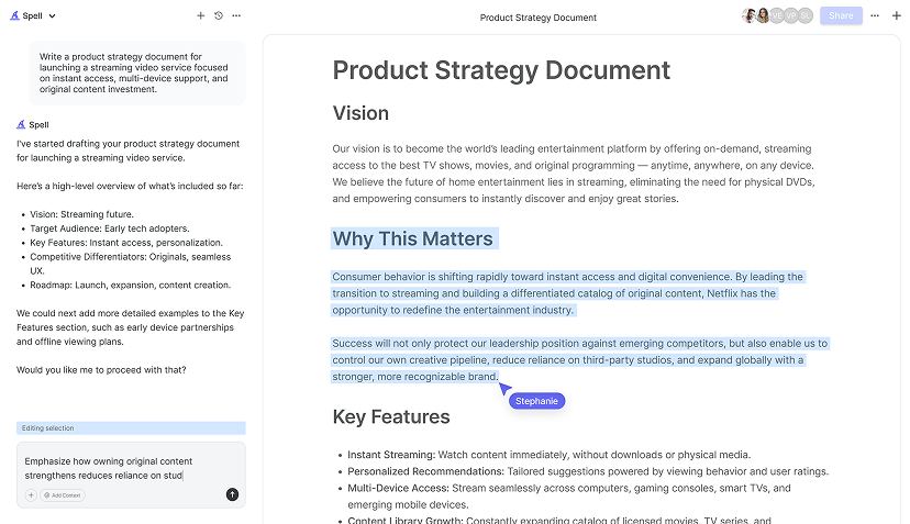
While arranging charts might be straightforward, creating the content around them can be time-consuming. That's where Spell can lend a hand. Our AI-powered document editor helps you draft and refine content quickly, making your document creation process much faster.
With Spell, you can generate high-quality drafts in seconds, edit them using natural language, and collaborate with your team seamlessly. It's like having a writing assistant that's always ready to help, allowing you to focus more on data presentation and less on wording.


Sharing Your Document
Once your charts are perfectly aligned and your document is polished, sharing with others is easy. Google Docs offers several ways to share:
- Click on the Share button in the top-right corner of your document.
- Enter the email addresses of your collaborators and adjust the permissions (view, comment, or edit).
- You can also generate a shareable link for broader access.
Remember, once you share the document, collaborators can view and interact with the charts, seeing the updates whenever the linked Google Sheets data changes. It's a real-time collaborative environment that keeps everyone on the same page.
Some Final Tips
Here are a few additional tips to keep in mind when working with charts in Google Docs:
- Always double-check your data before importing it into Google Docs. Accurate data leads to accurate charts.
- Keep your charts simple. Overcomplicating them can overwhelm your audience. Aim for clarity and precision.
- Use color wisely. Colors can highlight important data points but can also distract if overused.
- Consider your audience. Tailor your charts' complexity based on who will be reading the document.
These tips ensure that your charts not only look good but also serve their purpose effectively, providing insights at a glance.
Final Thoughts
Putting two charts side by side in Google Docs can enhance the way you present data, making comparisons easy and effective. With the right steps, you can create a document that's both informative and visually appealing. And if you're looking to streamline your document creation process, Spell offers a powerful AI approach to help you craft high-quality documents swiftly and efficiently. It's all about making your work easier and your presentations more impactful.


