Google Docs is a favorite tool for many people because it's simple, collaborative, and accessible just about anywhere you have an internet connection. But one small irritation for frequent users is not being able to set a preferred default font. If you're tired of using Arial or Times New Roman every time you start a new document, you're in the right place. Let's look at how you can make your favorite font the default in Google Docs, so you can spend more time focusing on your work and less time fiddling with formatting.
Why Change the Default Font?
First off, let's talk about why you might want to change the default font in Google Docs. Using a font that suits your style or the type of document you're working on can make a big difference in your productivity and presentation. Whether it's for personal preference, branding consistency, or readability, having your go-to font already set can save time and keep you in the flow of writing. Plus, if you're working on collaborative documents, it ensures that everything looks consistent from the start. Avoiding that moment where everyone realizes their headings are in different styles.
Getting Started with Font Changes
Before you go about changing the font, make sure you're logged into your Google account and have a document open. It can be a new document or an existing one. It doesn't matter for this purpose. The key thing is you're in a document where you can make changes to text formatting.
Choose Your Font
Alright, you've got your document open. Now, head to the toolbar at the top of the page. Click on the font dropdown menu. Here, you'll see a list of fonts that Google Docs offers. Take a moment to scroll through and find the one that fits your needs. If you're looking for something a bit more exotic, click on "More fonts" at the top. This will open up a larger selection for you to browse through.
Apply Your Font to the Document
After picking your font, you'll need to apply it to the text in your document. Select some text and apply the font choice. If you haven't typed anything yet, go ahead and write a few lines, so you have something to work with. Once you've selected your text, click your chosen font from the dropdown, and voilà, your text now showcases your preferred style. Remember, this step is crucial because you're setting the foundation for the default font style you want to apply across future documents.
Setting the Default Font
Now that you've chosen and applied your preferred font, let's make it the default setting for all future documents. This part is pretty straightforward but can be easily overlooked if you're not familiar with the menu options.
Open the Styles Menu
To lock in your choice, you need to access the styles menu. Find the toolbar again and look for the "Styles" dropdown. It usually starts with "Normal text" displayed. Click this dropdown menu to reveal options for text styles such as Title, Subtitle, and Heading.
Update the Default Style
Once you have the styles menu open, hover over the "Normal text" option. You'll see an arrow appear next to it. Click this arrow to bring up a small menu. Choose "Update 'Normal text' to match." This action ties your font choice to the default text style in Google Docs.
Save Your Settings
Now it's time to make it official. Go back to the styles dropdown and find "Options" at the bottom of the menu. Click on it, and you'll see a choice that says "Save as my default styles." Select this, and you've just set your font as the default for all new documents. It's like telling Google Docs, "Hey, this is how I like things to look, so let's stick with it."

Understanding Font Pairing
While you've set your default font, you might also be curious about font pairing. Fonts don't just stand alone. They often work best when paired with complementary styles. For example, a clean sans-serif font for headings paired with a serif font for body text can create a visually appealing document. This concept of font pairing ensures your document is not only readable but also aesthetically pleasing.
Experiment with Headers and Body Text
With your new default font, consider experimenting with different fonts for headers and body text. Head back to the styles menu and apply different fonts to the heading styles. Adjust them to your liking and observe how they look in relation to your default body text. This helps in creating a cohesive document style that's easy on the eyes.
Save Your Font Pairing
Once you've found a combination you like, update the styles as you did for the default font. Use the "Update" option in the styles menu for each heading. Then, save these as your default styles. Now, every new document you create will carry this consistent look, saving you the hassle of adjusting styles repeatedly.
Using Spell for Better Document Workflow
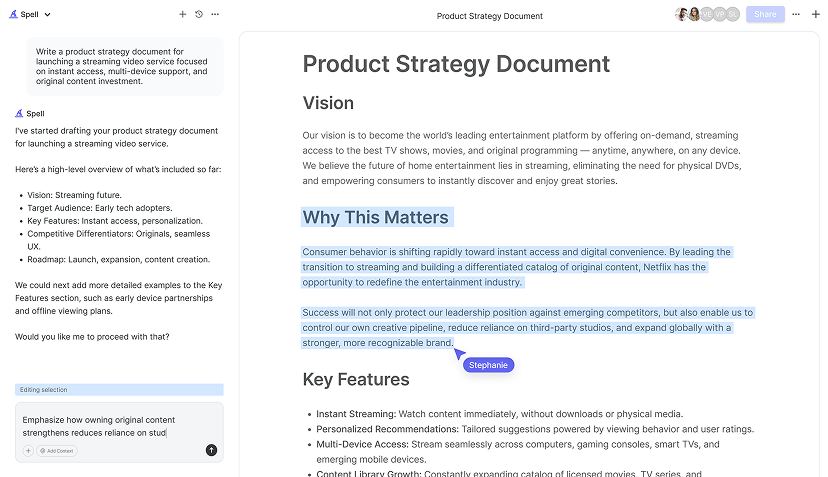
While Google Docs is fantastic, sometimes you need more robust tools to enhance your writing process. This is where Spell comes into play. Spell is an AI-powered document editor that allows you to create high-quality documents in no time. Imagine having your default font settings combined with AI assistance that helps polish your writing as you go. Spell's real-time collaboration and editing features can make your document creation process even smoother, like having a personal writing assistant built into your document editor.
Font Choices for Different Needs
Let's face it. Different documents call for different fonts. A formal report might require something more traditional, like Times New Roman. A creative project could benefit from a more playful font like Pacifico. Understanding the context of your document helps in choosing a font that aligns with the tone you want to convey.
Consider Readability
When selecting fonts, always consider readability. Fonts like Arial and Verdana are known for being easy on the eyes, especially for longer documents. If your document is meant to be printed, serif fonts often look better on paper, whereas sans-serif fonts are typically more readable on screens.
Branding Consistency
If you're working for a company or brand, consistency in font usage is crucial. Always keep brand guidelines in mind. Having a default font that aligns with your branding ensures that any document you produce remains consistent with your brand's identity, which is vital for maintaining professionalism.
Troubleshooting Font Issues
What happens if your default font setting doesn't stick or you encounter issues? Here are some troubleshooting tips to help you resolve common font-related problems in Google Docs.
Clearing Browser Cache
If your changes aren't saving, it might be a browser issue. Try clearing your browser cache. This can resolve issues with settings not sticking. Once cleared, reload Google Docs and check if your font settings are now applying as intended.

Check Your Extensions
Sometimes, browser extensions can interfere with Google Docs' functionality. If you're having trouble, try disabling your extensions one by one to see if one of them is causing the problem. Once identified, you can choose to keep it disabled while using Google Docs or look for an alternative extension that doesn't conflict.
Consult Google Support
If all else fails, Google Support can be a useful resource. Their help forums and support pages are full of helpful information from both users and Google staff. You can often find someone who has faced a similar issue and find a solution that works for you.
Revisiting Your Preferences
As you grow and your needs change, you may find that your font preferences evolve too. It's always a good idea to revisit your default font settings periodically. Maybe you're starting a new project that requires a different tone, or perhaps your personal style has changed. Don't hesitate to adjust your settings to fit your current needs.
Experiment with New Fonts
Google regularly updates its font library, so it's worth checking back every so often to see what's new. You might discover a new favorite that you weren't aware of before. Experimenting with different fonts can also spark creativity or give your documents a fresh look.
Feedback from Peers
If you're working collaboratively, consider getting feedback from your peers on your font choices. They might have insights or preferences that could help improve the overall document style. Collaboration often leads to better results, so don't shy away from seeking input.
Ensuring Accessibility
When choosing fonts, it's important to consider accessibility. Fonts that are hard to read can be a barrier for people with visual impairments. Always aim for high contrast between your text and background, and choose fonts that are clear and legible. This ensures that your documents are accessible to as many people as possible.


Font Size and Line Spacing
Beyond just the font type, consider font size and line spacing. A larger font size with ample line spacing can make a document more readable. This is particularly important for documents intended for presentations or those that will be printed and read by a wide audience.
Color Contrast
When using colored fonts, ensure there is enough contrast between the font color and the background. This is crucial for readability, especially for those with color blindness. Google Docs allows you to change font colors, so use this feature wisely to enhance accessibility.
Collaborative Font Choices
When working with a team, font choices can sometimes become a point of contention. Everyone has their own preferences, and reconciling these can be a challenge. Here's how you can navigate this aspect of teamwork.
Establishing Guidelines
Set clear guidelines at the start of a project. Decide on a default font and style for headings and body text that everyone agrees on. This ensures consistency and reduces the time spent on formatting debates later on. Creating a style guide can help in maintaining these standards across different documents.
Using Spell for Team Collaboration
For those looking to streamline document creation, Spell offers real-time collaboration with built-in AI. It's like Google Docs but with an AI twist. You can work with your team to create documents efficiently, with AI helping to maintain consistency in style and format, so you can focus on the content.
Final Thoughts
Changing the default font in Google Docs is a small tweak that can save you a lot of time and effort in the long run. By setting your preferred font, you're ensuring that every document starts out looking just the way you like. If you're looking for an even more efficient writing experience, consider using Spell. With its AI capabilities, it makes document creation faster and smoother, helping you focus on what really matters. Your content.


