Creating a T Chart in Google Docs is easier than you might think. It's a great way to organize information visually. Whether you're comparing pros and cons, listing differences between two ideas, or simply categorizing information, a T Chart can be incredibly useful. Let's walk through the process step-by-step. You can start using this handy tool in your documents right away.
Why Use a T Chart?
T Charts are simple yet powerful tools for organizing information. They're especially useful for comparisons. Imagine you're trying to decide between two job offers. You could list the pros and cons of each offer in a T Chart. This makes the decision-making process clearer and more structured. This visual aid helps you see the information side by side, which can be much more effective than reading through paragraphs of text. In educational settings, teachers often use T Charts to help students compare and contrast concepts, enhance critical thinking skills, and improve comprehension.
Moreover, T Charts are versatile. You can use them for brainstorming sessions, planning projects, or even organizing personal tasks. They're not just limited to comparisons, they can also be used to categorize information or list out steps in a process. The simplicity of a T Chart. Literally a "T" shape that divides the page into two columns. Makes it accessible and easy to create, especially in Google Docs.
Getting Started with Google Docs
Before we get into the nuts and bolts, let me assure you that you don't need any fancy tools or plugins to create a T Chart in Google Docs. Everything you need is already built into the application. If you're new to Google Docs, don't worry. It's quite intuitive. Just open a new document, and you're ready to roll.
Google Docs is similar to Microsoft Word, but with the added benefit of being cloud-based. This means you can access your documents from anywhere with an internet connection. Plus, Google Docs autosaves your work, so you won't lose your progress. This feature is a lifesaver, especially when you're deep into organizing information and don't want to be disrupted by a technical glitch.
Creating a Basic T Chart
Now, let's get down to business. Creating a T Chart in Google Docs is straightforward. Here's how you do it:
- Open a New Document: In Google Docs, click on "Blank" to open a new document.
- Insert a Table: Go to the "Insert" menu, select "Table," and choose a 2x1 table. This will give you two columns and one row, forming the basic structure of your T Chart.
- Adjust the Size: Click and drag the table borders to adjust the size of your columns as needed. You can make one column wider than the other if you have more content to fit in one side.
- Add Headings: In the first row of each column, type your headings. For example, if you're comparing two job offers, you might label the first column "Job Offer A" and the second column "Job Offer B."
- Enter Your Data: Beneath the headings, start entering the information you want to compare. You can add additional rows by right-clicking on the table and selecting "Insert row below."
And there you have it. A simple T Chart ready for your information! It's a basic setup, but don't worry. We can customize it to make it more visually appealing and better suited to your needs.

Customizing Your T Chart
While a basic T Chart is functional, sometimes you want it to look a bit more polished or tailored to your specific project. Here are some tips to customize your T Chart in Google Docs:
- Add Color: Use the paint bucket tool in the toolbar to add background color to your headings or entire columns. This can help differentiate the columns visually.
- Bold Text: Highlight important points by bolding the text. This can be done by selecting the text and clicking the "B" icon in the toolbar.
- Adjust Font Size: If you have a lot of information, you might want to decrease the font size to fit more text in each cell. Conversely, increase the font size to make key points stand out.
- Merge Cells: If you need to create sections within your T Chart, you can merge cells by highlighting them, right-clicking, and selecting "Merge cells."
These small tweaks can make a big difference in how your T Chart looks and how easy it is to read. Customization allows you to tailor the chart to your audience, whether it's for a professional presentation or a classroom setting.
Using T Charts for Brainstorming
One of the best uses for a T Chart is brainstorming. If you're working on a project and need to organize your thoughts, a T Chart can be a lifesaver. For instance, let's say you're planning a marketing campaign. You can label one column "Ideas" and the other "Considerations." Under "Ideas," list potential strategies, and under "Considerations," note any challenges or resources needed. This setup helps you visualize the relationship between your ideas and the practical steps required to implement them.
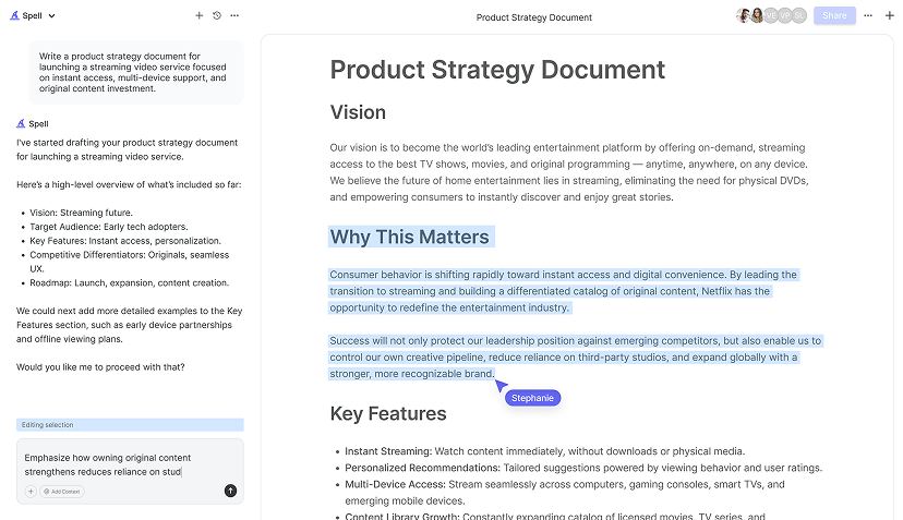
Brainstorming with a T Chart can also be a collaborative effort. If you're working in a team, share the Google Doc, and allow team members to add their thoughts. This real-time collaboration can lead to more dynamic discussions and a richer pool of ideas. Plus, with Spell, our AI document editor, you can draft and refine your brainstorming notes, making the process faster and more efficient. Just describe your brainstorming needs, and Spell can help generate an initial draft or organize your existing notes.
Comparing Options with T Charts
Another fantastic use for T Charts is comparing options. Whether it's deciding between different software tools or evaluating potential vendors, a T Chart can simplify the decision-making process. Let's say you're choosing between two project management tools. You can label one column with the name of the first tool and the other with the second. Under each column, list features, pricing, and user feedback.
By laying out the information side by side, you can quickly identify the strengths and weaknesses of each option. This visual comparison can make it easier to see which tool best fits your needs. Plus, if you're using Spell, you can easily refine your comparison notes using natural language prompts. Just highlight the text and tell Spell what to change or add, making it a breeze to keep your analysis up to date.

Teaching with T Charts
Teachers have long used T Charts as educational tools, and for good reason. They're great for helping students organize information and enhance comprehension. For example, in a history class, students might use a T Chart to compare two historical events. By listing similarities in one column and differences in the other, students can better understand the relationship between the events.
T Charts also encourage critical thinking. When students are tasked with filling out a T Chart, they're not just memorizing facts, they're engaging with the material in a deeper way. They're identifying key points and organizing them logically. This process helps solidify their understanding and makes the information more memorable.
Incorporating Spell into this process can streamline things further. Teachers can use Spell to generate initial outlines for T Charts or to refine student submissions. The AI capabilities make it easier to create structured, high-quality documents, saving time and enhancing the learning experience.
Using T Charts for Personal Projects
While T Charts are often used in professional or educational settings, they're also great for personal projects. Let's say you're planning a move to a new city. You can use a T Chart to list pros and cons of different neighborhoods, or to compare moving companies. This visual organization helps you weigh your options more effectively.
Another personal use might be budgeting. You can create a T Chart with columns for "Income" and "Expenses," listing all the relevant details. Seeing everything laid out clearly can help you manage your finances better. And if you're using Spell, you can quickly draft and adjust your budget plan, making it a seamless and efficient process.


Collaborating with T Charts
One of the great things about Google Docs is its collaborative features, and T Charts are no exception. You can share your chart with colleagues or friends, allowing them to add their insights. This collaboration can lead to more comprehensive and well-rounded information.
For team projects, real-time collaboration is invaluable. Team members can add their thoughts and make edits simultaneously, which can be a game-changer for group work. And with Spell, you can take collaboration to the next level. Spell's AI editor allows you to draft and refine documents in real time, making team collaboration smoother and more productive.
Final Thoughts
Creating a T Chart in Google Docs is a simple yet effective way to organize information visually. Whether you're comparing options, brainstorming ideas, or working on personal projects, T Charts can help you see the big picture more clearly. And with Spell, you can take your document editing to the next level. Our AI editor makes drafting and refining your T Charts faster and easier, allowing you to focus on what really matters. Making informed decisions. So why not give it a try? You might just find it transforms the way you organize information.


