Creating a pedigree chart in Google Docs might seem tricky at first, but it's easier than you think. Whether you're working on a family tree for a school project, tracking genetic traits, or simply curious about your ancestry, Google Docs offers a flexible platform to design your chart. I'll walk you through the process step by step, giving you the tips and tricks you need to make your chart visually appealing and informative. So, grab a cup of coffee, and let's get started on your pedigree chart journey!
Getting Started: Setting Up Your Google Docs
First things first, open Google Docs. I know it sounds obvious, but having the right setup is crucial. Once you're there, create a new document. The blank page might be a bit daunting. Don't worry. We'll fill it up soon. If you're not sure how to get there, simply head over to your Google Drive, click on "New," and choose "Google Docs." Now you're ready to roll.
Before we start adding shapes and lines, think about the layout you want for your chart. Pedigree charts usually have a straightforward structure, with squares for males, circles for females, and lines connecting them to represent relationships. Keep this in mind as you plan your design. A little bit of planning goes a long way in making the process smoother.
Creating Shapes for Individuals
Now, let's dive into creating the shapes that represent individuals on your chart. In Google Docs, head over to "Insert" in the top menu, then select "Drawing" and choose "+ New." You're now in the drawing tool, which is where the magic happens.
To create a shape, click on the "Shape" icon in the toolbar, then choose either a circle or a square, depending on whether you're representing a female or male. Click and drag on the canvas to draw your shape. You can resize it by clicking and dragging the corners of the shape. If you're a perfectionist like me, you'll appreciate the gridlines that help you align your shapes just right.
Once your shape is ready, you can add a label by selecting the "Textbox" icon from the toolbar. Click inside the shape and type the individual's name or identifier. If you're creating a large chart, it helps to use consistent abbreviations or codes for names to keep things tidy and readable.
Connecting Individuals with Lines
With your shapes in place, it's time to connect them. Still in the drawing tool, select the "Line" icon from the toolbar. Click and drag from one shape to another to create a line connecting them. This represents the relationship between the individuals, such as parent to child or spouse to spouse.
If you need to create a horizontal line, hold down the "Shift" key while dragging to ensure the line is straight. To adjust the position of the line, click and drag it where you need it. You can also change the line's style and thickness by selecting it and choosing "Line weight" and "Line dash" from the toolbar options.
Remember, neatness counts. A tidy pedigree chart is easier to read and understand. If you find that your lines are getting tangled or confusing, take a step back and rearrange your shapes and lines for better clarity. It might take a bit of trial and error. The result will be worth it.

Adding Additional Information
Your chart is coming together, but sometimes you want to include more information than just names. You can add text boxes to your shapes or beneath them to include details like birthdates, marriage dates, or genetic traits.
In the drawing tool, click on the "Textbox" icon again and draw a text box near the shape where you want to add additional information. Type in the relevant details, and use the formatting options to style the text as needed. Bold or italicize key information to make it stand out.
If you're dealing with a lot of data, consider creating a legend or key to explain the symbols and colors used in your chart. This helps others (and future you) understand what each element represents without guesswork.
Organizing Your Chart with Layers
As your pedigree chart grows, you might find it useful to organize shapes and lines using layers. While Google Docs doesn't have a built-in layer feature like some graphic design programs, you can simulate this by carefully arranging your elements.
To bring a shape or line to the front or send it to the back, right-click on the element, hover over "Order," and select the appropriate option. This is particularly useful when you have overlapping lines or shapes that need to be displayed in a specific order.
If you find yourself constantly moving elements around, consider grouping them. Select multiple shapes or lines by holding down the "Shift" key while clicking each element. Then right-click and choose "Group." This locks them together as a single unit, making it easier to move without disrupting your layout.
Using Color to Enhance Your Chart
Color can be a powerful tool in your pedigree chart, helping to differentiate generations, highlight specific traits, or simply make your chart more visually appealing. In the drawing tool, you can change the color of your shapes and lines by selecting the element, then clicking on the "Fill color" or "Line color" icon in the toolbar.
When using color, consistency is key. Assign specific colors to certain traits or generations and use them consistently throughout your chart. This makes the chart easier to interpret and adds a professional touch.
If you're not sure where to start, try using a color scheme generator to create a harmonious palette. This ensures your chart is not only informative but also aesthetically pleasing.

Incorporating Spell for Effortless Editing
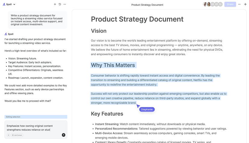
While Google Docs is incredibly versatile, sometimes you might need a little extra help to polish your document quickly. That's where Spell comes in. With its built-in AI, Spell can help you draft and edit your charts and documents more efficiently. Imagine being able to generate a polished first draft in seconds. This can save you a ton of time, especially when you're dealing with complex documents.
Say you've added a text box to explain a genetic trait but you're not quite happy with the wording. You can use Spell to refine the text until it sounds just right. This seamless integration of AI in your document editing process can turn hours of work into minutes, leaving you with more time to focus on the creative aspects of your project.
Saving and Sharing Your Pedigree Chart
Once you're happy with your pedigree chart, it's time to save and share it. In Google Docs, simply click on "File" in the top menu and choose "Download." You can select from several formats, including PDF and Microsoft Word, depending on your needs.
If you're working with a team or sharing with family members, consider using Google Docs' sharing features. Click on "Share" in the top-right corner, enter the email addresses of your recipients, and choose their level of access (view, comment, or edit). This makes collaboration easy and ensures everyone has the latest version of the document.
And remember, because Spell works in real time, you can even collaborate with others directly in the platform. This is perfect for teams who need to work together on complex documents or for families who are building a shared genealogy project.


Final Touches: Reviewing and Refining
Before you consider your pedigree chart complete, take a moment to review and refine your work. Look for any inconsistencies or errors, and adjust the layout if needed. A fresh set of eyes can be incredibly helpful here, so don't hesitate to ask a friend or colleague to take a look.
With Spell, you can also use AI to review and suggest improvements to your document, ensuring it meets the highest standards. This can be particularly useful for catching those last-minute typos or awkward phrasings that are easy to overlook when you've been staring at the same document for hours.
Printing and Displaying Your Chart
If you're planning to print your pedigree chart, there are a few things to consider. First, check your printer settings to ensure the chart will print correctly. You might need to adjust the page orientation or margins for the best results.
For a more professional look, consider printing your chart on high-quality paper or even having it printed at a professional printing service. This is especially worthwhile if you're planning to display the chart at a family reunion or incorporate it into a larger project.
Printing might seem like a small detail, but it can make a significant difference in how your chart is perceived. Take the time to ensure it looks its best, and you'll be proud to show it off to others.
Final Thoughts
Crafting a pedigree chart in Google Docs is not just about documenting family history. It's about creating something meaningful and personal. I hope this guide helps you bring your family stories to life. And if you're ever in need of a quicker, more efficient way to draft and edit documents, don't forget about Spell. It's like having a digital assistant that turns hours of work into minutes, leaving you more time to explore the stories behind the names. Happy charting


