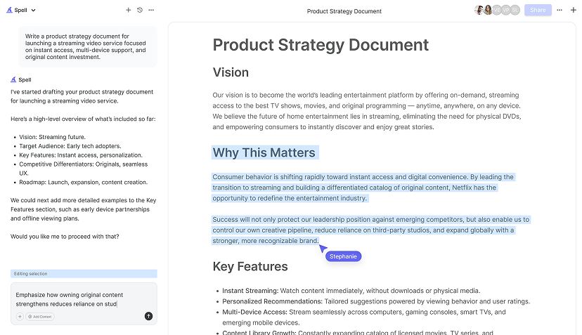
Sometimes, Google Docs can feel a bit like a blank canvas that's lacking color. While it's a super handy tool for collaboration and writing, its plain look might not always inspire creativity or readability. If you're itching to spice up your documents, you're in luck. Let's explore some easy and effective ways to make your Google Docs not just informative, but visually appealing too. From adding stylish fonts to incorporating images and charts, there are loads of tricks up our sleeves to transform your document into a visual treat.
Play with Fonts and Text Styles
First things first, let's talk fonts. The default font in Google Docs is Arial, which is perfectly fine. Sometimes you want your document to stand out a bit more. Fortunately, Google Docs offers a variety of fonts to choose from, and switching things up can instantly add more personality to your text.
- Explore Font Options: Click on the font dropdown in the toolbar to see a list of available fonts. If you want even more choices, click on "More fonts" at the top of the list. Here you can browse and add new fonts to your document.
- Font Combinations: Using more than one font in a document can add visual interest. For example, try pairing a serif font like Times New Roman for body text with a sans-serif font like Lato for headings. Just make sure not to go overboard. A couple of different fonts are usually enough.
- Text Styles: Use styles like bold, italic, and underline to emphasize key points. You can also change text color or highlight text to draw attention to important information. The key is to use these styles sparingly to maintain a clean look.
While you're playing with fonts, keep in mind that readability is still important. Choose fonts that are easy on the eyes and ensure there's enough contrast between text color and background. If you're unsure, a good rule of thumb is to stick with classic, professional-looking fonts for most of the document and reserve decorative fonts for headings or special sections.
Incorporate Images and Graphics
Images can be a game-changer when it comes to making your Google Doc more engaging. They can break up large blocks of text, illustrate points more clearly, and simply make the document more attractive.
- Adding Images: To add an image, click on "Insert" in the toolbar, then select "Image." You can choose to upload an image from your computer, search the web, or even use your Google Drive.
- Positioning and Sizing: Once you've added an image, you can resize it by clicking on it and dragging the blue squares at the corners. To move it around, click and drag the image, or use the "Wrap text" option for seamless integration with your text.
- Use Graphics and Icons: Graphics like icons and infographics can also make your document more engaging. Tools like Canva or Google Drawings can be helpful for creating simple graphics that complement your content.
Remember, while images can enhance your document, too many can clutter it. Aim for a balance where images complement the text rather than overwhelm it.
Add a Splash of Color
Colors can do wonders for a document's appeal. Whether it's a bold heading or a subtle background, color can guide the reader's eye and make your document stand out.
- Text Color: Changing the color of headings or important points can make them pop. Use the text color tool in the toolbar to select a new color.
- Background Color: For sections that need emphasis, consider changing the background color. Highlight the section, click on the "Highlight color" tool, and pick a color that complements your font.
- Tables and Borders: If you're using tables, adding color to the headers or borders can make them more visually appealing and easier to read.
It's easy to get carried away with colors, so try sticking to a color scheme that suits the document's purpose. A cohesive color palette can make your document look more professional.

Utilize Tables for Structured Information
Tables are not just for data. They can also help organize information in a neat and structured way. Whether you're listing pros and cons or creating a mini calendar, tables can add clarity to your document.
- Creating Tables: Click on "Insert" in the toolbar, then choose "Table." Select the number of rows and columns you need. You can always add or remove rows and columns later.
- Customizing Tables: Once your table is in place, you can customize it by adjusting cell padding, changing border colors, and merging cells for a cleaner look.
- Visual Appeal: Adding background colors to certain cells or using bold fonts for headers can make your tables more visually appealing and easier to read.
Tables are a fantastic way to present information in a clear and concise manner. They help break up text-heavy sections and make data more digestible for the reader.
Craft a Stylish Header and Footer
Headers and footers might seem like small details. They can add a polished look to your document. They're also practical ways to include important information like page numbers or document titles.
- Adding a Header or Footer: Click on "Insert," then select "Header" or "Footer." Once added, you can type directly into the header or footer area.
- Including Page Numbers: To add page numbers, go to "Insert" and select "Page numbers." You can choose from different styles depending on your document's needs.
- Customizing the Style: Use different fonts, sizes, and colors in the header and footer to make them stand out or match the rest of your document's aesthetic.
Headers and footers can serve as the finishing touches to a well-designed document. They provide continuity and context, especially in longer documents.
Implement Consistent Formatting
Consistency is key to a cohesive and visually appealing document. This means using the same font styles, colors, and spacing throughout your document.
- Using Styles: Google Docs has preset styles for headings and text. Use these to maintain consistency. You can customize these styles to fit your preferences.
- Spacing and Alignment: Ensure that your text is aligned properly and that there's consistent spacing between paragraphs and sections. This helps with readability and gives your document a clean look.
- Bullet Points and Lists: Use bullet points and numbered lists to organize information. Make sure the style of these lists is consistent throughout the document.
A consistent format not only looks professional but also helps readers navigate your document more easily. It's these small details that can make a big difference in the overall appeal.

Use Spell for Effortless Document Creation
In the fast-paced world where time is of the essence, having tools that simplify the document creation process is invaluable. That's where Spell comes into play. Spell is like having a personal assistant that helps you create, edit, and enhance documents with ease. Imagine drafting a polished document in seconds. Plus, editing becomes a breeze with natural language prompts.
Spell not only accelerates the drafting process but also ensures that your document maintains high quality from start to finish. With AI handling the heavy lifting, you can focus on the creative aspects, ensuring your document is not just informative but also visually stunning.
The best part? You collaborate in real-time, just like Google Docs, but with AI baked right in. No more switching between tools or dealing with formatting headaches. It's all seamless and efficient.
Integrate Links and Hyperlinks
Adding hyperlinks to your Google Doc can provide additional resources and make your document more interactive. Whether it's linking to a related article, a video, or a website, hyperlinks can enhance the reader's experience.
- Inserting a Link: Highlight the text you want to turn into a link, right-click, and choose "Link." Paste the URL into the box that appears and click "Apply."
- Linking Within the Document: If your document is long, you can create a table of contents with links to different sections. This can improve navigation and make it easier for readers to find what they're looking for.
- Using Anchor Text: Choose descriptive anchor text for your links. Instead of "click here," use text that indicates what the link is about, like "read more about formatting tips."
Hyperlinks are a small but powerful way to add depth to your document. They provide additional context and resources without cluttering your main content.


Leverage Spell for Seamless Collaboration
Collaboration is at the heart of Google Docs. Spell takes it to the next level. With real-time collaboration features, you and your team can work together on documents, seeing updates live and making edits simultaneously.
What sets Spell apart is its AI-first approach. You're not just editing text, you're enhancing it with AI. This means your documents can be more polished and professional with less effort. Imagine having an AI assistant that helps refine your writing, ensuring it's clear, concise, and compelling.
Plus, with Spell, you don't have to worry about formatting issues that often arise from copy-pasting between different tools. Everything happens in one place, making the process smooth and hassle-free.
Incorporate Charts and Diagrams
Sometimes, words alone aren't enough to convey complex information. That's where charts and diagrams come in. They can help illustrate data, show relationships, and make your document more engaging.
- Inserting Charts: Go to "Insert," then "Chart," and choose from different types like bar, line, or pie charts. Google Docs allows you to create a chart directly or import one from Google Sheets.
- Using Diagrams: For more complex visuals, you can use Google Drawings or third-party tools like Lucidchart to create diagrams and then insert them into your document.
- Formatting Visuals: Ensure your charts and diagrams are easy to read by using clear labels, legends, and colors that differentiate elements.
Visual aids like charts and diagrams not only make your document more visually appealing but can also make data and ideas easier to understand at a glance.
Concluding with Spell's Efficiency
Making your Google Docs visually appealing doesn't have to be a chore. Whether you're tweaking fonts, adding images, or using tables, small changes can make a big difference. And with Spell, creating polished, professional documents becomes even easier. Spell helps you draft and edit efficiently, allowing you to focus on content and creativity. It's like having an AI-powered assistant making sure your documents shine.


