Creating a flyer in Microsoft Word might seem like a task for graphic designers, but Word actually makes it quite accessible for everyone. Whether you're planning an event, promoting a business, or just need to spread some information quickly, a well-designed flyer can do wonders. Let's walk through how you can create an eye-catching flyer using Microsoft Word, step by step.
The Basics of Flyer Design
Before diving into the technical steps, it's essential to have a clear idea of what makes a flyer effective. A great flyer grabs attention, delivers a message, and prompts action. So, how do you achieve this? It's all about the balance between text, images, and white space.
When it comes to text, less is often more. Think about the core message you want to communicate and focus on that. A catchy headline, a few key points, and a call to action can do the trick. Use images to complement and emphasize your message. High-quality, relevant images can make a huge difference. And remember, white space, or the empty space around your text and images, is your friend. It helps guide the reader's eye and makes your flyer easier to read.
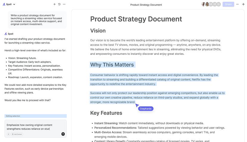
Interestingly enough, even though Word is primarily a text editor, it offers a surprising amount of flexibility for visual design. You can experiment with different fonts, colors, and layouts until you find something that resonates. And if you're ever in a pinch, you could even use Spell to help draft the text for your flyer in seconds, leaving more time to focus on design.
Choosing the Right Template
Microsoft Word comes with a variety of templates that can serve as a starting point for your flyer. These templates are designed to help you get started quickly without needing to worry about layout design.
To find the perfect template, start by opening Word and clicking on "File," then "New." In the search bar, type "flyer" and hit enter. You'll see a selection of templates that vary based on theme, layout, and color scheme. Choose one that fits your needs. Remember, you're not locked into the template. Think of it as a framework you can customize.
One thing to keep in mind: while templates are a great starting point, they shouldn't limit your creativity. Feel free to adjust colors, fonts, and images to better suit your needs. And if you're worried about writing compelling content, Spell can assist in creating engaging and professional-looking copy.
Customizing Your Flyer with Text
Once you've selected a template, it's time to start personalizing it. Begin with the text. As mentioned earlier, your flyer should communicate a clear message. Start with a strong headline that captures the essence of your flyer. This could be an event name, a catchy slogan, or a compelling offer.
Next, focus on the body text. This is where you provide more details about your event or offer. Use short sentences and bullet points to make the information easy to digest. Remember to include a call to action. This could be an invitation to attend an event, a special offer, or contact details.
- Headline: Keep it bold and easy to read.
- Body text: Clear and concise information.
- Call to action: What do you want the reader to do next?
Word's built-in tools allow you to adjust font size, style, and color. Don't hesitate to experiment with these options to make your text stand out. And if you're struggling with writing, using Spell can provide a well-written starting point, ensuring that your text is both engaging and professional.

Adding Images and Graphics
Images can significantly enhance the visual appeal of your flyer. They can highlight essential information and make your flyer more engaging. Word allows you to add images easily from your computer or online sources.
To add an image, click on "Insert" in the menu bar, then choose "Pictures." From there, you can select "This Device" to upload an image from your computer or "Online Pictures" to search for images on the internet. Once added, you can resize and move the image as needed.
When selecting images, ensure they are high quality and relevant to your message. Avoid cluttering your flyer with too many visuals which can make it overwhelming. Instead, choose a few impactful images that support your text. For example, if you're promoting a food event, an appetizing picture of a dish can instantly attract attention.
Additionally, Word provides options for adding shapes, icons, and borders, which can be used to enhance the layout further. These tools allow you to create a more structured and visually appealing flyer. And remember, if you're pressed for time, you can use Spell to quickly generate content so that you can focus more on the design aspects.
Using Colors Effectively
Color is a powerful element in design. It can evoke emotions, create mood, and draw attention. When designing your flyer, think about the color scheme and how it will affect the viewer's perception.
Word allows you to change the color of fonts, shapes, and backgrounds. To change the color of text, highlight it, then click on the "Font Color" button in the toolbar. For shapes and backgrounds, select the object and use the "Shape Fill" or "Shape Outline" options.
Consider the psychology of colors when making your choices. For instance, red can create a sense of urgency, blue can convey trust, and green is often associated with growth and freshness. Try to stick to a simple color scheme, using two or three main colors to avoid overwhelming the viewer.
Also, ensure there's enough contrast between your text and background colors to maintain readability. If you're unsure about color combinations, Word offers pre-set themes that can guide you in creating a harmonious design.
Arranging Elements for Balance
A well-balanced flyer ensures that no single element overshadows the rest. The arrangement of text, images, and white space should create a cohesive look that guides the reader's eye through the information smoothly.
Start by arranging the most crucial elements, such as the headline and main image. These should be the focal points of your flyer. Once these are in place, arrange your body text and additional visuals around them.
Consider using alignment tools in Word. These tools help you align text and images evenly across the page, which can contribute to a cleaner, more professional look. You'll find these options under the "Format" menu when you select an object.
Another tip is to use columns and grids. Dividing your flyer into sections can make it easier to organize information and create a more structured layout. This is particularly useful if you have a lot of content to include.

Incorporating Contact Information
Including contact information is crucial, especially if your flyer is promoting an event or business. Ensure this information is easy to find and read. Common contact details include phone numbers, email addresses, social media handles, and website URLs.
Place your contact information near the bottom of the flyer, where it's easily accessible but doesn't distract from the main message. Make sure the font size is large enough to be readable but not so large that it overpowers other elements.
If you're using social media or have a website, consider adding icons that link to these platforms. These icons can be found in Word's online image library under Insert > Icons.
Reviewing and Refining Your Design
Once you've laid out your flyer, take a step back and review your design. Look for any spelling or grammatical errors, check the alignment of elements, and ensure that the text is readable and the images are clear.
Consider asking for feedback from friends or colleagues. A fresh set of eyes can catch things you might have missed and offer new perspectives on your design.
After gathering feedback, make any necessary adjustments. This might involve tweaking the layout, changing some colors, or altering the text. Remember, the goal is to create a flyer that communicates your message effectively and looks professional.


Saving and Printing Your Flyer
After perfecting your flyer, it's time to save and print it. Click "File," then "Save As" to choose your preferred file format. For printing, it's often best to save in PDF format to ensure the layout and fonts remain consistent across different devices.
When printing, consider the type of paper you'll use. Heavier, glossy paper can give your flyer a more professional look. If you're printing in bulk, you might want to use a local print shop or an online service.
And if you ever need to update your flyer or create another one in a hurry, remember that Spell is there to help you quickly generate new content, so you can focus on design and distribution.
Final Thoughts
Creating a flyer in Microsoft Word is not only possible but can be quite enjoyable. By following the steps outlined above, you can design a professional-looking flyer that effectively communicates your message. And if you're ever short on time or need some writing assistance, Spell can help you craft high-quality content in minutes, giving you more time to perfect your design.


