Creating a bubble chart in Google Docs might sound like a daunting task, but it's actually quite straightforward once you get the hang of it. Whether you're visualizing data for a school project or preparing a presentation for work, a bubble chart can add a splash of insight and clarity. Let's break down the steps to create one, using Google's tools efficiently and effectively. You'll not only learn how to make one, but also how to customize it to suit your needs.
Why Use a Bubble Chart?
Bubble charts are a fantastic way to represent three dimensions of data in a two-dimensional graph. Unlike traditional line or bar charts, a bubble chart uses circles (or "bubbles") to convey information. The position of each bubble on the X and Y axes indicates two data points, while the size of the bubble conveys a third dimension. This makes bubble charts especially useful for showcasing relationships between data sets.
But why would you choose a bubble chart over other types of visual data representations? Here are a few reasons:
- Multidimensional Analysis: If you have three variables that need to be represented simultaneously, bubble charts do this in a clear and visually engaging way.
- Identifying Trends and Patterns: The bubbles can quickly reveal trends and outliers in your data, making them perfect for analysis and decision-making.
- Visual Appeal: Let's face it, bubble charts look cool. They capture attention and can make your reports or presentations stand out.
That said, they're not ideal for every kind of data. For instance, if your data is too scattered or if the relationship between the data points isn't significant, a bubble chart might not be the best choice. It's all about picking the right tool for the job.
Getting Started with Google Sheets
To create a bubble chart in Google Docs, we'll actually start in Google Sheets. Google Docs doesn't natively support chart creation, but you can easily insert charts from Sheets into your Docs. Here's how to get started:
- Open Google Sheets and create a new spreadsheet.
- Enter your data in a structured format. You'll need at least three columns: one for the X-axis values, one for the Y-axis values, and one for the bubble sizes.
- Label your columns clearly to avoid confusion later on. For instance, you might label them "Year," "Sales," and "Profit Margin," if you're analyzing business data.
If you're new to Google Sheets, don't fret, it's quite intuitive. And if you're familiar with Excel, you'll find the interface and functionality quite similar. Once your data is neatly organized, you're ready to move on to the fun part. Creating the chart.
Creating the Bubble Chart
Now that your data is ready, it's time to transform those numbers into a bubble chart. Follow these steps to create your chart in Google Sheets:
- Select the data range you want to include in your chart. Highlight all the cells that contain your X and Y values, as well as the bubble sizes.
- Click on "Insert" in the menu bar, then select "Chart."
- In the Chart Editor that appears on the right, you'll see a dropdown menu for "Chart type." Click it and scroll down until you find "Bubble chart."
- Google Sheets will automatically generate a bubble chart using your selected data. If it looks a bit off, don't worry. You can customize it to your liking.
At this point, you should see a basic bubble chart on your screen. It might not look perfect yet, but that's okay. Google Sheets gives you plenty of options to tailor the chart to your specific needs. Let's dive into those customization options next.
Customizing Your Bubble Chart
Customization is where your chart goes from functional to fabulous. Google Sheets provides a range of options to tweak and fine-tune your bubble chart. Here's how you can make it uniquely yours:
Adjusting Data Ranges
If you find that your chart isn't displaying all the data you want, or if it's showing too much, you can adjust the data range:
- In the Chart Editor, go to the "Data" tab.
- Click on the box showing your data range and adjust it as needed.
- Ensure that all the data you want is selected, and any unnecessary data is excluded.

Styling Your Chart
To enhance the visual appeal of your chart, head to the "Customize" tab in the Chart Editor. Here, you can:
- Change Colors: Pick a color palette that aligns with your theme or brand. This can be particularly useful in presentations and reports.
- Modify Bubble Sizes: Adjust how the bubble size correlates with your data values. This can help emphasize certain data points over others.
- Add Labels: You can label each bubble with its data value, making the chart easier to interpret at a glance.
- Edit Chart Title: Make sure your chart has a descriptive title that tells viewers what they're looking at.
Remember, the goal is to make your chart both informative and easy on the eyes. Don't go overboard with colors or labels, as this can make the chart look cluttered and confusing.
Inserting the Chart into Google Docs
Once your chart is polished and ready, the next step is to insert it into Google Docs. Here's how you do it:
- In Google Sheets, click on the chart to select it.
- Click on the three vertical dots in the upper-right corner of the chart, then select "Copy chart."
- Navigate to your Google Docs document and click where you want to place the chart.
- Right-click and select "Paste," or use the keyboard shortcut
Ctrl + V(orCmd + Von a Mac). - A dialog will pop up asking if you want to link the chart to the spreadsheet. Choose whether to link it or not, then click "Paste."
Linking the chart means any updates you make in Sheets will automatically reflect in your Docs document. This is especially handy for documents that require frequent data updates.
Using Spell for an Easier Workflow
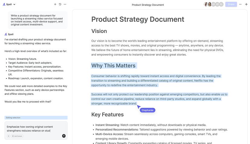
Now, if you're like me and prefer to streamline tasks, Spell can be a game-changer. Spell is an AI document editor that speeds up the process of creating and editing documents. Think Google Docs but with AI capabilities built right in. With Spell, you can generate drafts quickly and make edits in a snap using natural language. It's perfect for those who juggle multiple tasks and need to get things done efficiently.
Imagine you need to update your document with new data frequently. Instead of jumping back and forth between Sheets and Docs, Spell can help you manage these tasks directly, making your workflow smoother and saving you time.
Troubleshooting Common Issues
Even with the best tools, you might run into a hiccup or two. Here are some common issues and how to handle them:
Chart Not Showing Correct Data
If your chart isn't displaying the right data:
- Double-check your data range in the Chart Editor. Make sure all necessary data is included.
- Ensure that there are no empty cells within your data range, as this can throw off the chart.

Bubbles Are Too Small or Too Large
If the bubbles aren't the right size:
- Adjust the "Bubble size" setting under the "Customize" tab in the Chart Editor.
- Consider scaling your data appropriately so the differences in bubble size are more pronounced.
Chart Not Updating in Google Docs
If you've linked your chart and it's not updating:
- Try refreshing your Google Docs page. Sometimes a simple refresh is all it takes to sync the updates.
- If that doesn't work, verify that the chart is indeed linked by right-clicking the chart and checking the "Link options."
With these tips in hand, you should be able to troubleshoot most issues that come your way. Remember, practice makes perfect, and the more you work with bubble charts, the more intuitive it will become.
Exploring Advanced Features
Once you're comfortable with the basics, you might want to explore some advanced features to make your bubble charts even more dynamic. Google Sheets offers several possibilities:
Using Conditional Formatting
Conditional formatting isn't just for cells, it can also be applied to charts to highlight data points that meet certain criteria:
- Use different colors for bubbles based on value ranges. This can help emphasize high or low values at a glance.
- Set up conditional rules in your dataset to automatically apply these formats to your chart.


Combining Charts
Sometimes, a single chart type isn't enough. You can layer multiple chart types for more complex data analysis:
- Create a combo chart that includes a bubble chart and a line chart, for example, to show trends over time alongside individual data points.
- Google Sheets allows you to add multiple data series, so get creative and see what makes your data pop.
Exploring Third-Party Tools
If Google Sheets' built-in features aren't cutting it, there are third-party tools and add-ons that can enhance your charting capabilities. However, exercise caution with third-party tools to ensure they're reputable and secure.
For those seeking seamless integration and more advanced features, Spell offers unique capabilities that can save time and effort, especially when working with complex documents.
Collaborating with Your Team
One of the beauties of using Google's suite of tools is the ease of collaboration. Bubble charts, like any other part of your Google Docs or Sheets, can be easily shared with colleagues or team members:
- Use the "Share" button in Google Sheets to invite others to view or edit your chart.
- Collaborate in real-time to make changes, add data, or refine your chart presentation.
Real-time collaboration is a lifesaver when working on team projects. Everyone sees the updates immediately, minimizing the back-and-forth of emails and allowing for more dynamic teamwork.
Spell takes this collaboration a step further by seamlessly integrating AI into the document editing process. You can draft, edit, and polish documents collaboratively without ever leaving the Spell platform.
With these insights, you're all set to create, customize, and share your bubble charts effectively. Whether you're a student, a data analyst, or just someone who loves visual data representation, bubble charts offer a unique way to tell your story.
Final Thoughts
Creating a bubble chart in Google Docs, via Google Sheets, is a straightforward process that can greatly enhance your presentations and reports. With the tips shared, you can make your data come alive. Plus, with tools like Spell, you can streamline your document creation process, making it faster and more efficient. Happy charting


