Creating a pamphlet in Google Docs can seem a bit like trying to fold an elaborate origami crane when all you have is a single sheet of paper. But with a few tips and tricks, you can craft a professional-looking pamphlet that effectively communicates your message. We'll walk through the steps of setting up a pamphlet in Google Docs. Exploring everything from layout to design and sharing some handy tips along the way.
Choosing the Right Layout
When it comes to creating a pamphlet, the layout is where the magic begins. Google Docs doesn't offer a dedicated "pamphlet" template, but don't worry. With a bit of creativity, you can create a layout that's perfect for your needs. The first step is to decide on the orientation. Most pamphlets are designed in landscape mode, allowing for a tri-fold or bi-fold setup.
To set this up, go to the menu bar, click on "File," then "Page setup." Here, you'll find the option to switch from "Portrait" to "Landscape". Once you've done that, you can adjust the margins to suit your design. Typically, pamphlets will have smaller margins to maximize space. Try setting the margins to 0.5 inches as a starting point.
Now, let's talk columns. Most pamphlets use two or three columns to divide the content neatly. To add columns, highlight the text area, click on "Format," then "Columns," and choose your desired number. You can also adjust the spacing between the columns if needed. This setting gives you a clear structure to work with, making it easier to organize your content.
Designing the Cover Page
Your pamphlet's cover page is like the front door to your content. It's the first thing people see, so it should be inviting and informative. Start by thinking about what message or image you want to convey. Is it a bold title, an eye-catching image, or perhaps both?
To add an image, navigate to "Insert," then "Image," and you can either upload an image from your computer or choose one from the web. Google Docs allows you to resize and move images easily, so play around with the placement until it looks just right.
For the title, use a bold font to make it stand out. Google Docs offers a range of fonts, but choosing one that matches the tone of your pamphlet is key. If it's a professional pamphlet, something like Arial or Times New Roman works well. For a more casual feel, you might opt for something like Comic Sans or Pacifico. Remember, the font size should be large enough to grab attention but not so large that it overpowers the entire page.

Organizing Your Content
With the cover page designed, it's time to focus on the inside of your pamphlet. Start by outlining the main points you want to cover. Think of each section as a mini-article, complete with its own heading and content.
To make each section stand out, use headings. Highlight your text, click on "Format," then "Paragraph styles," and choose from the heading options. Headings not only break up the text but also guide the reader through your pamphlet.
Bullet points are another great tool for organizing information. They make content easier to skim, which is essential for pamphlets. To add bullet points, click on the bullet point icon in the toolbar. If you have several related points, consider using sub-bullets for clarity.
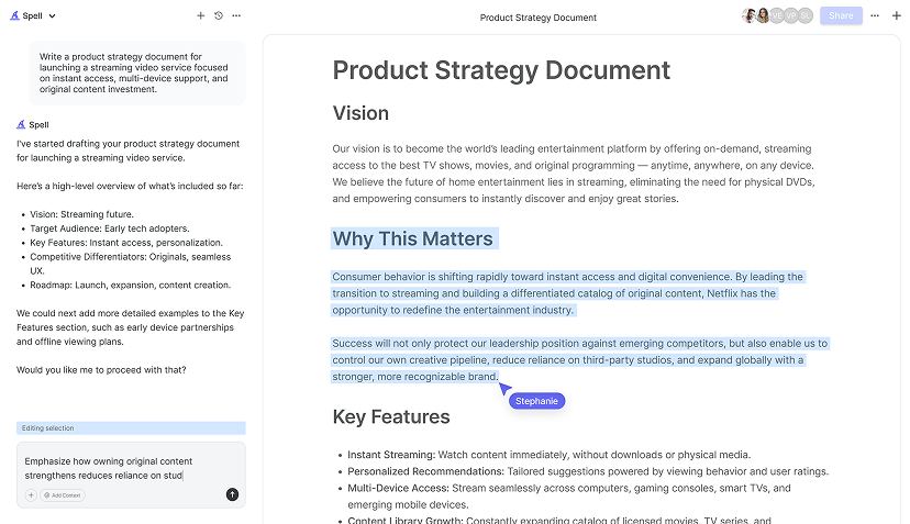
And here's a little insider tip. When writing your content, keep your sentences short and punchy. People tend to skim pamphlets, so clarity is crucial. If you're looking for help with writing or editing, Spell can assist you in crafting high-quality content quickly.
Adding Visual Elements
Visuals are a powerful way to enhance your pamphlet. They break up text, draw attention, and help convey your message more effectively. In Google Docs, you have a variety of options for adding visuals.
Images are a great choice. Whether it's a photo, an illustration, or an infographic, a picture can speak a thousand words. To insert an image, go to "Insert," then "Image," and select your source. You can adjust the size and position of the image by clicking on it and dragging the corners.
Another option is to use shapes and lines. You can find these under "Insert" and then "Drawing." Here, you can create custom shapes, lines, and even text boxes. These can be used to create borders, highlight sections, or add visual interest to your layout.
Charts and graphs can also be effective if your pamphlet includes data. To add a chart, click on "Insert," then "Chart," and choose the type of chart you need. Google Docs lets you customize the chart's design and data, making it a flexible option for presenting information visually.
Remember, while visuals are important, they should complement your content, not overshadow it. Keep the design balanced to maintain a professional and clean look.
Working with Colors
Colors can dramatically affect the look and feel of your pamphlet. Choosing the right color scheme is crucial for setting the tone and making your pamphlet visually appealing. But where do you start with color selection?
First, consider the purpose and audience of your pamphlet. For a corporate pamphlet, neutral colors like blues and grays might be appropriate. For something more playful, you could use brighter colors like reds or yellows. Consistency is key, so stick to two or three colors to maintain a cohesive look.
To change text color, highlight the text and click on the "Text color" icon in the toolbar. For background colors, like for headers or sections, click on "Format," then "Paragraph styles," and "Borders and shading." Here, you can choose a background color that complements your text.
If you're not sure which colors work well together, online tools like color palette generators can be a lifesaver. They suggest color combinations based on color theory, helping you create a harmonious design.
Colors can also be used to emphasize important points. For instance, using a different color for headings or key phrases can draw the reader's eye to crucial information. Just be cautious not to overdo it. Too many colors can make your pamphlet look chaotic.

Ensuring Readability
Readability is a crucial aspect of any pamphlet. After all, if your audience can't read the content easily, your message will be lost. Here are some tips to ensure your pamphlet is easy on the eyes.
Start with the font. Choose a font that's simple and easy to read. Fonts like Arial, Verdana, or Georgia are popular choices for printed materials. Avoid overly decorative fonts, as they can be difficult to read, especially in smaller sizes.
Next, consider the font size. For body text, 10-12 point size is usually sufficient. Headings should be noticeably larger to create a clear hierarchy, but not so large that they dominate the page.
Line spacing also plays a role in readability. In Google Docs, you can adjust line spacing by clicking on "Format," then "Line spacing." A 1.15 or 1.5 line spacing can make your text more readable by preventing it from looking too cramped.
Finally, pay attention to contrast. Dark text on a light background is easiest to read. If you're using colored backgrounds, ensure there's enough contrast between the text and background color to maintain readability.
Proofreading and Editing
No matter how stunning your design is, errors in your text can undermine your pamphlet's professionalism. Proofreading is essential to ensure your content is clear, correct, and concise.
Start by reading through your pamphlet slowly, checking for typos, grammatical errors, and awkward phrasing. It's often helpful to read your text aloud. This can highlight issues you might not notice when reading silently.
If possible, ask someone else to review your pamphlet. A fresh pair of eyes can catch mistakes you might have overlooked. They can also provide feedback on the overall flow and clarity of your content.
For an even more efficient editing process, consider using a tool like Spell. With built-in AI, Spell can help you draft, refine, and polish your writing right within the document editor, saving you time and effort.


Printing and Sharing Your Pamphlet
Once you're satisfied with your design and content, it's time to print and share your pamphlet. Google Docs makes this process straightforward.
For printing, click on "File," then "Print." Here, you can choose your printer settings. If you're printing a tri-fold or bi-fold pamphlet, you might need to print on both sides of the paper, so select "Two-sided" if your printer supports it.
If you're sharing your pamphlet digitally, Google Docs offers an easy way to convert your document to a PDF. Simply go to "File," then "Download," and select "PDF Document." This format ensures that your design remains intact when viewed on different devices.
Google Docs also allows you to share your document directly with others. Click on "Share" in the top right corner, enter the email addresses of the people you want to share with, and set their permissions. This is particularly useful if you're collaborating with a team or need feedback before finalizing your pamphlet.
By using a tool like Spell, you can simplify the process even further. Spell allows for real-time collaboration, so you and your team can work on the document simultaneously, making adjustments and edits as needed.
Final Thoughts
Creating a pamphlet in Google Docs is all about combining creativity with practical design principles. By choosing the right layout, designing engaging content, and ensuring readability, you can craft a pamphlet that effectively communicates your message. And with Spell, you can streamline the writing and editing process, saving time and enhancing collaboration. Happy pamphlet-making


