Google Docs is a great tool for creating documents, whether you're drafting a quick note or crafting a detailed report. But sometimes, the default settings don't quite match your vision. One of the subtle tweaks you might find yourself needing is adjusting the spacing between letters, also known as kerning. If you're looking to give your document a unique touch or simply improve readability, changing letter spacing can make a big difference. Let's explore how you can adjust this in Google Docs and throw in a few tips to make the most of your document styling.
Why Adjust Letter Spacing?
Before we get into the how-tos, let's chat about the "why." Adjusting letter spacing might seem like a minor detail, but it can have a significant impact on your document's readability and visual appeal. Here are a few reasons why you might want to tweak those spaces:
- Enhance readability: Some fonts look cramped, especially in smaller sizes. Increasing the spacing can make the text easier on the eyes.
- Visual design: If you're crafting a document with a creative flair, like a flyer or a poster, playing with letter spacing can add style and personality.
- Professional touch: In formal documents, subtle adjustments can elevate the overall appearance and make your content look polished.
- Alignment: Sometimes, you just need your text to fit perfectly into a designated space, and tweaking the letter spacing can help achieve that.
Now that we've covered why you might want to adjust the spacing, let's get into the methods available in Google Docs.
Using Google Docs' Built-In Features
At this point, you might be wondering, "Does Google Docs have a button for that?" Well, not exactly. Unlike some desktop publishing software, Google Docs doesn't offer a direct letter spacing option. However, don't worry. There are workarounds.
Adjusting Font Size
The most straightforward method is to adjust the font size. While this doesn't directly change the spacing, it can help improve readability. For instance, if your text looks too tight, increasing the font size can give letters more room to breathe.
Using Fonts with Built-In Spacing
Some fonts naturally have different spacings. When you change the font, you might notice a difference in how the text appears. Fonts like "Arial" or "Times New Roman" might look standard, but exploring others can give your document a fresh look.
Character Spacing in Third-Party Tools
If you're really keen on adjusting letter spacing, consider using third-party tools for more control. While Google Docs doesn't offer direct adjustments, you can design your text in a tool like Photoshop or Canva, then import it as an image into your document. This approach gives you total control over the text's appearance.
Using Add-ons for Letter Spacing
Google Docs supports a variety of add-ons that can expand its capabilities. While there might not be a specific add-on for letter spacing, some text styling add-ons allow for advanced text manipulation.

Finding the Right Add-On
To explore add-ons, click on "Extensions" in the menu bar, then choose "Add-ons" and "Get add-ons." Here, you can search for text styling tools that might offer more options for adjusting your text.
Integrating with Other Tools
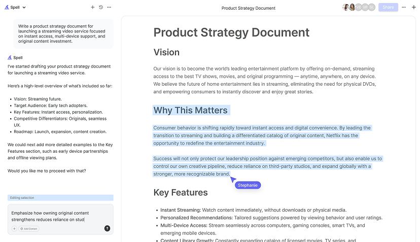
Another option is integrating Google Docs with external tools such as Spell, an AI document editor. Spell allows you to draft, edit, and refine documents with AI, offering a seamless experience for creating polished, professional documents. While it doesn't directly change letter spacing, Spell's ability to generate and format text quickly can save time and help you focus on other design elements.
Practical Tips for Better Document Design
While we're on the topic of document styling, let's share some tips that can make your documents visually appealing and effective, even if you're working within Google Docs' limitations.
Consistency is Key
Stick to a consistent font and size throughout your document. This creates a unified look and helps maintain readability. If you change fonts frequently, it can distract the reader and make the document appear disorganized.
Use Headings Wisely
Headings and subheadings can break up text and guide the reader through your document. Google Docs offers several heading styles under the "Styles" menu. These not only help with organization but also make your document more accessible.
Color and Contrast
While adjusting letter spacing, don't forget about color. A good contrast between text and background improves readability. Dark text on a light background is usually the easiest to read.
Spacing in Margins and Lines
Don't forget about line and paragraph spacing. You can adjust these by going to "Format" > "Line & paragraph spacing." This can help make your document look more professional and easier to read, especially in longer documents.

Exploring Google Docs Alternatives
If you find Google Docs too limiting for your design needs, it might be worth exploring other tools. While Google Docs is great for collaboration and basic text editing, some projects require more advanced design capabilities.
Desktop Publishing Software
Tools like Adobe InDesign or Microsoft Publisher offer advanced text manipulation, including letter spacing. These are ideal for projects that require a high level of design control.
Online Design Tools
Canva and similar tools offer a user-friendly interface for designing visually appealing documents. While these aren't traditional word processors, they provide extensive design options, including custom letter spacing.
AI-Powered Document Editors
For a blend of design and automation, consider using an AI-powered editor like Spell. Spell can help you draft and refine documents quickly, allowing you to focus on design aspects like letter spacing.
Practical Examples of Letter Spacing
To illustrate the impact of letter spacing, let's look at a couple of scenarios where adjusting this small detail can make a big difference.


Creating a Flyer
Imagine you're designing a flyer for a local event. The title needs to stand out, and increasing the letter spacing can give it a modern, clean look. Pair this with a bold font, and you've got a headline that grabs attention.
Crafting a Resume
In a resume, readability is crucial. If the text feels cramped, hiring managers might find it hard to skim through. A slight increase in letter spacing can make your resume look more professional and easier to read.
Designing a Business Card
Business cards have limited space, so every design choice counts. By adjusting letter spacing, you can ensure your contact information is clear and legible, even at small sizes.
Common Mistakes to Avoid
While adjusting letter spacing can enhance your document, there are pitfalls to watch out for. Here are some common mistakes and how to avoid them:
- Over-spacing: Too much space can make text look disjointed and hard to read. Aim for subtle adjustments rather than dramatic changes.
- Inconsistency: Applying different spacings within the same section can disrupt the flow. Keep it consistent for a polished look.
- Ignoring readability: Style is important, but never at the expense of readability. Always prioritize clear and accessible text.
- Not previewing: Always preview your document on different devices and formats to ensure it looks good everywhere.
Final Thoughts
Changing the spacing between letters in Google Docs might not be straightforward, but with a few creative solutions, you can achieve the look you're after. Whether you're using built-in features, exploring add-ons, or integrating with tools like Spell, there's plenty of room to customize your document. Spell, in particular, can speed up the process, allowing you to focus on the finer details of your design. With these tips, you're well on your way to creating documents that are both stylish and functional.


