Microsoft Word is a staple in the world of document creation. Even seasoned users can find it a bit of a treasure hunt to navigate its features. One of the most commonly asked questions is about the Design tab. Where is it, and how can it change your document from drab to fab? Let's take a closer look at this feature and how you can make the most of it to enhance your documents with style and flair.
Why the Design Tab Matters
First things first, why should you care about the Design tab? Well, it's your gateway to making documents look polished and professional without needing a graphic design degree. Whether you're working on a resume, a business report, or a school project, the Design tab provides tools that can transform plain text into something visually appealing. From themes and colors to fonts and effects, it offers a variety of options to elevate your document's appearance.
Think of the Design tab as your document's wardrobe. Just like how you wouldn't wear pajamas to a job interview, you wouldn't want your document to look plain when it could easily look professional. This tab allows you to apply styles consistently throughout your document, making sure everything looks cohesive and intentional.
Locating the Design Tab
Alright, let's get to the crux of the matter: where exactly is this elusive Design tab? If you're using a modern version of Microsoft Word, you should find it easily accessible on the ribbon at the top of your document. If your screen looks like a barren desert, devoid of the Design tab, don't worry. It's likely just a matter of adjusting your settings or version. Here's a quick guide:
- Check Your Version: The Design tab is available in Word 2013 and later. If you're using an older version, it might not be there.
- Enable the Ribbon: If the ribbon is minimized, you won't see the tabs. Click on any tab to expand it, or double-click a tab to keep the ribbon open.
- Customize the Ribbon: If the Design tab is mysteriously missing, right-click on the ribbon, select "Customize the Ribbon," and ensure the Design tab is checked.
Once you've located the tab, it's time to explore what it can do for you.
Exploring Themes
The word "theme" probably makes you think of parties or movies, but in Word, a theme is a set of design elements that give your document a consistent look. Themes include fonts, colors, and effects, all designed to work harmoniously.
To apply a theme, simply click on the Design tab and look for the Themes group. Here, you'll find a range of pre-designed themes that you can apply with just a click. This is perfect for those times when you want your document to look polished without spending hours fiddling with individual settings.
But what if none of the themes suit your fancy? You can customize an existing theme by choosing different colors, fonts, or effects. This way, you can have a document that looks uniquely yours while maintaining a professional edge.

Customizing Colors and Fonts
Now that you've got the theme sorted, let's talk about colors and fonts. These two elements can significantly impact the readability and aesthetics of your document. Under the Design tab, you'll find options to change the color scheme and font set.
When selecting colors, consider the purpose of your document. A business report might benefit from a more subdued, professional palette, while a school project could be a bit more playful. Click on "Colors" to see a list of color sets, and choose one that fits your needs. If you're picky about shades, you can even create a custom color set.
Fonts are equally important. The right font can set the tone for your document. Under "Fonts," you'll see a selection of font pairs that are designed to work well together. Again, you can create your own pair if you have specific fonts in mind.
Using Effects for Visual Appeal
Effects are like the icing on the cake. They include things like shadows, reflections, and glow that can make your document stand out. While it's easy to go overboard, tasteful use of effects can draw attention to important parts of your document.
In the Design tab, you'll find the Effects option. Here, you can choose a set of effects that complements your theme. Applying effects is simple: select the text or object you want to enhance, and click on the desired effect. Remember, less is often more when it comes to visual effects.
Headers and Footers
Headers and footers might sound like a snooze-fest, but they're actually quite important. They provide a space for essential information like page numbers, document title, or author's name. The Design tab makes it easy to add and customize these elements.
To add a header or footer, go to the Design tab and click on "Header" or "Footer." Choose from a variety of styles, or create your own. You can also insert page numbers or other document info directly from this menu.
Using headers and footers can give your document a more organized and professional look. Plus, they ensure that important information is always visible, no matter which page you're on.

Adjusting Page Background
If you're feeling adventurous, you can also change the page background from the Design tab. This feature is particularly useful for creating unique documents like newsletters or flyers.
Under the Page Background group, you'll find options to add a watermark, change the page color, or add a border. Watermarks are great for marking drafts or confidential documents, while borders can add a touch of flair to special documents.
However, for standard documents like reports or essays, it's usually best to stick with a plain white background to maintain readability.
Spell: Your AI Document Editor
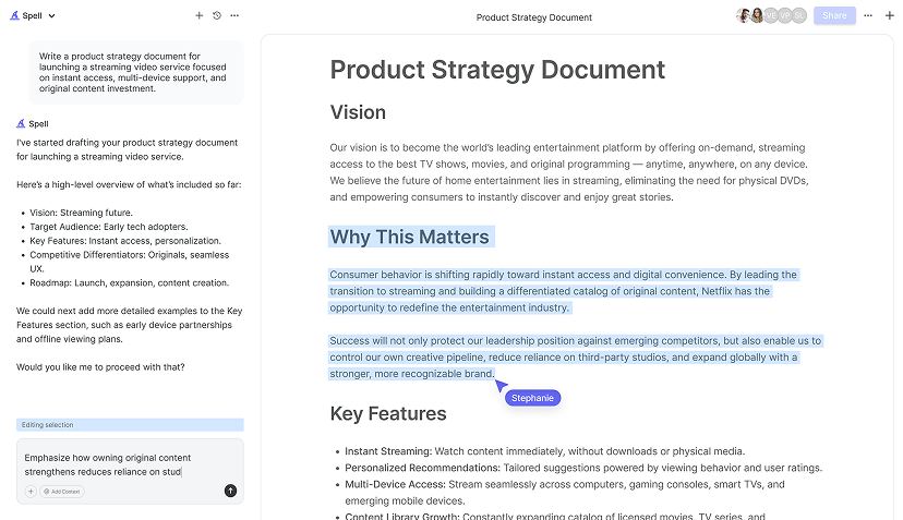
While we're on the topic of making your documents shine, have you ever wished there was a tool that could handle all the heavy lifting for you? Enter Spell, an AI document editor that's like having a personal assistant for your writing tasks. Imagine Google Docs, but with AI built right in.
With Spell, you can generate drafts in seconds, edit using natural language, and collaborate in real time. It's designed to take you from a blank page to a polished document faster than ever. You can say goodbye to the back-and-forth between chat apps and document editors. Everything happens in one place, with no formatting headaches.


Avoiding Common Pitfalls
While the Design tab is a fantastic tool, it's easy to make some common mistakes if you're not careful. Here are a few things to watch out for:
- Overdesigning: It's tempting to use every feature available, but restraint is key. Too many fonts, colors, or effects can make your document look cluttered and unprofessional.
- Ignoring Readability: Make sure your design choices don't hinder readability. Stick to high-contrast color combinations and readable font sizes.
- Inconsistency: Consistency is crucial in design. Ensure that the styles you choose are applied consistently throughout your document.
If you're looking for a faster way to ensure your documents look great, Spell can be your go-to tool. It helps you create high-quality documents in a fraction of the time, with AI doing the heavy lifting for you.
The Power of Templates
Why start from scratch when you can use a template? The Design tab gives you access to a variety of templates that are pre-designed with themes, fonts, and colors. These templates can be a huge time-saver, especially if you're working on something like a newsletter or a report.
To find templates, go to the File menu and select New. You'll see a selection of templates to choose from. Once you pick one, you can customize it to fit your needs using the Design tab. Templates can give you a head start and ensure your document has a cohesive look from the get-go.
Final Thoughts
In conclusion, the Design tab in Microsoft Word is a treasure trove of tools that can transform your documents from plain to professional. Whether you're customizing themes, colors, fonts, or effects, there's plenty to play with. And if you're looking to save time, Spell can help you create polished documents faster than ever, with AI doing the heavy lifting. Happy designing


