Staring at a trend analysis report can feel like deciphering hieroglyphics if you're not sure what you're looking for. But breaking it down into a concise trend analysis summary can make all the difference. This post will guide you through the process of writing a trend analysis summary that effectively communicates the key insights and observations in a way that's both clear and engaging.
Spotting Trends: What Are You Looking For?
Before putting pen to paper. Or fingers to keyboard, as it were. It's crucial to understand what constitutes a trend. A trend is essentially a pattern or direction in data over a period of time. This can be upward, downward, or even stagnant. But it‘s not just about the numbers; trends can reflect changes in consumer behavior, market conditions, or even internal business processes.
Let's say you're looking at sales data for a retail store. A trend might be a consistent increase in sales every holiday season or a dip during summer months. These patterns help businesses make informed decisions, like when to ramp up marketing efforts or when to introduce a new product.
Here's a quick example to illustrate:
Month      | Sales
-------------------
January    | $10,000
February   | $12,000
March      | $11,500
April      | $13,000
May        | $9,500
June       | $9,000
In this case, you might notice a slight upward trend in the first quarter and a downward trend starting May, indicating a potential seasonal effect on sales.
Collecting and Organizing Your Data
Data collection is the backbone of any trend analysis. The process begins by gathering all relevant data points. Depending on your objective, this could range from sales figures, customer feedback, website traffic, or even social media engagement metrics.
Once you have your data, organizing it in a coherent structure is the next step. Spreadsheets are your best friend here, as they allow for easy sorting, filtering, and visualization. Tools like Excel or Google Sheets make it straightforward to set up columns and rows to capture your data efficiently.
Consider using the following columns for a sales trend analysis:
Date      | Sales | Returns | Net Sales
------------------------------
01-Jan    | $500  | $50     | $450
02-Jan    | $600  | $30     | $570
03-Jan    | $550  | $20     | $530
With this format, you can easily calculate net sales and begin to visualize trends over time.
Analyzing the Data: Look Beyond the Numbers
Once your data is neatly organized, the real fun begins. Analysis. This is where you start identifying patterns, anomalies, and correlations. Charts and graphs are incredibly useful for visualizing trends. A simple line chart can reveal an upward or downward trend at a glance, making it easier to communicate your findings.
For example, plotting the sales figures from our earlier example might show a seasonal pattern that corresponds with holiday shopping trends or other external factors. This visualization helps you see beyond the raw numbers and understand the story they tell.
Here's a basic line chart representation:
Date    | Sales
-----------------
Jan     | $10,000
Feb     | $12,000
Mar     | $11,500
Apr     | $13,000
May     | $9,500
Jun     | $9,000
In this chart, you can quickly spot that sales peak in February and April, suggesting these months might have events or promotions boosting sales.

Identifying Influencing Factors
Trends don't occur in a vacuum. Identifying influencing factors is crucial to understanding why a trend is happening. Is it due to external factors like economic conditions, or internal factors like a new marketing campaign?
For instance, if there's a spike in sales every November and December, it‘s likely influenced by the holiday shopping season. On the other hand, a consistent drop in sales every summer might be due to vacation trends or competitive market moves.
Brainstorm a list of potential factors that could affect your data:
- Seasonal changes
- Promotional campaigns
- Economic shifts
- Competitor actions
- Product launches
Considering these factors helps you create a more comprehensive trend analysis summary that accounts for the various elements influencing your data.
Crafting the Summary: Telling the Story
Now comes the part where you put everything together. The trend analysis summary. This is your chance to narrate the story your data is telling, succinctly and clearly. Think of it as a movie trailer: you want to grab attention and convey the essence without giving away every detail.
Start with a brief introduction that outlines the scope and purpose of the analysis. Follow this with a summary of key findings, supported by the data you've analyzed.
Here's a sample summary for a sales trend analysis:
"In reviewing the sales data from January to June, we've observed a consistent increase in sales during the first quarter, peaking in April. This trend aligns with our promotional efforts during Valentine's Day and Easter. However, there's a noticeable decline in May and June, likely due to the start of the summer vacation season. To capitalize on this trend, we recommend increasing marketing efforts prior to summer and exploring new promotions to boost sales during these months."
This summary provides a clear, concise overview of the trends observed and offers actionable recommendations based on the data.
The Role of Data Visualization
Visuals can transform a dry analysis into an engaging story. Including charts, graphs, and infographics in your summary can help readers grasp complex information quickly. They provide a snapshot that complements your written analysis, making your findings more digestible.
Let‘s go back to our sales data example. A simple bar chart showing monthly sales visually reinforces the upward trend in the first quarter and the decline in the summer months. This visual cue can be more impactful than words alone.
Consider using the following types of visuals:
- Line Charts: Ideal for showing trends over time.
- Bar Charts: Useful for comparing different categories or time periods.
- Pie Charts: Good for illustrating proportions within a whole.
- Heat Maps: Effective for showing density or intensity of data points.
Using Spell, you can easily create and integrate these visual elements into your document, enhancing both its appeal and clarity.

Making it Relatable: Using Everyday Examples
Relatable examples can bridge the gap between complex data and everyday understanding. By comparing your analysis to familiar scenarios, you can make your insights more accessible and engaging.
Consider this analogy: If your sales data is like a roller coaster with highs and lows, think of your marketing campaigns as the engine that powers the ride. When the engine is strong, the ride is smooth, and peaks are reached. When the engine falters, the ride slows down, and dips become more frequent.
When crafting your summary, use metaphors or analogies sparingly but strategically to clarify your points. This approach not only makes your analysis more relatable but also more memorable.
Providing Actionable Insights
A trend analysis summary should not just highlight what's happening; it should also offer guidance on what to do next. Actionable insights are recommendations based on the trends identified, guiding decision-makers on the next steps.
Ask yourself: What changes can be made based on this analysis? What strategies could be implemented to capitalize on positive trends or mitigate negative ones?
For instance, if you notice that sales dip during summer, consider suggesting a summer sale or partnership with vacation-related businesses to boost engagement during those months.
Here's how you might phrase these insights:
"To address the decline in summer sales, we recommend launching a targeted summer promotion. Consider collaborating with travel agencies to offer discounts to vacationers, potentially driving foot traffic to our stores."
Your goal is to translate the data into actionable steps that can lead to tangible improvements.


Review and Revise: Fine-Tuning Your Summary
Even the most seasoned writers benefit from reviewing and revising their work. Once your draft is complete, take a step back and evaluate it with fresh eyes, or better yet, ask a colleague for feedback.
Check for clarity: Does your summary clearly communicate the trends and insights? Are your recommendations practical and well-supported by the data?
Look for consistency: Ensure that your analysis aligns with the data and that all sections of your summary flow logically from one to the next.
Revising might also involve trimming unnecessary details or rephrasing sections for clarity. Remember, the goal is to create a summary that's both informative and concise.
Saving Time with AI Tools
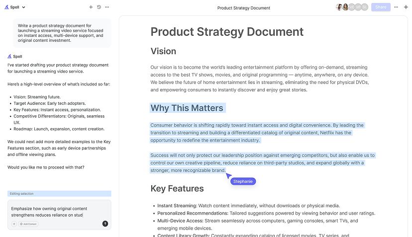
Writing a comprehensive trend analysis summary can be time-consuming, but AI tools like Spell can significantly streamline the process. With Spell, you can quickly draft and refine your summary, ensuring it's polished and professional in a fraction of the time it normally takes.
Using Spell, you can:
- Generate initial drafts quickly, saving you from staring at a blank page.
- Edit and refine your document using natural language prompts, making the revision process more intuitive.
- Collaborate with team members in real time, allowing for seamless integration of feedback and insights.
This combination of features helps you transform raw data into a compelling narrative that resonates with your audience.
Final Thoughts
Crafting a trend analysis summary doesn't have to be daunting. By following these steps, you can create a clear, insightful document that not only highlights key trends but also offers actionable insights. And with Spell, you can do it faster and more efficiently, turning time-consuming tasks into manageable ones. Happy analyzing


