Writing a data analysis might sound like a task reserved for data scientists or statisticians, but it's a skill anyone can master with a bit of guidance. Whether you're putting together a report for work or school, understanding how to present data clearly and effectively is invaluable. In this piece, we'll break down the process into manageable steps, showing you how to turn a jumble of numbers into a compelling story. Ready to get started? Let's jump in!
Setting the Stage: Define Your Objective
Before you start crunching numbers, it's essential to know why you're doing it. What is the main question you're trying to answer? Are you analyzing sales data to identify trends or perhaps looking at survey results to understand customer satisfaction? Defining your objective upfront will guide your analysis and keep you focused on what's important.
For instance, if you're tasked with understanding why a product's sales are declining, your objective might be to identify factors affecting sales. This clarity helps you determine which data to analyze and how to interpret it. Without a clear objective, it's easy to get lost in the data and lose sight of what you're trying to achieve.
Here's a simple way to frame your objective: "I want to understand [what] because [why], so I can [action]." For example, "I want to understand the decline in sales because it's affecting our revenue, so I can recommend strategies to improve performance."
Gathering Your Data: Find the Right Sources
Now that you know what you're after. It's time to gather the data you'll need. This step is crucial because the quality of your analysis depends on the quality of your data. Start by identifying the sources you can tap into. These could be internal databases, surveys, public datasets, or even data generated from social media platforms.
Ensure that your data sources are reliable and up-to-date. If you're working with a team. Collaborate to confirm that everyone is on the same page regarding the data's accuracy and relevance. It might seem tedious, but this groundwork sets the foundation for a solid analysis.
For example, if you're analyzing customer feedback. You might pull data from customer service logs, social media comments, and survey responses. Be sure to check the dates and completeness of this data to ensure it's ready for analysis.
Cleaning Data: The Unsung Hero of Analysis
Data cleaning might not be the most glamorous part of analysis. But it's a critical step. Raw data is often messy, with missing values, duplicates, or inconsistencies. Cleaning involves removing or correcting these issues to ensure your analysis is accurate and meaningful.
Start by scanning your dataset for obvious errors or outliers. For instance, if a survey response has a typo (e.g., "222" instead of "22"). You'll need to correct it. You might also need to fill in missing data or decide how to handle it. Sometimes it's appropriate to exclude incomplete entries.
# Python example for data cleaning using pandas
import pandas as pd

# Load your dataset
data = pd.read_csv('your_data.csv')

# Drop duplicates
data.drop_duplicates(inplace=True)

# Fill missing values
data.fillna(method='ffill', inplace=True)
Cleaning might be time-consuming. But it pays off in the end. A clean dataset means your analysis isn't skewed by errors, leading to more reliable conclusions.

Choosing the Right Analytical Method
With clean data in hand. It's time to decide how you'll analyze it. The method you choose depends largely on your objective and the type of data you're working with. Common methods include descriptive statistics, regression analysis, and data visualization.
Descriptive statistics help summarize your data, providing measures like mean, median, and mode. Regression analysis can identify relationships between variables, while visualization tools like charts and graphs make patterns easier to spot.
For example, if you're analyzing sales data over time. A line graph can illustrate trends and seasonal patterns, making it easier to communicate findings to others.
# Python example for plotting a line graph using matplotlib
import matplotlib.pyplot as plt

# Sample data
months = ['Jan', 'Feb', 'Mar', 'Apr']
sales = [200, 250, 300, 280]

plt.plot(months, sales)
plt.title('Monthly Sales')
plt.xlabel('Month')
plt.ylabel('Sales')
plt.show()
Choosing the right method might require some experimentation. But don't be afraid to try different approaches and see what reveals the clearest insights.
Interpreting Your Results: Tell the Story
This is where your hard work pays off. Interpreting your results involves looking at the data and asking, "What story does this tell?" It's not just about numbers. It's about the narrative they form.
Start by identifying key patterns or anomalies in your data. Do sales peak at certain times of the year? Is there a surprising correlation between two variables? These insights form the backbone of your analysis.
As you interpret, consider your audience. What do they need to know, and how can you present it in a way that's both informative and engaging? If you're presenting to a team unfamiliar with the data, avoid jargon and explain findings in simple terms.
Visualizing Data: Paint the Picture
A picture is worth a thousand words, especially in data analysis. Visualizations make complex data more accessible and are a powerful way to communicate your findings. Whether it's a simple bar chart or a complex dashboard, effective visuals can highlight trends, outliers, and patterns in your data.
When choosing visualizations, consider what best represents your data. Bar charts are great for comparing categories, line charts for trends over time, and pie charts for proportions. Tools like Excel, Tableau, and R's ggplot2 package are excellent for creating professional-quality charts.
# R example for creating a bar chart using ggplot2
library(ggplot2)

# Sample data
data <- data.frame(
  category = c('A', 'B', 'C'),
  value = c(30, 50, 20)
)

ggplot(data, aes(x=category, y=value)) +
  geom_bar(stat='identity')
Remember, simplicity is key. Overly complex visuals can confuse rather than clarify. Keep it straightforward, and always include labels and legends for clarity.

Documenting Your Findings: Creating the Report
Once you've interpreted and visualized your data. It's time to compile everything into a coherent report. This document should outline your process, findings, and recommendations. A well-structured report typically includes an introduction, methods, results, discussion, and conclusion.
Start with a clear introduction that restates your objective and provides context for your analysis. In the methods section, describe how you collected and analyzed your data. The results should summarize your findings, supported by visuals and statistical evidence.
In the discussion, interpret your results and consider their implications. Finally, conclude with recommendations based on your analysis. This might involve suggesting actions to address the issues identified or proposing further research if needed.
Here's a brief example of how to start a report:
Introduction:
This report analyzes the decline in sales for XYZ product over the past year. Our aim is to identify key factors contributing to this trend and suggest possible solutions.

Methods:
Sales data from January to December 2023 was collected from internal databases. Descriptive statistics and regression analysis were used to identify trends and correlations.
Using Spell to Streamline Your Analysis
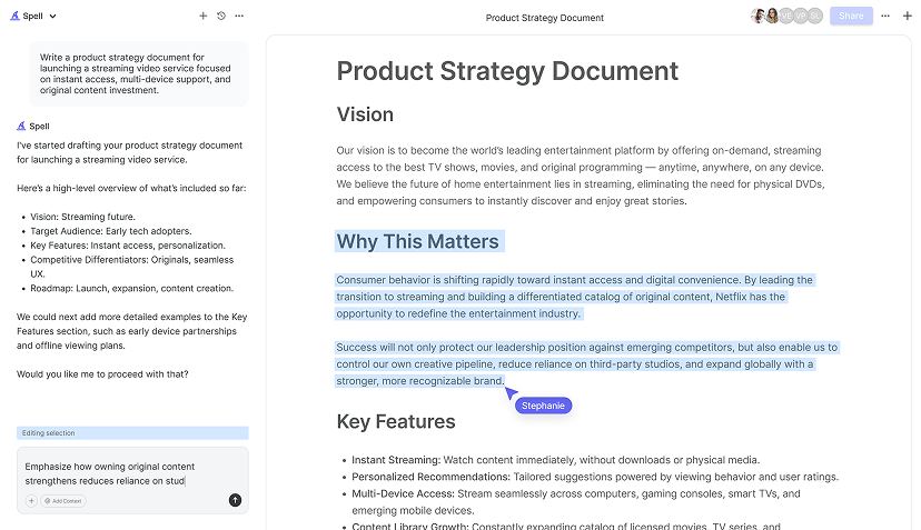
Here's where Spell can be a game-changer for your data analysis projects. Our AI-powered document editor helps you draft reports quickly and efficiently, leaving you more time to focus on the analysis itself. Spell can assist in creating first drafts, refining text, and even generating insights from your data. It's like having a smart assistant right at your fingertips, ready to turn your analysis into a polished document.
With Spell, you can collaborate with your team in real-time, share findings, and edit documents with ease. It seamlessly integrates with your workflow, ensuring that your reports are both accurate and professional. Check it out and see how it can simplify your next data analysis project.


Avoiding Common Pitfalls in Data Analysis
Even the most seasoned analysts can fall into common traps. To avoid these, be mindful of a few key areas. First, don't let bias cloud your interpretation. It's easy to see what you want to see. But always let the data guide your conclusions.
Second, ensure your data is representative. If your sample is too small or not diverse enough. Your analysis might not capture the full picture. Consider whether your data accurately reflects the population or phenomenon you're studying.
Lastly, be careful with correlation. Just because two variables move together doesn't mean one causes the other. Always look for underlying factors or conduct further analysis to confirm any causal relationships.
By being aware of these pitfalls, you can conduct more robust and trustworthy analyses.
Continuous Learning: Stay Curious
Data analysis is a dynamic field, always evolving with new tools and techniques. Staying curious and open to learning will keep your skills sharp. Whether it's picking up a new software or diving into the latest statistical method. There's always something new to explore.
Engage with communities online, attend workshops, or take courses to expand your knowledge. The more you learn, the more tools you'll have at your disposal when tackling data challenges.
Remember, the best analysts are those who blend technical skills with a curious mind. Keep exploring, asking questions, and pushing the boundaries of what's possible.
Final Thoughts
Writing a data analysis doesn't have to be intimidating. By following these steps, you can transform raw data into meaningful insights, ready to inform decisions and drive action. And with tools like Spell, you can streamline the process, saving time and effort. Spell helps you create polished, professional documents quickly, allowing you to focus on what truly matters: uncovering insights and telling compelling stories with your data. Happy analyzing


