Ever opened Google Docs and wondered how to make the first letter of a paragraph or a word stand out with that classic big, bold look? You're not alone. This technique, often seen in books and magazines, is known as a drop cap. It's a simple trick that can add a touch of elegance or flair to your documents. Today, we're going to walk through how to do just that in Google Docs.
Why Bother with Big First Letters?
Before we dive into the nuts and bolts of making that first letter pop, let's chat about why you might want to do this in the first place. Big first letters, or drop caps, have a few neat benefits:
- Visual Appeal: A drop cap can break the monotony of text-heavy documents, making them more inviting to read.
- Emphasis: It helps emphasize the beginning of a section or a new idea, guiding your readers smoothly through the content.
- Professionalism: This small design tweak can lend a polished, professional look to your documents, especially useful in newsletters, reports, or presentations.
So, whether you're drafting a report for work, creating a newsletter, or just adding some pizzazz to a personal project, understanding how to use a drop cap can be a handy tool in your document design toolkit.
Getting Started with Google Docs
Alright, let's get into it. First things first, open Google Docs and create a new document or select an existing one. Once you have your document open, here's a simple step-by-step guide to make that first letter big:
Step 1: Select Your Text
Start by clicking on the paragraph or the sentence where you want to make the first letter larger. Just place your cursor at the beginning of the paragraph to get started.
Step 2: Open the Drawing Tool
Since Google Docs doesn't have a built-in drop cap feature, we'll use the Drawing tool to manually create one:
- Go to the menu bar and click on Insert.
- Select Drawing from the dropdown, then click on + New.
This will open a new window where you can start creating your drop cap.
Creating the Drop Cap
Now that we're in the Drawing tool, let's create that eye-catching first letter.
Step 3: Add a Text Box
In the Drawing window, you'll need to create a text box:
- Click on the Text Box icon (it looks like a little square with a 'T' inside).
- Click and drag on the canvas to create your text box.
Step 4: Customize Your Letter
Now, it's time to make the magic happen:
- Type the letter you want to enlarge.
- Highlight the letter and change the font size to something larger (try starting with 48 or 72, depending on your document's font size).
- Feel free to change the font style, color, or add any effects like bold or italics to make it pop.
Finalizing Your Design
After you've got your letter looking just right, it's time to add it back to your document:

Step 5: Save and Insert
Once you're happy with your letter:
- Click Save and Close in the top right corner of the Drawing window.
The drop cap will now appear in your document. You can click and drag it to position it perfectly within your text. Adjust the text wrapping options by clicking on the image and choosing how you want text to flow around it.
Positioning and Adjustments
Positioning is key to making sure your drop cap enhances your document rather than disrupts it.
Step 6: Adjust Text Wrapping
To make sure your text aligns nicely with your new drop cap:
- Click on the drop cap to select it.
- Choose the wrapping option that best suits your layout. Most people prefer Wrap Text or Break Text for a seamless look.
With these settings, you can easily move the drop cap around and see how the text adjusts to it, allowing for better integration into your document.
Considerations for Different Fonts and Styles
Not all fonts are created equal, and some may look better as a drop cap than others.
Step 7: Experiment with Fonts
Try out different fonts to see which one complements the rest of your document:
- For a classic look, consider serif fonts like Times New Roman or Garamond.
- If you're going for a modern feel, sans-serif fonts like Arial or Helvetica can be a good choice.
- Don't shy away from decorative fonts for a bit of flair, but make sure they're still readable.
Remember, readability is key. The drop cap should enhance the text, not distract from it.
Enhancing with Colors and Effects
Adding color or effects to your drop cap can make it even more striking.
Step 8: Adding Color
To add color:
- While still in the Drawing tool, highlight your letter.
- Click on the Text Color icon and choose a color that complements your document's theme.
Step 9: Special Effects
Consider adding effects like bold or shadow to give the letter more depth:
- Experiment with bold, italic, or underline to see what looks best.
- Some drawing tools also allow for shadow or glow effects, which can add a subtle highlight to your drop cap.
Maintaining Consistency
While it's tempting to go all out with styles, maintaining consistency throughout your document is crucial.

Step 10: Create a Style Guide
If you plan on using drop caps repeatedly:
- Decide on a font, size, and color scheme at the beginning and stick to it for a cohesive look.
- Consider creating a template in Google Docs with your chosen drop cap style to save time on future documents.
Consistency not only improves the visual appeal of your documents but also enhances readability and professionalism.
Alternative Methods
If the manual method feels like too much work, there are quicker alternatives. While Google Docs doesn't have a native drop cap feature, using other tools can streamline the process.
Using Spell for Faster Results
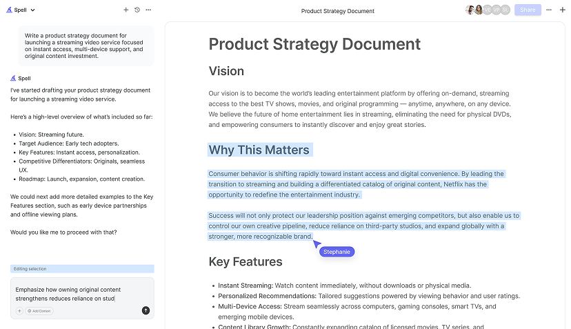
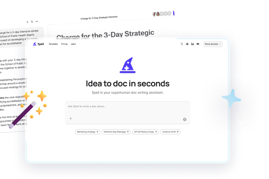
While we've been focused on Google Docs, Spell offers a nifty way to create documents with drop caps and much more, using AI to speed up the process:
- Easily generate drafts with drop caps in seconds.
- Edit and refine with natural language prompts, avoiding the hassle of manual adjustments.
Spell's AI capabilities make it a breeze to produce polished documents quickly, saving you the time and effort of doing everything manually.
Common Pitfalls and How to Avoid Them
Even the best-laid plans can hit a snag. Here's how to navigate some common pitfalls:
Issue 1: Misaligned Text
Sometimes the text might not align perfectly around your drop cap. If this happens:
- Double-check your text wrapping settings.
- Manually adjust the position of the drop cap until the text aligns as desired.
Issue 2: Overcrowded Styles
It's easy to get carried away with styles, but too many effects can clutter your document:
- Stick to one or two enhancements like a bold font and a subtle color.
- Avoid mixing too many font styles and colors, which can make the document look chaotic.


Leveraging Templates for Consistency
If you find yourself using drop caps frequently, creating a template can save you loads of time:
Step 11: Create a Template
- Set up a document with your preferred drop cap style.
- Save the document as a template for future use.
This way, you'll have a ready-to-use format that ensures consistency across all your documents, without having to reinvent the wheel each time.
Troubleshooting and Tips
Even with a solid plan, issues can arise. Here are a few troubleshooting tips and tricks:
Tip 1: Adjusting Font Sizes
If your drop cap looks too big or too small compared to the text:
- Try different font sizes until you find one that looks just right.
- Remember that the ideal size depends on the overall font size of your document.
Tip 2: Using the Right Tools
If you're struggling to get the drop cap just right in Google Docs, consider using Spell for more flexibility and control. It's designed to make document creation and editing faster and easier, especially when it comes to design elements like drop caps.
Final Thoughts
Making the first letter big in Google Docs can transform your document's appearance with minimal effort. By following these steps, you can create a visually appealing document that grabs attention and directs focus where you need it. Plus, using tools like Spell can speed up the process, making document creation and editing a breeze. Happy writing


