Creating a Gantt chart in Google Docs might not be as straightforward as plotting one in specialized project management software, but it's definitely achievable with some creativity and the right steps. Whether you're coordinating a team project or planning a personal endeavor, a Gantt chart helps visualize and track your progress. This guide will walk you through the process of making a Gantt chart in Google Docs, offering tips and tricks to streamline your project planning.
Understanding the Gantt Chart Basics
Alright, let's start with the essentials. A Gantt chart is a type of bar chart that illustrates a project schedule. It breaks down the project into tasks and displays them along a timeline. On one side, you have a list of tasks, and along the top, there's a timeline. Each task is represented by a bar that shows its start and end dates, allowing you to see the duration of each task and overlap between different activities.
Why would you want to use a Gantt chart? Well, it's a great way to get a visual overview of your project. Imagine you're planning a wedding. You can see at a glance when the invitations need to go out, when the venue should be booked, and when the florist needs to be confirmed. No more sifting through emails or sticky notes trying to remember what comes next.
Even though Google Docs doesn't have a built-in Gantt chart tool, we can still create one by using tables and some clever formatting. So, let's roll up our sleeves and get into it!
Setting Up Your Google Doc
First things first, let's get Google Docs ready for action. Open a new document in Google Docs. You can do this by heading to your Google Drive, clicking on the "+ New" button, and selecting "Google Docs". If you're all set, let's move on to the next step.
Once you have your document open, it might be helpful to set it up with a title and a brief description of your project at the top. This way, if you're sharing the document with a team, everyone will know what it's about. Something like "Wedding Planning Timeline" or "Team Project Schedule" works perfectly.
Remember, organization is key. You might want to use bullet points or a short list to outline the major components of your project before diving deep into the chart itself. This will help you keep track of what needs to be included in your Gantt chart.
Creating the Timeline
Now, let's create the timeline for your Gantt chart. This is where things start to get interesting. To do this, we'll insert a table. Click on "Insert" in the top menu, then "Table," and select the number of columns and rows you'll need. A good starting point is to have a column for each of the following:
- Task Name
- Start Date
- End Date
- Duration
- Timeline
Adjust the number of columns based on the number of tasks you have. If you're planning a complex project, you might need more columns. You can always add or remove columns later, so don't worry too much about getting it perfect on the first try.
Your timeline will be in the "Timeline" column. This is where you'll visually represent each task's duration using colored cells. But before we get there, let's input the task details.

Filling in Task Details
With your table set up, it's time to fill in the task details. Start by listing all your tasks in the "Task Name" column. It's usually best to break down your project into small, manageable tasks. For instance, if you're planning an event, tasks might include booking the venue, sending invitations, and arranging catering.
Next, add the start and end dates for each task. This helps you understand the timeline and duration at a glance. Be realistic about the time each task will take. If you underestimate, you might end up with a crunched timeline later on.
For the "Duration" column, calculate how long each task will take (in days, weeks, etc.). This step is crucial because it will guide how you format the timeline in the next section. If math isn't your strong suit, don't worry. Just count the days between the start and end dates.
Adding Color to Your Timeline
Here's where your Gantt chart starts to come to life. In the "Timeline" column, you'll use colors to represent the duration of each task. This is done by merging cells and coloring them in Google Docs.
To do this, highlight the cells in the "Timeline" column that correspond to the duration of the task. For example, if a task takes five days, select five cells next to the task name. Then, right-click and choose "Merge cells."
With the cells merged, it's time to add some color. Click on the paint bucket icon in the toolbar and choose your color. You might want to use different colors for different types of tasks or phases of your project. This visual distinction can make it easier to see what's happening at a glance.
Need a faster way to handle this? Check out Spell. While it's not specifically for creating Gantt charts, it can help you draft and organize the accompanying project documentation much faster.
Formatting for Clarity
Now that your Gantt chart is coming together, let's make it as clear and readable as possible. Here are a few tips to make sure everything is easy to understand:
- Bold the task names: This makes it easier to see what each row represents.
- Add borders: Use borders to separate different sections of your table, which helps prevent it from looking like a sea of colors.
- Adjust column widths: Make sure everything fits nicely and is easy to read. You might want to make the "Task Name" column wider if you have lengthy descriptions.
- Use consistent colors: Stick to a color scheme to avoid confusion. If red means urgent, make sure it's used consistently.
These tweaks can significantly improve the readability of your chart and make it easier to share with others. Plus, it gives your document a polished, professional look.

Sharing and Collaborating
One of the great things about Google Docs is the ability to share and collaborate in real time. If you're working on a team project, this feature is a lifesaver. Click on the "Share" button in the top right corner of Google Docs to invite others.
You can give different levels of access to your collaborators. Maybe someone needs to edit the chart, while others just need to view it. Adjust the sharing settings according to your needs.
Collaboration can sometimes be tricky, especially when multiple people are making changes at once. To keep things organized, consider adding comments or using the "Suggestion" mode in Google Docs. This way, changes can be made without overwriting existing work, and everyone can provide input.
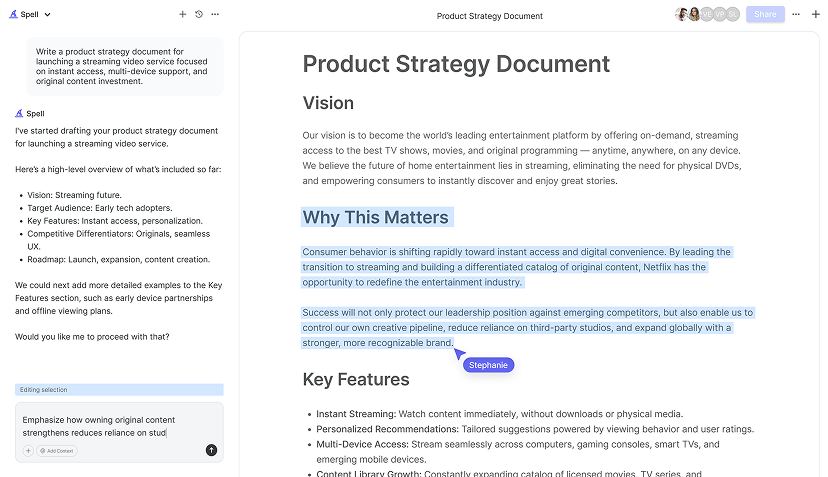
For even more streamlined collaboration, Spell offers real-time collaboration with AI support. You can work together on documents, making the process of drafting project plans or reports more efficient.
Updating Your Gantt Chart
Projects are rarely static. Timelines change, tasks get added, and priorities shift. That's why it's important to keep your Gantt chart updated. Regularly review and adjust the chart as your project progresses.
If a task takes longer than expected or if new tasks are added, update the chart to reflect these changes. This keeps everyone on the same page and helps avoid confusion.
Remember to communicate any major changes with your team. You might want to set up regular check-ins to discuss the project's progress and update the chart accordingly. This proactive approach can help prevent last-minute surprises and ensure the project stays on track.


Integrating with Other Tools
If you're managing a larger project, you might find it helpful to integrate your Gantt chart with other tools. While Google Docs provides a great foundation, you can enhance your project management by linking your chart with tools like Google Sheets or even specialized project management software.
For instance, you can use Google Sheets to automate some of the calculations and data entry associated with your Gantt chart. You could set up a spreadsheet that automatically updates your Google Docs chart when changes are made. This can save time and reduce the risk of errors.
Additionally, consider using Google Calendar to set reminders and deadlines for your tasks. This integration can help you keep track of important dates without having to constantly check your Gantt chart. You can also explore how Spell can aid in creating supporting documentation quickly, thanks to its AI-powered functionalities.
Final Thoughts
Making a Gantt chart in Google Docs is a creative process that, while a bit unconventional, can be incredibly rewarding. It offers a clear, visual way to manage your projects and keep everyone on the same page. Remember, tools like Spell can help streamline the documentation process, making it easier and faster to draft project plans and updates. Happy planning!


