Creating a compare and contrast chart in Google Docs can simplify your decision-making process. Whether you're weighing the pros and cons of two options or analyzing data, Google Docs provides a platform for designing these charts, making it accessible for everyone from students to professionals. This article will walk you through the steps of crafting a clear, organized compare and contrast chart in Google Docs, offering tips and tricks along the way.
Understanding the Purpose of Compare and Contrast Charts
Before jumping into how to make one, it's helpful to understand why you'd use a compare and contrast chart in the first place. These charts are fantastic for organizing information side by side, making it easier to see the similarities and differences between two or more subjects. This can be incredibly useful in a variety of contexts, such as:
- Evaluating different products or services before making a purchase decision.
- Comparing historical events or figures for a school project.
- Analyzing business strategies to determine the best course of action.
In essence, these charts help break down complex information into more digestible pieces, providing a visual aid that can clarify your decision-making process.
Setting Up Your Google Doc
Let's start with the basics of setting up your document in Google Docs. Once you've opened Google Docs and created a new document, you'll want to prepare it for your chart. Here's how:
- Give Your Document a Title: Click on "Untitled document" at the top left and type a descriptive name for your file. Something like "Comparison of Marketing Strategies" works well.
- Select the Page Layout: You might want to adjust the page settings. Go to File > Page setup to change the orientation, size, and margins if needed. Landscape orientation can sometimes offer more space for charts.
- Save Your Document: Google Docs automatically saves your work, but it's a good habit to ensure you're connected to the internet so your changes are saved in real-time.
Now that your document is ready, you can move on to creating your chart.
Creating a Table for Your Chart
A table in Google Docs serves as the foundation for your compare and contrast chart. Here's how to insert and set up a table:
- Insert a Table: Click Insert > Table and select the number of rows and columns you need. For a simple comparison between two items, a 3x3 table might suffice. The top row for headers, and the subsequent rows for comparison points.
- Label Your Columns: The first row should include the titles of the items you're comparing. For example, if you're comparing two phone models, your headers might be "Feature," "Phone A," and "Phone B."
- Adjust Column Widths: Drag the borders of your table columns to ensure that each cell has enough space for your content.
This table will be the structure for your chart, so take a moment to make sure it's set up to accommodate your needs.

Filling in Your Chart with Content
Once your table is ready, it's time to fill it with information. This is where the comparing and contrasting happens:
- List Features or Criteria: In the first column, list the features or criteria you're comparing. This could be anything from price, performance, design, etc., depending on your subject.
- Input Data for Each Item: In the subsequent columns, fill in the data for each item you're comparing. Be concise but informative, providing enough detail to understand the differences and similarities.
- Use Consistent Units: If you're comparing quantitative data, make sure you're using consistent units of measurement to avoid confusion.
With your chart filling up, you'll start seeing the differences and similarities more clearly, helping simplify the decision-making process.
Formatting Your Chart for Clarity
Good formatting can make your chart easier to read and understand. Here are some tips for making your chart look neat and professional:
- Use Bold and Italics: Highlight key points by using bold or italics. For instance, bold the headers to differentiate them from the rest of the data.
- Color Coding: Use colors to differentiate between the items being compared. You can change the background color of cells by right-clicking and selecting Table properties, then adjusting the Cell background color.
- Align Text: Ensure all text is aligned consistently. You can use the alignment tools in the toolbar to align text to the left, center, or right of the cell based on your preference.
Proper formatting can significantly enhance the readability of your chart, making it easier for anyone reviewing it to quickly grasp the key points.
Adding Visual Elements
Visual elements like images or graphs can further enrich your compare and contrast chart, making it more engaging and informative:
- Insert Images: If you're comparing visual products, adding images can help. Use Insert > Image to upload or search for images online.
- Include Charts: Sometimes a bar or pie chart can convey information more effectively. Google Docs allows you to insert charts from Google Sheets by going to Insert > Chart > From Sheets. You'll need to prepare the chart in Google Sheets first, but it's a powerful way to display data visually.
- Use Icons: Small icons can be used to represent ideas or concepts, adding a layer of visual interest without overwhelming the chart.
Adding these elements can transform a simple table into an informative graphic, making your comparisons stand out.

Collaborating with Others
Google Docs excels in its collaboration features, allowing you to work with others on your chart in real-time. Here's how you can make the most of these features:
- Share Your Document: Click the Share button in the top right corner and enter the email addresses of your collaborators. Choose whether they can edit, comment, or view.
- Use Comments: If you want to add notes or questions without altering the chart, use the Insert > Comment feature. This is particularly useful for group projects or when seeking feedback.
- Track Changes: To see the changes made by others, use File > Version history > See version history. This feature allows you to keep track of edits over time.
Collaboration can significantly enrich your chart as different perspectives are considered, leading to a more comprehensive analysis.
Using Spell for Faster Document Creation
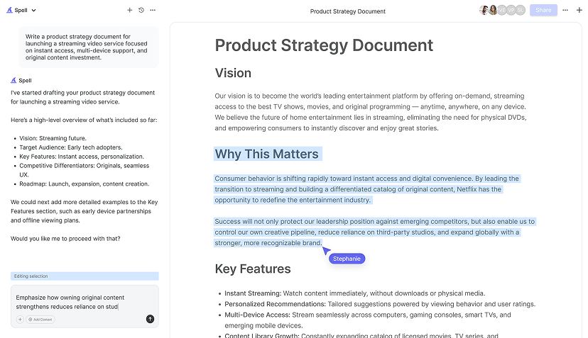
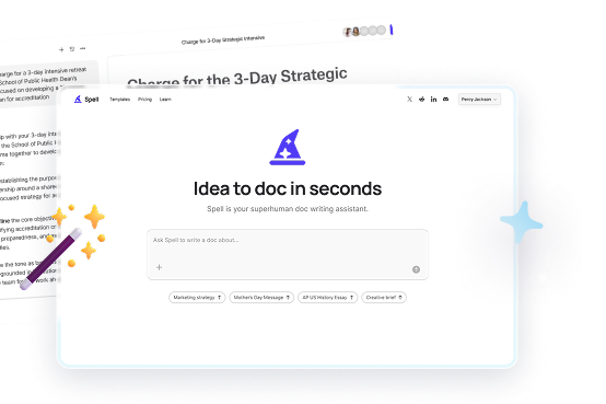
If you find yourself frequently creating documents and charts, Spell might be a helpful tool for you. As an AI document editor, Spell can assist in drafting, refining, and polishing your documents quickly. Imagine having a real-time assistant that not only helps you draft your document but also refines it using natural language prompts. This can save you a lot of time, especially if you're juggling multiple projects or tight deadlines.
With Spell, you can go from a blank page to a polished document much faster than with traditional tools. It integrates the power of AI with the familiar functionality of a document editor, making it perfect for both solo and collaborative projects. Whether you're working on a detailed comparison chart or any other type of document, Spell can streamline the process.


Finalizing and Sharing Your Chart
Once your chart is complete, it's time to finalize and share it:
- Review and Edit: Go through your chart to check for any errors or areas that need clarification. Make sure your information is accurate and up-to-date.
- Export Your Document: Google Docs allows you to download your document in various formats like PDF or Word. Go to File > Download and select your preferred format.
- Share Via Link: For easy sharing, you can generate a shareable link by clicking Share > Get link. Adjust the permissions as needed.
These steps ensure that your final product is polished and ready to share with your intended audience, whether that's a client, a class, or a team meeting.
Final Thoughts
Creating a compare and contrast chart in Google Docs is a practical skill that can make complex decisions more manageable. By organizing information clearly, these charts help reveal insights that might otherwise be missed. For those looking to enhance their document creation process, Spell offers a unique blend of AI-driven efficiency and collaborative functionality, helping you craft high-quality documents in record time. Whether you're a student, a professional, or anyone in between, mastering these tools can simplify your work and boost productivity.


