Graphs are a great way to make data visually appealing and easy to understand. Whether you're working on a school project or a professional report, inserting a graph in Google Docs can transform your document. In this post, we'll walk through the steps to add a graph in Google Docs, making it both effective and visually pleasing.
Creating a Graph in Google Sheets First
The first step in inserting a graph into your Google Docs is to create the graph in Google Sheets. Google Docs doesn't have a direct graph-making tool. Sheets does. It's quite user-friendly. Here's how you can create a graph in Google Sheets:
- Open Google Sheets: Start by opening Google Sheets. You can do this by going to the Google Apps menu and selecting Sheets, or by visiting sheets.google.com.
- Enter Your Data: Once in Sheets, you'll need to enter the data you want to visualize. This could be anything from sales figures to survey results. The key is to organize your data in columns or rows, depending on how you want your graph to appear.
- Select Your Data: Click and drag to highlight the cells containing the data you want to include in your graph. This will signal to Sheets what information you're focusing on.
- Insert a Chart: With your data selected, go to the "Insert" menu at the top of the page and choose "Chart." This will open the Chart Editor, where you can customize the appearance of your graph.
- Choose Your Chart Type: In the Chart Editor, you'll see a drop-down menu titled "Chart type." Here, you can choose from various chart types like bar, line, pie, and more. Select the one that best fits your data story.
- Customize Your Chart: After choosing your chart type, use the "Customize" tab in the Chart Editor to tweak colors, labels, and other settings to make your graph just right.
Once you're satisfied with how your graph looks, you're ready to move it over to Google Docs. But before we get there, let's take a moment to appreciate how handy Spell would be if you needed to draft out the content of your report quickly. With AI-powered drafting, you can generate a high-quality first draft in no time, saving you hours of writing and editing.
Inserting the Graph into Google Docs
Now that you have your graph ready in Google Sheets, it's time to insert it into your Google Docs. Here's how you do it:
- Open Your Google Doc: Go to Google Docs and open the document where you want to insert the graph. If you haven't started your document yet, now's a good time to create one.
- Position Your Cursor: Click in the document where you want the graph to appear. This will be the insertion point for your graph.
- Insert the Graph: Go to the "Insert" menu at the top of the page, hover over "Chart," and select "From Sheets." This will open a new window where you can select the spreadsheet containing your graph.
- Select Your Spreadsheet: Find and select the spreadsheet with the graph you created. Once you select it, a list of available graphs from that spreadsheet will appear.
- Choose Your Graph: Click on the graph you want to insert. Before you finalize, you'll see an option to link the chart to the spreadsheet. This is useful if you anticipate making changes to the data, as the graph in your document will update automatically.
- Insert: Click "Import" to insert the graph into your document. It will appear where you positioned your cursor, ready to be resized or moved as needed.
With the graph in your document, you can now adjust its size by clicking and dragging the corners. This flexibility makes it easy to fit the graph into your document's layout just the way you want.
Why Linking Your Chart is Useful
When you insert a graph from Google Sheets into Google Docs, there's an option to link it to the spreadsheet. But why is this worthwhile? Let's take a closer look:
- Automatic Updates: When your chart is linked, any updates to the data in Sheets will automatically reflect in your Google Docs graph. This is a lifesaver if your data is likely to change or if you're working on a living document.
- Consistency: Linking ensures consistency between your data source and your document. You won't have to worry about discrepancies arising from manual updates.
- Efficiency: This feature saves you time as you won't need to repeat the process of inserting and customizing the graph every time there's a data change.
That said, if your data is static and unlikely to change, you might choose not to link. The choice really depends on your specific needs and how dynamic your data is expected to be.

Customizing Your Graph in Google Docs
Once your graph is in Google Docs, you might want to customize it further to fit the aesthetic of your document. While Google Docs offers fewer customization options than Sheets, there are still a few tweaks you can make:
- Resize: Click on the graph and drag the corners to resize it. This helps you match the graph to your document's layout.
- Position: Click and drag the graph to reposition it within your document. You can also use the alignment options to center or justify it.
- Text Wrapping: Adjust how text wraps around your graph by clicking on it and selecting "In line," "Wrap text," or "Break text." This gives you control over how your document flows.
Unfortunately, if you need to change the graph's design elements like colors or labels, you'll have to return to Google Sheets. Make your changes there, and if the chart is linked, it will update in Docs automatically.
Making the Most of Graph Types
Choosing the right type of graph is crucial to effectively convey your data's story. Let's explore some common graph types and when to use them:
- Bar Graphs: Ideal for comparing quantities. If you're looking at sales figures for different products, a bar graph can clearly show which product sells more.
- Line Graphs: Perfect for showing trends over time. For instance, if you're tracking monthly revenue, a line graph can illustrate growth or decline.
- Pie Charts: Useful for showing proportions. If you want to depict market share or budget allocations, pie charts give a clear picture of how parts contribute to a whole.
- Scatter Plots: Great for identifying relationships between variables. If you have two sets of data that might correlate, scatter plots show potential connections.
Choosing the right graph type makes a big difference in how easily your audience understands your data, so take a moment to consider which type best fits your information.
Collaborating on Documents with Graphs
One of the great things about Google Docs is its ability to facilitate collaboration. You can share your document with colleagues, allowing them to view, comment, or edit. Here's how to make collaboration smooth when working with graphs:
- Share Your Document: Click the "Share" button in Google Docs to invite others. You can set permissions to view, comment, or edit, depending on what level of access you want to provide.
- Comment on Graphs: Encourage collaborators to use the comment feature to discuss specific aspects of the graph. This keeps feedback organized and easy to follow.
- Use Suggestion Mode: If you want collaborators to make changes without altering the original document, use Suggestion Mode. This allows others to propose edits, which you can then accept or reject.
And for those who want to take collaboration to the next level, consider using Spell. It allows real-time collaboration just like Google Docs, but with the added benefit of AI to help draft and refine documents quickly.

Integrating Other Visuals with Graphs
Graphs are powerful, but sometimes they're even more effective when combined with other visuals. Here are a few ideas for integrating additional elements into your document:
- Images: Add relevant images to provide context or highlight important points. For example, a photo of a product can accompany sales data.
- Diagrams: Use diagrams to explain complex processes or systems that the graph relates to. This helps readers understand the bigger picture.
- Tables: Complement graphs with tables that provide detailed data. While graphs show trends, tables can give precise numbers for those who want a closer look.
Combining these elements creates a richer, more informative document that caters to different audience preferences. Some readers prefer visuals, while others want the nitty-gritty details that tables can offer.
Presenting Graphs Effectively
Presentation is everything, especially when sharing your document with an audience. Here are some tips to ensure your graphs make the impact you want:
- Keep It Simple: Avoid cluttering your graph with too much information. Focus on key data points that tell the story clearly.
- Use Annotations: Add labels or annotations to highlight significant data points or trends. This guides the reader's attention to important aspects of the graph.
- Consistent Color Schemes: Use consistent colors to represent data categories across graphs. This helps maintain clarity and avoids confusion.
These tips help ensure your graphs are not only visually appealing but also effectively communicate the insights you want to share.


Using Spell for Document Editing
While Google Docs is great for word processing, integrating powerful tools like Spell can take your document editing to the next level. Here's how Spell helps streamline the process:
- AI-Powered Drafting: Spell can generate a high-quality first draft in seconds, saving you hours of writing.
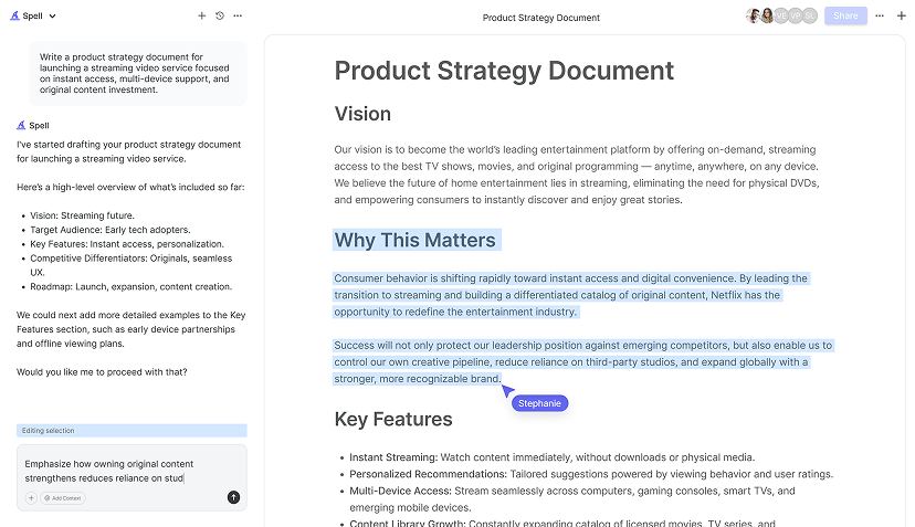
- Natural Language Editing: Highlight text and tell Spell what to change. This avoids the hassle of switching between different tools.
- Real-Time Collaboration: Share documents and collaborate with your team in real time, just like Google Docs, but with AI built in natively.
For those juggling multiple projects, Spell makes document creation and editing 10x faster, giving you more time to focus on what truly matters.
Final Thoughts
Adding a graph to your Google Docs is a straightforward process that significantly enhances your document's clarity and impact. Whether you're showcasing trends, comparisons, or proportions, the right graph makes all the difference. And if you want to speed up the document creation process, Spell offers an AI-powered approach to writing and editing, making your work not just faster but also more efficient.


