Fonts can make or break a document. They subtly convey the tone and personality of your text. If you're a fan of the crisp, modern look of the Futura font and you use Google Docs, you might be wondering how to incorporate it into your documents. In this post, we'll guide you through the process of getting Futura onto Google Docs, even though it's not natively available. Let's dive into some helpful workarounds and creative solutions.
Why Futura Isn't in Google Docs
First off, you might be wondering why Futura isn't available in Google Docs to begin with. Google offers a wide range of fonts through Google Fonts, a library of open-source fonts that are free to use. However, not all fonts make it into this library, mainly due to licensing restrictions. Futura, designed by Paul Renner in 1927, is one such font protected by licensing, which means it isn't freely available like many of its Google Fonts counterparts.
However, don't let this discourage you. There are still plenty of ways to bring the style and flair of Futura into your documents. Whether you're preparing a presentation, designing a flyer, or just want that extra touch of elegance in your report, Futura can still be part of your toolkit.
Using Google Fonts as Alternatives
While Futura itself isn't an option in Google Docs, some fonts offer a similar look and feel. Here are a few alternatives available right within Google Docs:
- Montserrat: This font has a clean, geometric style reminiscent of Futura. It's a great choice for headings and body text alike.
- Poppins: Poppins offers a modern sans-serif look with a friendly, approachable vibe, similar to Futura.
- Lato: Known for its strong yet subtle appeal, Lato can work well for both formal and informal documents.
To apply one of these fonts in Google Docs, simply go to the font dropdown menu, click "More fonts," and search for your preferred option. Once you've added it to your list, you can start using it in your document.
Custom Fonts with Extensis Fonts Add-on
Now, if you're set on using Futura, one way to mimic its appearance is through the Extensis Fonts add-on. Here's how you can use it:
- Open your Google Doc and click on "Add-ons" in the top menu.
- Choose "Get add-ons" and search for "Extensis Fonts."
- Click on the blue "+ free" button to install the add-on.
- Once installed, you can access it from the "Add-ons" menu. Select "Extensis Fonts" and then "Start."
- A panel will open on the right-hand side of your document, where you can browse through a wide selection of fonts similar to Futura.
Although Futura itself might not be there, you can find fonts that give you a similar vibe. This add-on is a fantastic way to expand your typographic options without leaving Google Docs.

Inserting Futura Font as an Image
If you're really keen on using Futura and need it for headings or specific sections, creating text images is another viable option. Here's how:
- Create your text in a graphic design tool like Canva or Photoshop, using Futura as the font.
- Save your design as a PNG or JPEG file.
- Insert the image into your Google Doc by clicking "Insert" in the menu, then "Image" and "Upload from computer."
While this method isn't ideal for large bodies of text, it's perfect for titles, headers, or any part of your document where you want that specific Futura look.
Pairing Fonts for Aesthetic Appeal
Sometimes, the secret to a great-looking document isn't just the font itself, but how you pair it with others. If you're using a Futura alternative, consider pairing it with complementary fonts for added visual interest. Here are some pairing suggestions:
- Montserrat and Open Sans: Montserrat's modern edge pairs beautifully with the neutral Open Sans for a balanced look.
- Poppins and Roboto: The friendly vibe of Poppins works nicely with Roboto's clean lines.
- Lato and Merriweather: Lato's subtle elegance can be complemented by the classic serif style of Merriweather.
Experimenting with font pairings can elevate your document design and make it stand out. Just like choosing the right outfit, a well-paired font can make all the difference.
Using Futura in Google Slides
If your project involves Google Slides, and you're yearning for that Futura touch, similar strategies apply. Google Slides works similarly to Docs when it comes to fonts. You can use the same add-ons and image insertion techniques we discussed earlier.
Interestingly enough, the visual nature of slideshows means that inserting text as images might be even more effective here. Slides tend to need less text, so you can use Futura for headings or important points without overwhelming your audience.

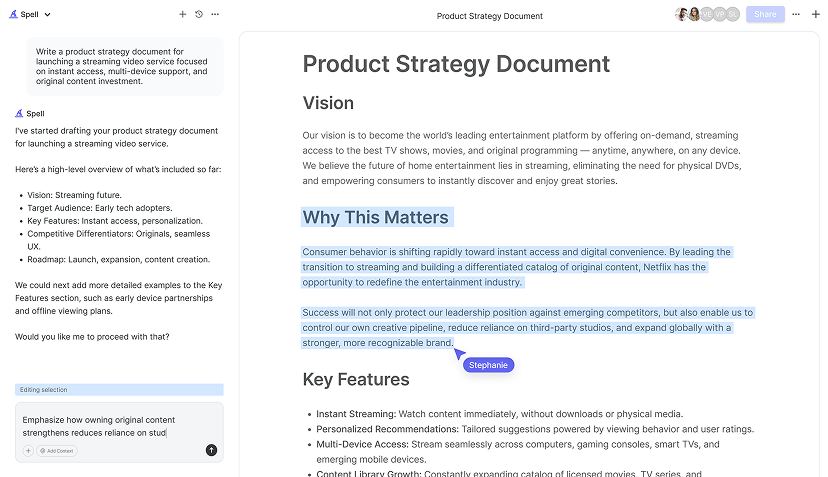
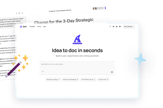
Spell: Bringing AI to Document Creation
While working with fonts and text design can be rewarding, it's also time-consuming. Thankfully, tools like Spell can help streamline the process. Imagine writing and editing your documents with AI assistance, making your work not just faster, but more polished and professional.
Spell is like having an editor and designer in your pocket. Need to whip up a document quickly with the right font pairing? Spell can generate a draft in seconds, and you can then refine it with easy, natural language prompts. Gone are the days of endlessly tweaking and reworking. Spell helps you focus on the content while it handles the style.
Font Licensing: What You Need to Know
Before diving into using any font, it's important to understand licensing. Futura, like many other fonts, is protected by copyright. This means that while you can use it for personal projects, commercial use might require purchasing a license.
If you're creating documents for a business or client, investing in a license could be worthwhile. It's always good to double-check to ensure you're using fonts legally, especially in professional settings. Google Fonts, on the other hand, offers a library of open-source fonts that are free for both personal and commercial use, making them a safer choice for many users.


Tips for Better Typography in Google Docs
Regardless of the fonts you choose, there are a few tips to keep in mind for better typography:
- Consistency: Stick to 2-3 fonts throughout your document to maintain a clean and cohesive look.
- Hierarchy: Use different weights and sizes to establish a visual hierarchy, making your document easier to read.
- Alignment: Pay attention to alignment and spacing for a polished look. Ensure your headings and body text are aligned consistently.
- Contrast: Use contrast to draw attention to key points. This can be achieved through font weight, size, or color.
These principles will help ensure your documents are not only easy to read but also visually appealing, no matter which fonts you choose to use.
Final Thoughts
While getting the Futura font directly in Google Docs might not be possible, there are plenty of creative ways to achieve a similar aesthetic. From using alternatives to leveraging add-ons and inserting images, you have a toolkit of options at your disposal. And if you're looking to cut down on time spent adjusting fonts and layouts, Spell offers a seamless solution to create and edit documents quickly. It's all about finding the right balance between aesthetics and functionality to make your documents shine.


