Fonts might seem like a small detail, but they can make a big difference in how your document is perceived. Whether you're looking to make your text stand out or simply want to add a touch of personality, knowing how to get more fonts on Google Docs can be a game-changer. Today, we're going to explore the ins and outs of adding fonts to your Google Docs, making your documents not only functional but also stylish and unique.
Why Fonts Matter
Before we dive into the how-to part, let's chat about why fonts even matter. Imagine you're reading a novel written entirely in Comic Sans. It doesn't quite convey the same gravitas, does it? Fonts carry emotion and tone, subtly influencing how the reader feels about your content. In business documents, a professional font can lend authority to your words, while a quirky font might be perfect for a creative project.
Fonts also play a crucial role in readability. A well-chosen font makes your text easy on the eyes, enhancing the reader's experience. On the other hand, a poor font choice can make even the most compelling content feel like a chore to get through. So, whether you're preparing a business proposal or a school project, selecting the right font sets the foundation for how your document will be received.
Getting Started with Google Docs
Now, let's get into the nitty-gritty of using Google Docs. If you're already familiar with it, you know it's a versatile tool that allows real-time collaboration and easy sharing. But when it comes to fonts, Google Docs might seem a bit limited at first glance. Fear not, though. There are plenty of ways to expand your font options and give your documents exactly the look you want.
First, open Google Docs and start a new document. You'll see a toolbar at the top that includes the default font options. These are great for basic needs, but if you're after something specific or unique, you'll want to explore more options. Let's see how we can do that.
Accessing More Fonts in Google Docs
You might be surprised to learn that Google Docs actually offers a wide range of fonts beyond the default list. Here's how to access them:
- Open your Google Doc and click on the font dropdown menu in the toolbar.
- Scroll to the top of the list and select "More fonts."
- This will open a new window with a plethora of font options available for you to peruse.
In this window, you'll see fonts categorized by popularity, alphabetical order, and script. You can also filter fonts based on serif, sans serif, display, handwriting, and monospace styles. Once you've found the fonts you like, simply click on them to add them to your list, and then click "OK."
These fonts will now be available in your Google Docs toolbar, making it easy to switch things up as you see fit. It's a simple yet effective way to customize your document's appearance without much hassle.

Using Add-ons for Even More Fonts
If the expanded list of fonts still doesn't satisfy your creative cravings, fear not. Google Docs supports add-ons that can help you go even further. Add-ons are like little apps that enhance the functionality of Google Docs, and there are several designed specifically for fonts.
To find and install these add-ons, follow these steps:
- Click on "Extensions" in the menu bar.
- Choose "Add-ons" and then "Get add-ons."
- In the Google Workspace Marketplace, type "fonts" in the search bar.
- Browse through the available font add-ons, such as "Extensis Fonts" or "Font Library," and click on the one you want to install.
- Follow the prompts to install the add-on.
Once installed, you can access new fonts directly through the add-on. This is particularly useful for those who need a wide variety of fonts for different projects, as it opens up a world of possibilities beyond what's natively available in Google Docs.
Custom Fonts: Bringing in New Styles
What if you're looking for a specific font that's not included in Google Docs or any add-ons? While Google Docs doesn't support uploading custom fonts directly, there are a few workarounds you can use to achieve a similar effect.
One method is to create your text in another program, such as Adobe Illustrator or Microsoft Word, and then save it as an image file. You can then insert this image into your Google Doc. While this method isn't ideal for large bodies of text, it's a great option for headings or special sections that need a distinctive touch.
Another approach is to use HTML and CSS in Google Sites to create a webpage with your custom fonts, then embed this page in your Google Doc. This is a bit more technical, but it allows you to have more control over the appearance of your text.
Mixing and Matching Fonts
Now that you have access to a wider range of fonts, the fun part begins. Mixing and matching them to create a document that's both functional and visually appealing. Here are a few tips for pairing fonts effectively:
- Contrast is key: Pairing a serif font with a sans serif font can create a clean and balanced look. For example, use a serif font for headings and a sans serif font for body text.
- Limit your choices: Too many different fonts can make a document look chaotic. Stick to two or three fonts to maintain a cohesive appearance.
- Consider hierarchy: Use bold or larger fonts for headings to create a clear visual hierarchy. This helps guide the reader's eye and makes the document easier to navigate.
Mixing fonts can be a bit like putting together an outfit. It's all about finding the right balance and ensuring everything works together harmoniously. Play around with different combinations until you find the look that suits your document best.
Using Spell for Document Creation
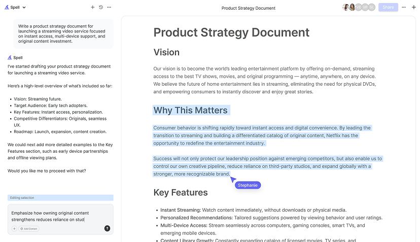
While Google Docs offers a fantastic platform for creating documents with a variety of fonts, sometimes you need a bit more power at your fingertips. That's where Spell comes in. Imagine having an AI document editor that not only helps you with fonts but also assists in drafting, editing, and refining your content.
With Spell, you can create high-quality documents in seconds. Whether it's generating a first draft or making real-time edits, Spell integrates AI technology in a way that traditional tools just can't match. Plus, you get the added benefit of real-time collaboration, so you and your team can work together seamlessly, just like in Google Docs but with a smarter twist.

Keeping Your Fonts Consistent Across Documents
Once you've found your perfect font combinations, you'll likely want to keep them consistent across multiple documents. Consistency is crucial, especially for branding or when working on a series of related documents. Here's how you can ensure your fonts remain the same:
- Create a template: Set up a Google Doc with your preferred fonts and styles, then save it as a template. You can use this template for future documents to maintain consistency.
- Use styles: Google Docs allows you to create and save styles for different types of text, such as headings, subheadings, and body text. Customize these styles with your chosen fonts and save them for easy access.
- Collaborate with your team: Share your font choices and templates with your team to ensure everyone is on the same page. This is especially important for businesses and projects where a unified look is essential.
By keeping your fonts consistent, you create a polished and professional look that reinforces your message and strengthens your brand identity.
The Role of Accessibility in Font Choices
When selecting fonts, it's important to consider accessibility. Different fonts can affect how easily people with visual impairments or reading difficulties can engage with your content. Here are some tips for choosing accessible fonts:
- Choose simple fonts: Fonts with clean lines and clear shapes are generally easier to read. Avoid overly decorative fonts for body text.
- Ensure sufficient contrast: Make sure there's enough contrast between the text and background color. This is especially important for readers with visual impairments.
- Consider font size: Larger fonts can be easier to read, so avoid using very small font sizes, particularly for body text.
Accessibility is all about making your content available to the widest possible audience. By considering these factors, you ensure that everyone can enjoy and benefit from your document, regardless of their abilities.


Testing and Finalizing Your Fonts
You've selected your fonts, mixed and matched them to perfection, and considered accessibility. Now it's time to test your document to ensure everything looks as expected. Here are a few steps to finalize your font choices:
- Print a copy: Sometimes fonts look different on screen compared to print. Print a test copy of your document to see how the fonts translate to paper.
- Check on different devices: Open your document on various devices, such as a smartphone, tablet, or desktop, to ensure the fonts display correctly across platforms.
- Get feedback: Share your document with a colleague or friend and ask for their opinion on the font choices. Fresh eyes can catch things you might have missed.
Testing your document helps you catch any issues before finalizing it, ensuring your work is polished and ready for its intended audience.
Leveraging Spell for Effortless Editing
Once you've finalized your fonts, Spell can take your document to the next level. With Spell, you can edit your document using natural language prompts, making it easy to refine your content without the hassle of traditional editing tools. Whether you need to adjust your wording or enhance your overall document structure, Spell's AI capabilities streamline the process, saving you time and effort.
Spell also ensures that your document looks professional and polished, with clean formatting and high-quality outputs that you can rely on. It's like having a personal editor that works with you in real time, enhancing your productivity and taking your document creation to new heights.
Final Thoughts
Fonts are more than just a stylistic choice. They're a powerful tool for conveying your message effectively. By exploring Google Docs' font options and leveraging add-ons, you can create documents that are both visually appealing and functional. And when you need a bit more magic, Spell is there to help you draft, edit, and refine your documents with ease. With these tools at your disposal, you're well-equipped to create documents that stand out and communicate your message clearly.


