Creating a Gantt chart in Pages might not be the first thing that comes to mind when you're managing a project, but it's definitely possible and can be quite effective. Whether you're planning a small personal project or coordinating tasks for a bigger team, Gantt charts can give you a clear visual representation of your timeline. We'll walk through the process step by step, making it easy to set up your own Gantt chart in Apple's Pages.
Getting Started with Pages
First things first, if you're going to create a Gantt chart in Pages, you need to be familiar with the application itself. Pages is part of Apple's iWork suite, and while it's not as feature-rich as some other tools in terms of project management, it offers a clean and straightforward interface for creating documents and charts. You might be used to using Pages for writing documents, but it can also be a handy tool for visual projects like a Gantt chart.
To get started, open Pages on your Mac or iOS device. If you're new to Pages, don't worry. It's pretty intuitive. You can find the app in your Applications folder on a Mac or download it from the App Store if you don't have it yet. Once you're in, choose to create a new document and select a blank template. This will give you a fresh slate to work with.
Now, if you're thinking of diving straight into the chart-making part, a word of advice. It helps to sketch out your project tasks and timeline on paper or a whiteboard first. This way, you'll have a clear idea of what your Gantt chart needs to include. Once you have your project plan outlined, you're ready to transfer it into Pages.
Setting Up the Basic Structure
Now that you have a blank document open in Pages, it's time to set up the structure for your Gantt chart. This involves creating a table that will serve as the backbone of your chart. In Pages, tables are quite flexible, allowing you to add as many rows and columns as you need.
Start by clicking on the "Table" button in the toolbar, then select a simple table style. Don't worry too much about the design at this stage. You can tweak it later. Insert a table with enough columns to represent the time span of your project. For instance, if your project runs over several months, you might want a column for each week or day, depending on how detailed you want your Gantt chart to be.
Next, add rows for each task or phase of your project. In the first column, you'll list the tasks, and the subsequent columns will represent the timeline. It might look a bit bare at first, but this is just the skeleton of your chart. You'll flesh it out with details as you go along.
Don't forget to label your columns and rows. The top row should be your timeline markers (like weeks or days), and the first column should list your tasks. This setup will give you a clear framework to start filling in your project details.

Filling in Your Project Details
With your table set up, it's time to add the details of your project. This is where your pre-planned timeline comes into play. Start by entering each task in the first column of your table. Be specific and concise with your task descriptions to avoid cluttering your chart.
Once your tasks are in place, it's time to map them out over the timeline. For each task, determine the start and end dates within your timeline. You can fill in the corresponding cells in the table by shading or coloring them. This visual representation helps you and your team quickly see when each task is scheduled to begin and end.
For instance, if a task is scheduled to start in week one and finish in week three, you'll shade the cells under those weeks for that task. This shading forms the bars of your Gantt chart, illustrating the duration and overlap of tasks.
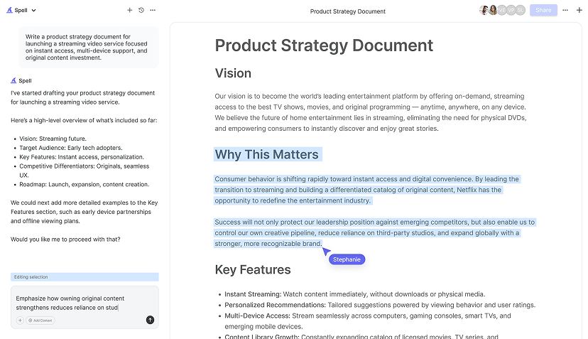
If you're using Spell, this is where it shines. With natural language prompts, you can describe your task and timeline, and Spell can help create a draft of your Gantt chart. It's like having an assistant that speeds up the process, making task management a breeze.
Customizing Your Gantt Chart
Now that the basic structure and data are in place, it's time to make your Gantt chart visually appealing and easy to read. Pages offers several customization options to help you do just that. You can adjust the colors of your bars for better visibility or to match your project's theme.
To change the color of the bars, click on a cell or series of cells that you've shaded, then use the Fill tool in the toolbar to select a new color. Consistent color coding can make it easier to distinguish between different phases or types of tasks. For example, you might use one color for planning tasks and another for execution phases.
Additionally, you can adjust the row heights and column widths to better fit your data. Simply click and drag the edges of the rows or columns to resize them. This can help ensure that all task names and timeline markers are clearly visible.
If you want to add more depth to your chart, consider inserting a legend to explain your color coding or any symbols you've used. This extra step can be particularly useful if you're sharing the chart with others who might not be familiar with your project.
Adding Milestones and Dependencies
A Gantt chart isn't just about tasks and timelines. It's also about milestones and dependencies. Milestones are significant points in your project that signify key achievements or stages. In Pages, you can mark milestones by adding symbols or using a different color to highlight specific cells.
To add a milestone, pick a unique color or symbol and apply it to the corresponding cell in your timeline. This visual cue will stand out in your chart, making it easy for anyone to spot important events. As for dependencies, these are tasks that rely on the completion of others before they can begin.
While Pages doesn't automatically manage dependencies like some project management software, you can manually indicate them. One method is to use arrows or lines to connect dependent tasks. You can draw these with the line tool available in the toolbar. Align the start of one task with the end of another to showcase their relationship.
For a more efficient way to handle dependencies, Spell can be a game-changer. With its AI capabilities, you can quickly update and adjust tasks and dependencies with natural language commands, saving you time and effort.

Sharing and Collaborating on Your Gantt Chart
Once your Gantt chart is ready, you'll likely want to share it with your team or stakeholders. Pages makes this easy with several sharing options. You can export your document as a PDF or Word file, ensuring it's accessible to those who may not use Pages.
To export your chart, go to the "File" menu, select "Export To," and choose your preferred format. If you're working within a team, consider using Apple's collaboration features to share the document directly. This allows team members to view and edit the chart in real time, making it a living document that evolves with your project.
For those who prefer seamless collaboration, Spell offers an even more integrated experience. With real-time editing and AI-powered suggestions, Spell allows your team to collaborate effectively, making adjustments on the fly without the hassle of switching between different tools.
Printing Your Gantt Chart
Sometimes, having a physical copy of your Gantt chart can be incredibly useful, whether for meetings or personal reference. Printing your chart from Pages is straightforward. Before you hit print, preview your document to ensure everything appears as expected.
Use the "Print" option in the "File" menu, but don't rush through the settings. Take a moment to adjust the print layout to ensure your chart fits on the page properly. You might need to scale the document or adjust the orientation (portrait or landscape) for the best results.
Once everything looks good, print your Gantt chart. If you're planning to distribute printed copies, consider using high-quality paper for a professional touch. It's a small detail, but it can make a significant difference in how your project plan is perceived.


Keeping Your Gantt Chart Updated
Your Gantt chart is a living document, meaning it should evolve as your project progresses. Regular updates are crucial to reflect any changes in timelines, tasks, or dependencies. In Pages, this means revisiting your chart periodically and making necessary adjustments.
As you update the chart, remember to adjust any related tasks or milestones. If a task is delayed, for example, you'll need to shift its timeline and potentially update any dependent tasks. It's a bit like adjusting the sails on a ship. Small tweaks can keep you on course.
For those who like efficiency, Spell offers a streamlined way to keep your Gantt charts up-to-date. With its AI-driven editing tools, you can quickly make changes and ensure your project plan reflects the current state of affairs, saving you time and reducing the risk of errors.
Final Thoughts
Creating a Gantt chart in Pages might not be the most traditional method, but it's definitely doable and can be quite effective for visualizing your project timeline. By following these steps, you can set up a clear and organized chart that helps everyone stay on track. And, if you're looking to streamline the process even further, consider using Spell. With its AI-powered features, Spell can make creating and updating Gantt charts faster and more intuitive. Happy planning!


