Creating a brochure in Word without relying on a template might sound tricky at first, but it's a fantastic way to unleash your creativity and customize your content exactly how you want it. Whether you're promoting an event, a product, or simply sharing information, doing it from scratch allows for that personal touch. Let's walk through the process with clear steps and tips so you can confidently design a brochure that stands out.
Planning Your Brochure
Before you start clicking around in Word, it's worth taking a moment to plan what you want your brochure to convey. Think about your audience and the purpose of your brochure. Are you promoting a local event, a new product, or maybe offering educational content? Understanding your goal will guide your design choices, from font styles to color schemes.
Next, sketch out a rough layout on paper or in a digital tool. Consider how much information you need to include and where it should go. Most brochures are trifold, which means they have three sections per side. Decide what content will go on each panel. For instance:
- Front Panel: Eye-catching headline and visuals.
- Inside Left Panel: Introduction or overview.
- Inside Center Panel: Main content or key details.
- Inside Right Panel: Call to action or additional information.
- Back Panel: Contact information or social media links.
With a clear plan, you'll find the process much smoother and more fun. Plus, you'll avoid the frustrating experience of rearranging everything later.
Setting Up Your Document
Now that you've got a plan, let's set up your Word document. Open Microsoft Word and start a new blank document. To create a trifold brochure, you'll need to adjust the page layout to accommodate the three panels. Here's how you can do it:
- Go to the Layout tab.
- Click on Margins and select Narrow to maximize your space.
- Under the Layout tab, click Orientation and choose Landscape.
- Now, go to Columns and choose Three.
This setup will divide your page into three equal sections, perfect for a trifold brochure. Remember to save your document frequently. You don't want to lose your hard work due to an unexpected computer glitch.

Adding Text to Your Brochure
With your layout ready, it's time to start adding content. Text is the backbone of your brochure. It needs to be clear, concise, and engaging to capture and hold the reader's attention. Here's a simple way to tackle this:
- Start with the basics. Add a headline on the front panel that summarizes your message in a few words.
- Use the Insert tab to add Text Boxes within each panel if you want more control over text placement. Simply click Insert, then Text Box, and draw the box where you want your text.
- Keep paragraphs short. Aim for scannable content with bullet points or numbered lists to break up blocks of text.
- Maintain a consistent tone and style throughout the brochure to create a cohesive look and feel.
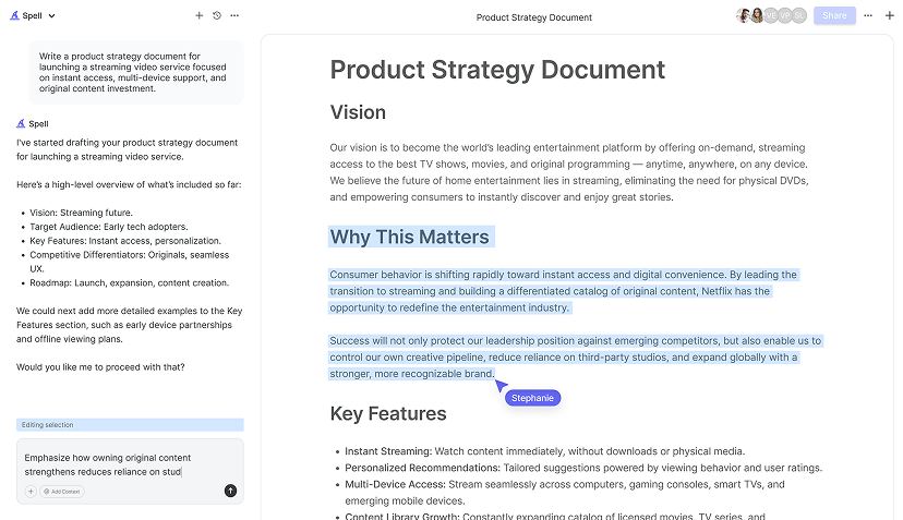
Have you ever been halfway through a project and thought, "There's got to be an easier way"? Well, with Spell, I can quickly draft high-quality documents in seconds. Imagine the time saved in crafting content like this!
Selecting Fonts and Styles
Your choice of fonts and styles can significantly impact the readability and aesthetic of your brochure. It's tempting to go wild with fonts, but restraint is often key. Here's how to make your brochure both attractive and legible:
- Choose two to three fonts: Use one for headings, another for body text, and perhaps one more for accents. For example, a bold sans-serif font for headings and a clean serif font for body text.
- Adjust font sizes: Make sure your headings stand out by increasing their size compared to the body text. A good starting point is 14-16 pt for body text and 18-24 pt for headings.
- Use bold and italics: Emphasize important points by using bold or italics sparingly. This helps draw the reader's eye to crucial information.
Remember, the goal is to communicate effectively, so prioritize readability over flashy design. A clean, consistent look will keep your audience focused on the message rather than the medium.
Incorporating Images and Graphics
Images can breathe life into your brochure and help convey your message without words. Here's how to effectively incorporate visuals into your design:
- Quality is key: Use high-resolution images to avoid a pixelated look. Blurry images can make your brochure look unprofessional.
- Relevance: Choose images that relate directly to the content. If you're advertising a product, use pictures of the product in action.
- Balance: Don't overcrowd your brochure with images. Leave some white space to maintain readability and focus.
- Insert images: Go to the Insert tab, click Pictures, and select images from your computer. You can also use Online Pictures to search for royalty-free images.
Images are more than just decoration, they're a powerful tool to enhance your message, so choose wisely.

Adding Colors and Themes
The colors you choose can evoke emotions and set the tone for your brochure. Here's how to select a color scheme that complements your content:
- Stick to a palette: Use a limited color palette of two to four colors. This ensures consistency and makes your brochure visually pleasing.
- Consider your brand: If you're creating a brochure for a business, align the colors with your brand identity to reinforce recognition.
- Background and text contrast: Ensure there's enough contrast between text and background colors for readability. Dark text on a light background works well for body text.
- Apply themes: Use Word's built-in themes under the Design tab to quickly apply a cohesive look to your entire document.
A well-thought-out color scheme can make your brochure not only attractive but also memorable, so take the time to choose wisely.
Finalizing Your Brochure
With all the elements in place, it's time to fine-tune your brochure. Here's a checklist to ensure it's polished:
- Proofread: Check for typos, grammar mistakes, and consistency in style. A second set of eyes can be invaluable here.
- Align elements: Make sure text boxes, images, and other elements are properly aligned for a tidy appearance. Use the alignment guides in Word to help.
- Print preview: Use Word's print preview feature to see how your brochure will look when printed. This helps catch any layout issues.
- Test folds: If you're printing it yourself, fold a printed copy to ensure everything aligns correctly.
Once you're satisfied, your brochure is ready to print or share digitally. You've crafted a unique piece that represents your message precisely how you envisioned it.


Printing and Sharing Your Brochure
With your brochure finalized, the last step is sharing it with the world. Here's how to do it efficiently:
- Printing: If you plan to print, consider using a professional printer for high-quality results. Make sure to use the right paper stock that complements your design.
- Digital sharing: Save your document as a PDF for easy sharing via email or online. Go to File, Save As, and select PDF from the format options.
- Distribution: Think about where your audience will be. Are they more likely to see it in an email, on social media, or in a physical location? Tailor your distribution plan accordingly.
And just like that, your brochure is ready to make an impact. Whether it's handed out at events or shared online, it's a reflection of your careful planning and creativity.
Final Thoughts
Creating a brochure from scratch in Word is a rewarding experience that allows you to express your creativity while ensuring every detail aligns with your vision. By following these steps, you've crafted a personalized piece that stands out. And if you're ever pressed for time, Spell can streamline the process, letting you focus on the fun parts of design. Happy creating


