When it comes to Google Docs, most of us think of it as a straightforward word processor. But what about those times when you need to tweak the space between letters to make your text look just right? That's where kerning comes in. It's an often overlooked aspect of typography. Yet it can make a significant difference in how your document looks and feels. Today, we'll break down how you can adjust kerning in Google Docs, even if it's not as direct as some might hope.
Why Kerning Matters
First things first. Kerning. It's the art of adjusting the space between individual letter pairs in your text. While it might seem minor, proper kerning can greatly enhance the readability and aesthetic of your content. Think about it. Have you ever seen a word that just looked a bit off? Maybe the letters seemed too squished together or too far apart? That's kerning at play.
In design-heavy contexts like logos, kerning can be crucial. But even in regular documents, it can help create a cleaner, more professional appearance. It's one of those subtle tweaks that can elevate your document from "meh" to "wow." So, while Google Docs doesn't offer direct kerning adjustments like some design software, there are still ways to control letter spacing that we'll explore.
Letter Spacing in Google Docs
Google Docs doesn't offer a direct kerning feature, but don't worry! You can still adjust the overall letter spacing, which can give you some control over how your text appears. Here's how you can do it:
- Highlight the Text: Start by selecting the portion of text you want to adjust.
- Open the Format Menu: Click on "Format" in the top menu bar.
- Choose Alignment & Indentation: From the dropdown, select "Line spacing," then "Custom spacing."
- Adjust the Values: In the dialog box, you'll see options for "Line spacing" and "Paragraph spacing." While these don't directly change kerning, you can adjust these to modify the overall spacing feel. Enter your desired values and click "Apply."
While this method doesn't adjust kerning per se, it allows you to play with spacing to achieve a similar effect. It's a little workaround, but it can be quite effective in the right context.
Using Font Choices to Influence Kerning
Another way to subtly impact kerning is through your choice of fonts. Some fonts are inherently well-kerned, meaning the designer has already optimized the spacing between letters. Here are a few tips:
- Experiment with Different Fonts: Some fonts naturally have better kerning. Try fonts like Arial, Times New Roman, or Roboto for more balanced spacing.
- Use Google Fonts: Google Docs integrates seamlessly with Google Fonts, offering a wide selection. Experiment with different options to see which one offers the best spacing for your needs.
- Check Font Pairings: If you're using multiple fonts, ensure they complement each other in terms of spacing. A mismatched pair can make your document look disjointed.
Choosing the right font can often negate the need for manual kerning adjustments, giving your document a polished look with minimal effort.

Customizing Spacing with Tables
If you need more control over spacing for specific sections, consider using tables. This method might sound unconventional, but it can be surprisingly effective:
- Create a Table: Insert a table around the text you want to adjust.
- Adjust Cell Padding: Right-click the table, choose "Table properties," and adjust the cell padding to control spacing.
- Remove Borders: To keep your document looking clean, set the table borders to "0" so they're invisible.
Using tables allows for more precise control over text placement, which can mimic kerning in a roundabout way. It's a handy trick when dealing with titles or specific sections that need a bit of extra finesse.
Kerning in Headers and Footers
Headers and footers deserve special attention because they often contain crucial information like titles, dates, and page numbers. Here's how you can adjust their appearance:
- Edit Headers/Footers: Double-click at the top or bottom of the page to activate the header or footer section.
- Use the Same Spacing Techniques: Apply the same letter spacing adjustments as you would in the main text body.
- Choose Fonts Wisely: Since headers and footers carry key information, ensure they use clear, well-kerned fonts for better readability.
By paying attention to these areas, you ensure that your document maintains a professional look from top to bottom, even if the reader only glances at the headers or footers.
Spell: A Helping Hand for Document Editing
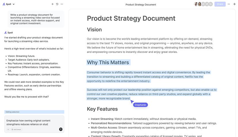
While Google Docs offers some basic ways to adjust spacing, sometimes you need a bit more help. This is where Spell comes into play. Imagine having an AI document editor that fine-tunes your document, saving you from manual tweaks. With Spell, you can generate high-quality drafts, edit using natural language, and collaborate in real-time, all with AI's help.
Spell's built-in AI capabilities mean that you can focus more on your content and less on the nitty-gritty of formatting. It's like having a personal assistant who ensures everything looks just right, allowing you to concentrate on the bigger picture.

Using Add-ons for Enhanced Control
Google Docs supports a wide variety of add-ons, which can extend its capabilities. While there isn't a dedicated kerning add-on, some tools can help with text styling and spacing:
- Text Cleaner: This add-on helps tidy up text formatting and can indirectly improve the appearance of your document.
- Extensis Fonts: This add-on allows you to access a wide range of fonts, some of which may offer better kerning and spacing.
- Advanced Find & Replace: While mainly for text, this tool can help manage large documents by maintaining consistent formatting, which can improve overall appearance.
Add-ons can enhance your Google Docs experience, giving you more flexibility when it comes to managing text appearance. Experimenting with different tools can uncover new ways to optimize your document's look.
When to Use Spell for Document Perfection
Sometimes, the built-in features of Google Docs aren't enough for what you need. If you're looking for a faster, more streamlined way to perfect your documents, consider using Spell. With its AI capabilities, Spell can assist in creating and refining documents with ease.
Imagine being able to describe what you want, and Spell generates a polished draft in seconds. You can refine and update your document using natural language prompts, making it an excellent tool for anyone who values efficiency without sacrificing quality.


Tips for Better Document Design
While kerning is one aspect of document design, there are several other factors that contribute to a well-crafted document:
- Consistent Formatting: Ensure your font sizes, colors, and styles remain consistent throughout your document.
- Use White Space: Don't overcrowd your document. White space can make it more approachable and easier to read.
- Incorporate Visuals: Break up text with images or diagrams where appropriate to maintain reader engagement.
- Test Print: If your document is intended for print, do a test run to ensure it looks as good on paper as it does on screen.
These tips, combined with thoughtful kerning and spacing, can transform your document into something truly professional.
Final Thoughts
While Google Docs doesn't offer a direct kerning feature, there are plenty of ways to manage letter spacing and enhance your document's appearance. From adjusting font choices to using tables, you've got options. And for those times when you need a little extra help, Spell offers an AI-powered solution to create, refine, and perfect your documents quickly. It's like having an extra set of hands to help you produce high-quality work effortlessly.


