Centering a title in Google Docs is one of those small tasks that can make a big difference in the presentation of your document. Whether you're working on a school report, business proposal, or a creative project, having a neatly centered title at the top sets the tone for the entire piece. Let's walk through how to achieve this, step by step, and explore a few extra tips to polish your document even further.
Why Centering Your Title Matters
At first glance, centering a title might seem like a minor detail. However, it's these little touches that contribute to the overall readability and professionalism of a document. A centered title draws the reader's attention immediately. Providing a clear starting point. This simple stylistic choice can significantly elevate the look and feel of your document, making it more engaging and visually appealing.
Think of your document as a stage and the title as the opening act. A well-positioned title sets expectations and makes a strong first impression. When the title is off-center or misaligned, it can distract the reader, pulling focus away from the content. So, let's get into the practical steps to center a title in Google Docs.
The Simple Steps to Center a Title
Centering a title in Google Docs is straightforward, but if you're new to the tool or just need a quick refresher, here's how to do it:
- Select Your Title: Click and drag your cursor over the title text to highlight it.
- Find the Alignment Toolbar: Look for the toolbar at the top of your document. It's the one with various alignment icons, usually located to the right of the bullet list icon.
- Choose the Center Alignment Icon: Click the center alignment icon, which looks like a stack of horizontal lines centered in a box. Once clicked, your title should move to the center of the page.
And there you have it! Your title is now perfectly centered. But what if you want to add a bit more flair? Let's explore some formatting options to enhance your title further.
Adding Style with Fonts and Sizes
After centering your title, the next step is to make it stand out with the right font and size. This is where you can let your creativity shine. Here's how you can do it:
- Choose a Font: Select your title and click on the font dropdown menu in the toolbar. Google Docs offers a variety of fonts, from classic options like Times New Roman to more modern ones like Roboto. Pick a font that aligns with the tone of your document.
- Adjust the Size: Next, click on the size dropdown, which is right next to the font menu. A larger font size can make your title more prominent. Common choices for titles are 18, 20, or even 24 points, depending on the font.
- Consider Bold or Italics: Adding bold or italics can give your title that extra punch. Use the B and I (italic) buttons in the toolbar to apply these styles.
By experimenting with these options, you can create a title that not only stands out but also complements the rest of your document. It might take a couple of tries to get it just right, so don't hesitate to play around with the settings.

Spacing and Line Breaks for a Neat Look
Now that your title is looking sharp, let's ensure it's nicely positioned on the page. This involves adjusting the spacing and line breaks. Here's how you can do it:
- Check the Line Spacing: Highlight your title and click on the line spacing button in the toolbar (it looks like lines with up and down arrows). A spacing of 1.5 or 2.0 often works well for titles, providing enough space above and below.
- Add a Line Break: If your title feels too close to the top of the page, try adding a line break. Place your cursor before the title and press "Enter" to insert blank lines. This can create a more balanced look.
- Use Page Breaks Wisely: If your title is at the end of a page, use a page break (found under "Insert" in the menu) to move it to the next page, ensuring it starts at the top.
These adjustments can help your title breathe and sit comfortably on the page, enhancing the overall visual appeal. That said, let's not forget the power of color in making your title pop.
Using Color to Highlight Your Title
Color can add a dynamic element to your title, helping it stand out even more. Here's how you can incorporate it without going overboard:
- Select the Title: Highlight your title once more.
- Choose a Text Color: Click the text color button in the toolbar (it looks like a letter "A" with a color bar underneath). Select a color that complements your document. For a professional look, stick with darker shades or subtle hues.
- Background Color Option: For added emphasis, you can also use the highlight button (next to the text color button) to add a background color to your title. This works well when you want your title to truly stand out on the page.
Remember, less is often more when it comes to color. A simple color change can make your title visually appealing without distracting from the content of your document.
Incorporating Spell for More Efficiency
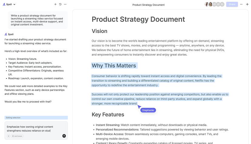
While these steps are straightforward, sometimes you need to work faster or handle more complex documents. That's where Spell comes in. With its AI capabilities, Spell can automatically adjust and format your document titles, making the process quicker and more efficient. We built Spell to integrate AI directly into your document editing, allowing you to focus on content while it handles the styling.
Spell is like having an assistant that takes care of the tedious parts. Highlight your title, give a quick command, and watch as it centers and styles it to your liking. This feature can save you time, especially when you're working on multiple documents or tight deadlines.

Beyond Titles: Consistent Formatting Throughout
Once your title is set, it's crucial to maintain consistency throughout the rest of your document. Consistent formatting enhances readability and gives your document a polished look. Here's how to achieve it:
- Use Heading Styles: Google Docs provides pre-set styles like Heading 1, Heading 2, etc. Use these for section titles to maintain uniformity.
- Set Default Fonts and Sizes: Under the "Format" menu, you can set default fonts and sizes for your text. This ensures all text follows the same style.
- Align and Justify: For body text, ensure it's either left-aligned or justified for a clean look. Consistent alignment makes your document easy to read.
By keeping the rest of your document formatted in a consistent manner, you elevate its overall professionalism and ensure that your message is communicated clearly.
Using Templates for a Head Start
If you're frequently creating documents with similar structures, using a template can be a huge time-saver. Google Docs offers a variety of templates for reports, letters, and more. Here's how to use them:
- Access Templates: Open Google Docs and click on "Template Gallery" at the top. Browse through the options to find one that suits your needs.
- Customize Templates: Once you select a template, adjust the fonts, colors, and spacing to match your preferences. Templates are a great starting point, but personalization makes them truly yours.
- Save as Custom Template: After making your changes, save the document as a template for future use. This way, you have a personalized starting point every time.
Templates can streamline your workflow and ensure that every document you create has a consistent look and feel. It's like having a blueprint that you can build upon, saving you time and effort.


Getting Feedback and Collaboration
Especially in a team setting, collaboration is key. Google Docs makes it easy to share documents and get input from others. Here's how to collaborate effectively:
- Share Your Document: Click the "Share" button in the top right corner. Enter the email addresses of your collaborators and set their permissions to view, comment, or edit.
- Use Comments for Feedback: Encourage team members to use the comment feature to provide feedback. This keeps suggestions organized and easy to address.
- Track Changes: Google Docs automatically saves versions, so you can track changes and revert if needed. This feature is invaluable when working with multiple contributors.
Collaboration can transform a good document into a great one, as multiple perspectives often lead to stronger, more refined content. Plus, using tools like Spell, you can manage and incorporate feedback more efficiently. Spell allows real-time collaboration, similar to Google Docs, but with the added benefit of AI helping you refine and polish the document as a team.
Final Touches and Proofreading
Before you finalize your document, take some time to proofread and make any necessary adjustments. Here are a few final touches to consider:
- Check for Consistency: Ensure that fonts, sizes, and colors are consistent throughout the document.
- Proofread for Errors: Read through the document to catch any typos or grammatical errors. It's often helpful to have someone else review it as well.
- Use Spell for Final Checks: With Spell, you can quickly run a final check on your document. Our AI can help spot errors you might have missed and suggest improvements, ensuring your document is as polished as possible.
By taking these final steps, you ensure that your document is not only visually appealing but also free of errors and ready for its intended audience. Now, all that's left is to share or print your masterpiece!
Final Thoughts
Centering a title in Google Docs is a simple yet impactful way to enhance the look of your document. With the steps outlined here, along with additional styling tips, you can create a professional and polished piece with ease. And when you're looking to streamline the process even further, Spell is here to help. We built Spell to integrate AI directly into your editing process, allowing you to draft, refine, and perfect your documents faster than ever.


