Centering a chart in Google Docs might seem like a minor detail, but it can make a big difference in how your document looks. Whether you're preparing a report for work or a project for school, making sure everything is neat and tidy is crucial. This guide will walk you through the steps to achieve that perfect alignment. Maybe even share a few tips you didn't know you needed.
Why Centering Matters
Have you ever noticed how a well-aligned document just feels more polished? That's the magic of good formatting. Centering a chart isn't just about aesthetics. It's about readability and professionalism. Whether you're dealing with a pie chart showing sales data or a bar graph presenting survey results, placing it right in the middle of your page can help your readers focus on the information instead of getting distracted by uneven margins.
When charts are off-center, they can create visual imbalance, making the document look cluttered. This imbalance can lead to misinterpretation of data or, worse, a lack of interest in the document altogether. On the flip side, a centered chart draws the eye naturally to the data, ensuring that your hard work gets the attention it deserves.
Interestingly enough, centering can also impact the perception of your work. A document that looks clean and organized can convey professionalism and attention to detail. So, centering your charts can indirectly influence how others view your competency and thoroughness. It's a small step with potentially big rewards.
Starting with Google Docs
Let's assume you've already got your Google Doc open and your chart inserted. If not, here's a quick rundown on how to get your chart into the document. First, go to the top menu, click on Insert, select Chart, and choose the type of chart you need. Google Docs allows you to insert different types of charts, such as bar, line, and pie charts, directly from Google Sheets. Once you've made your selection, the chart will appear on your document.
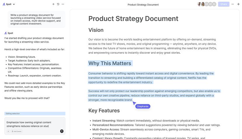
Now, if you're starting from scratch and need to create a chart, you might want to hop over to Google Sheets. Spell can actually help you draft and refine any accompanying text or explanations in your Google Docs as you go. Once your chart is ready in Sheets, just copy it and paste it into your Google Doc. The beauty of Google Docs is that it maintains a link to the original data, so if you update the chart in Sheets, it can automatically update in your document as well.
But enough about inserting. Let's focus on that centering action. You might be surprised at how easy it is, once you know where to look.
Using the Alignment Tool
Google Docs doesn't have a specific "center chart" button, but don't worry, there's a straightforward workaround using the alignment tools. First, click on the chart to select it. You'll know it's selected when you see a light blue border around it. Once selected, head to the toolbar at the top of your document.
You'll see an alignment button - it looks like a series of horizontal lines stacked on top of each other. If you hover over it, it says "Align." Click there and then choose Center.
If it doesn't quite work as expected, it might be because Google Docs handles images and charts a bit differently compared to text. Sometimes, adjusting the chart's size or the document margins can help. Try resizing your chart by clicking and dragging the corners, or adjust the margins by going to File > Page setup and tweaking the settings there.

Fine-Tuning with the Ruler
Sometimes, the alignment tool might not give you the precision you crave. That's where the ruler comes in. At the top of your document, just below the toolbar, you'll see a ruler. If it's not visible, make it appear by clicking on View in the menu and selecting Show ruler.
Click on your chart to select it, then drag it along the ruler until it's perfectly centered. You can also use the indent markers on the ruler for finer adjustments. These are the little triangles and rectangles on the ruler line. Just drag them to move your chart to the desired position.
While the ruler can be a bit more manual than other methods, it gives you a lot of control. So, if you're a perfectionist, this might be just what you need to get everything just right.
Aligning with Tables
If you're still struggling to center your chart using the above methods, it might be time to enlist the help of a table. This method involves inserting a single-cell table and placing your chart inside it. Here's how you do it:
- Go to Insert > Table > select a 1x1 table.
- Click inside the table cell, then insert your chart.
- With the chart inside the table cell, click Table > Table properties.
- In the Table properties panel, set the Alignment to Center.
This method ensures your chart is perfectly centered within the document, as the table cell's boundaries help keep everything in place. Plus, tables are pretty handy for organizing other data or images alongside your chart if needed.
Adjusting Text Wrapping
Another factor that can affect centering is text wrapping. By default, Google Docs might wrap text around your chart, which can shift its position. To fix this, select your chart and click on the Wrap text button in the toolbar. Choose In line with text to ensure the chart stays in the center without interference from surrounding text.
Alternatively, you can select Break text if you want the chart to sit on its own line, without any text next to it. This can be particularly useful if you have a lot of accompanying text that might crowd your chart.
Experiment with these options to see which looks best for your document. Sometimes, a little trial and error is the best way to find the perfect layout.

Using Spell to Speed Things Up
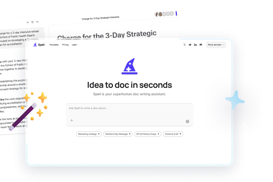
If you're finding these steps a bit tedious, or you're dealing with a long document with multiple charts, Spell can make this process a whole lot easier. Spell is like having an AI assistant built right into your document editor. It can help you draft, refine, and improve your writing as you go. It even lets you collaborate with your team in real time.
With Spell, you can describe what you want in natural language, and it writes the first draft in seconds. This can be a huge time-saver, especially when you're working under tight deadlines. Plus, Spell's AI capabilities mean your documents look polished and professional, without spending hours tweaking every detail.
And if you're worried about the quality of your work, Spell's AI is fine-tuned for long-form writing, so you can trust it to deliver clear, well-structured content every time. It's like having a supercharged version of Google Docs that takes care of the heavy lifting for you.
Common Pitfalls and How to Avoid Them
While centering might sound simple, there are a few common pitfalls that can trip you up. One biggie is forgetting to check the document's margins. If they're set too wide, your centered chart might still look off-balance. Always double-check your margin settings in File > Page setup to ensure everything aligns properly.
Another common issue is resizing. When you resize a chart, it can mess with your carefully planned layout. If you're adjusting the size, make sure to re-center the chart using the alignment tools or ruler afterwards. This step is often overlooked, but it's crucial for maintaining that clean, professional look.
And lastly, don't forget about consistency. If your document contains multiple charts, make sure they're all centered the same way. This creates a cohesive look and makes your document easier to follow.


Pro Tips for a Polished Document
Once you've mastered the basics, there are a few extra steps you can take to make your document look even more professional. Consider adding captions to your charts for clarity. A simple "Figure 1: Sales Data for Q1" can help readers understand what they're looking at without diving into the text.
Also, think about using color strategically. While it might be tempting to use lots of bright colors, sometimes less is more. Stick to a consistent color scheme that complements the rest of your document, making sure it enhances readability rather than distracting from the data.
And remember, if you're working with a team, collaboration is key. Share your document with colleagues and ask for feedback. Sometimes a fresh set of eyes can spot things you might have missed. And with tools like Spell, you can edit together in real time, making the process smoother and more efficient.
Final Thoughts
Centering a chart in Google Docs is a small step that can have a big impact on the overall look of your document. By using alignment tools, the ruler, and even tables, you can ensure your charts always look polished and professional. And if you're looking for a faster way to create high-quality documents, Spell can help you draft, edit, and perfect your work in record time. It's like having an AI assistant built right into your document editor, saving you hours of work and making sure your documents always look their best.


