Ever found yourself staring at a picture in a Word document, wondering how to add a little description that might help someone who can't see it? You're in the right place. Adding alt text to images in Word isn't just a good practice. It's essential for accessibility. Let's explore how to do it, why it matters, and some tips to make your documents more inclusive.
Why Alt Text Matters
Alt text, or alternative text, serves as the descriptive text for images, helping those who use screen readers understand what's on the page. Imagine navigating the internet without being able to see. Alt text acts as your eyes, describing images so you can grasp their context. It's not just a nice-to-have feature. It's a must for accessibility.
When you add alt text, you ensure everyone can access your content, regardless of their abilities. This inclusion can make your document more engaging and informative for all readers. Plus, it's a best practice for compliance with accessibility standards like the Web Content Accessibility Guidelines.
Now, let's get into the nitty-gritty of adding alt text in Microsoft Word.
Getting Started with Alt Text in Word
Adding alt text in Word is straightforward. First, open your document and select the image you want to add alt text to. Here's a step-by-step guide:
- Right-click on the image.
- Select Format Picture from the context menu.
- In the Format Picture pane, click on the Layout & Properties icon (it looks like a square with a line around it).
- Click Alt Text.
- You'll see two fields: Title and Description. The title is optional, but the description is where you should enter a brief, informative text explaining the image.
And that's it! You've added alt text to your image. But what makes good alt text?
Crafting Effective Alt Text
Writing good alt text is an art. It should be concise yet descriptive enough to convey the image's purpose. Here are a few tips to consider:
- Be Specific: Describe what's in the image and its context. Instead of saying "dog," say "a golden retriever playing in the park."
- Avoid Redundancy: If the image is purely decorative, you might consider marking it as decorative rather than adding alt text.
- Context is Key: Think about why the image is there. What does it add to the document? Tailor your description to fit that context.
- Keep it Short and Sweet: Aim for 125 characters or less. Screen readers can truncate longer text, which might leave users guessing.
Remember, alt text isn't just for accessibility. It can also help with search engine optimization, making your content easier to find.

Common Mistakes to Avoid
It's easy to make a few missteps when adding alt text. Here are some pitfalls you might want to steer clear of:
- Overloading with Information: You don't need to describe every detail. Stick to what's relevant.
- Using "Image of" or "Picture of": Screen readers already announce the presence of an image, so there's no need to repeat this.
- Leaving Alt Text Blank: If an image conveys important information, leaving alt text blank means some users miss out on that data.
- Ignoring Context: Context matters. What might be relevant in one document might not be in another.
By avoiding these mistakes, you ensure your document is as accessible and user-friendly as possible.
Advanced Tips for Alt Text
If you're comfortable with the basics, here are some advanced tips to further improve your alt text game:
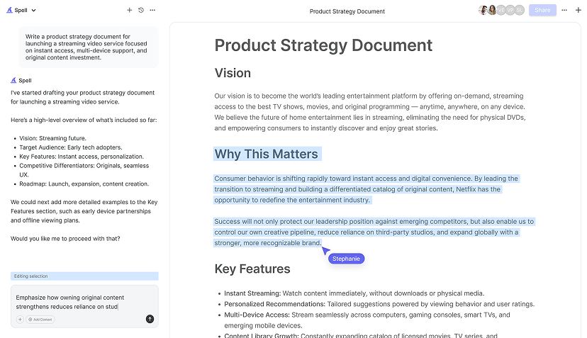
- Use AI Tools: Consider using AI tools like Spell to generate initial alt text drafts. AI can quickly provide a base description, which you can then refine for accuracy and context.
- Think About Audience: Tailor your alt text to your audience's needs. What might a technical audience need versus a general reader?
- Consistency is Key: If you're working on a document with a team, ensure everyone is on the same page about the style and tone of alt text.
- Regular Audits: Regularly review your documents to ensure all images have appropriate alt text.
These advanced tips can further enhance the accessibility and professionalism of your documents.
Alt Text and Different Image Types
Not all images are the same, and the type of image can influence the alt text you write. Here's how to handle different kinds of images:
Decorative Images
Sometimes images are purely decorative and don't add information to the text. In these cases, you can mark them as decorative, so screen readers skip them, avoiding unnecessary information for users.

Informative Images
These images are crucial for understanding the document. Ensure your alt text conveys the essential information the image provides. For example, a chart showing sales growth should have alt text summarizing the chart's key points.
Complex Images
For more complex images like infographics or maps, consider providing a longer description in the main text or a linked page, with the alt text indicating that more detail is available elsewhere.
Understanding the purpose of each image type ensures your alt text is appropriate and helpful.
Testing and Validating Alt Text
After adding alt text, it's a good idea to test its effectiveness. Here's how you can do that:
- Use a Screen Reader: Try using a screen reader to navigate your document. This gives you firsthand experience of how your alt text sounds.
- Get Feedback: If possible, have someone who relies on screen readers review your document. Their feedback can be invaluable.
- Check for Errors: Typos or unclear language can confuse users. Double-check your text for any mistakes.
Testing and validating your alt text ensures it meets the needs of all users.


Alt Text in Collaborative Environments
When working in a team, consistency is vital. Ensure everyone knows the importance of alt text and how to write it. Here are some tips for collaborative environments:
- Establish Guidelines: Create a style guide for alt text to ensure consistency across documents.
- Use Tools Wisely: Tools like Spell can streamline the process, helping teams draft and refine alt text collaboratively.
- Regular Check-Ins: Schedule regular reviews to ensure everyone is on track and understands the guidelines.
With these strategies, you can maintain high standards of accessibility in your team's documents.
Using Alt Text for SEO
While alt text primarily aids accessibility, it can also boost your SEO. Search engines can't "see" images, so they rely on alt text to understand the content. Here's how to optimize alt text for SEO:
- Incorporate Keywords: Naturally include relevant keywords to help search engines classify your content.
- Avoid Keyword Stuffing: Overloading keywords can harm both accessibility and SEO.
- Ensure Relevance: Make sure your alt text accurately reflects the image and its context in the document.
Balancing accessibility with SEO can enhance your document's reach and effectiveness.
Final Thoughts
Adding alt text to images in Word is a simple yet profound way to make your documents more inclusive and accessible. From enhancing understanding to boosting SEO, alt text plays a crucial role in digital communication. Plus, using tools like Spell, we can streamline our workflow, making it easier to create accessible, high-quality documents. By prioritizing accessibility, we ensure everyone can engage with our content equally.


