Adding alt text to images in Word is a great way to make documents more accessible to everyone. Alt text, short for alternative text, provides a textual description of an image, helping those who use screen readers to understand what's visually presented. Whether you're working on a report, a presentation, or any document with images, knowing how to add alt text is essential. Let's walk through the process step-by-step, ensuring your documents are inclusive and informative.
Why Alt Text Matters
Before we get into the nitty-gritty of adding alt text, let's talk about why it matters. Alt text is crucial for individuals who rely on screen readers to access digital content. When you include alt text, you're ensuring that everyone, regardless of ability, can understand the content of your document.
Beyond accessibility, alt text also plays a role in SEO (Search Engine Optimization) when your documents are published online. Search engines use alt text to index images, which can improve the visibility of your content. Plus, if an image fails to load, the alt text is displayed in its place, giving users context about what should be there.
So, whether it's for accessibility or SEO, adding alt text is a small step with significant benefits. Now, let's look at how you can add it in Word.
Adding Alt Text to Images in Word
Adding alt text in Word is a straightforward process. Here's how you can do it:
- Insert your image: First, open your Word document and insert the image you want to add alt text to. You can do this by clicking on the "Insert" tab and selecting "Pictures."
- Right-click the image: Once your image is in place, right-click on it. This will open a context menu.
- Select "Edit Alt Text": In the context menu, look for the option that says "Edit Alt Text" and click on it. This will open the Alt Text pane on the right side of your document.
- Enter your alt text: In the Alt Text pane, you'll see a field to enter your description. Type a brief, clear description of the image. Remember, the goal is to convey the same information that the image does.
- Close the pane: Once you've entered your alt text, you can close the pane. Your alt text is now saved with the image.
And that's it. You've successfully added alt text to your image. But what exactly should you write in that little box? Let's discuss some best practices next.
Best Practices for Writing Alt Text
Writing effective alt text is an art. You want to be descriptive yet concise, providing enough information without overwhelming the reader. Here are some tips to help you craft the perfect alt text:
- Be specific: Describe the content and function of the image. What is it showing, and why is it there?
- Keep it concise: Alt text should be brief. Aim for one or two sentences at most.
- Avoid using "image of" or "picture of": Screen readers already announce that it's an image, so there's no need to repeat it.
- Consider the context: Think about how the image fits into the document as a whole. What is its purpose?
- Skip decorative images: If an image is purely decorative and doesn't add meaningful content, you can mark it as decorative. Word will then skip it when read by a screen reader.
Writing alt text can sometimes be tricky, especially for complex images. When in doubt, focus on the core message of the image and how it relates to the surrounding text.
Alt Text for Different Types of Images
Not all images are created equal, and the type of image can affect how you write your alt text. Let's look at some common types of images and how to approach each one:

Photographs
Photographs often require a straightforward description. Focus on the main subject and any relevant details. For example, if you have a photo of a sunset over a beach, you might write, "Sunset over a sandy beach with palm trees silhouetted against the sky."
Charts and Graphs
Charts and graphs convey data visually. When writing alt text, summarize the key insights or trends. For example, "Bar chart showing a steady increase in sales from January to June."
Diagrams
Diagrams can be more complex. Focus on the overall purpose and any critical components. For example, "Flowchart showing the steps of the project management process from initiation to closure."
Logos
Logos often represent a brand or organization. Simply state the name of the company or what the logo represents, like "Company logo for Tech Innovations."
Tailoring your alt text to the type of image ensures that all users can grasp the essential information without visual cues.
Common Mistakes and How to Avoid Them
Even with the best intentions, it's easy to make mistakes when adding alt text. Here are some common pitfalls and how to avoid them:
- Being too vague: Avoid generic descriptions like "image" or "photo." Be specific about what's depicted.
- Over-describing: While detail is good, too much can be overwhelming. Stick to the essentials.
- Ignoring context: Consider how the image fits into your document. What role does it play in conveying your message?
- Forgetting to add alt text: It's easy to overlook alt text, especially in long documents. Make it a habit to add it as you go.
By being mindful of these common mistakes, you can ensure your documents are accessible and informative for all users.

Using AI Tools to Speed Up the Process
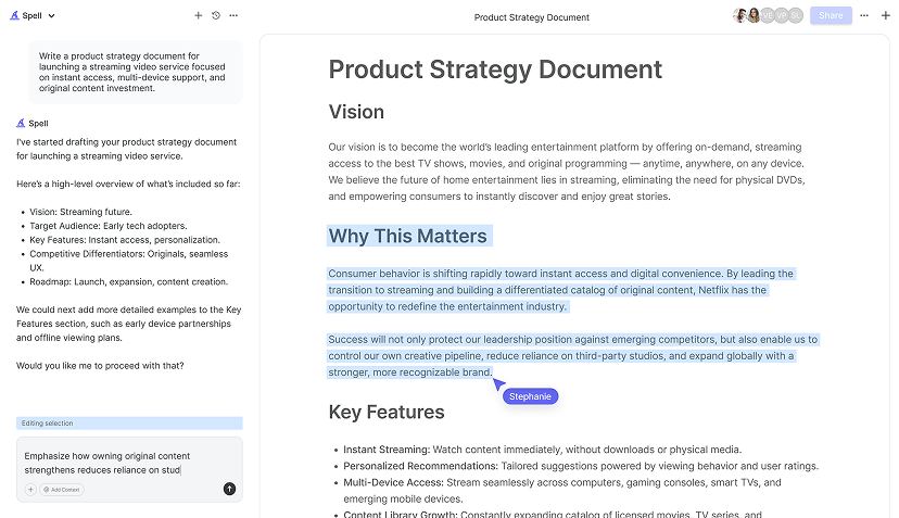
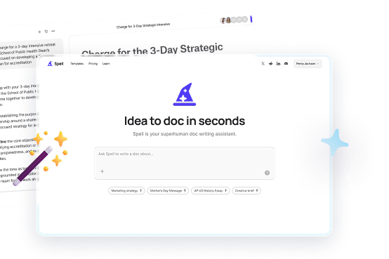
Adding alt text manually can be time-consuming, especially if you're dealing with a lot of images. This is where AI tools like Spell can be a real lifesaver. Spell allows you to generate high-quality drafts quickly, and its AI capabilities can help you brainstorm alt text descriptions. With Spell, you can focus on fine-tuning your document while the AI handles the initial heavy lifting. It's like having a writing assistant right in your document editor.
Not only does Spell save time, but it also ensures consistency in your alt text, making your documents more cohesive and professional.
Checking Alt Text for Accessibility
After adding alt text, it's a good idea to double-check your work for accessibility. Word has built-in tools that can help you ensure your document is fully accessible:
- Use the Accessibility Checker: Word includes an Accessibility Checker that identifies issues in your document. You can find this tool under the "Review" tab. It will highlight any areas that need attention, including missing alt text.
- Review alt text for clarity: Go through each image and read the alt text aloud. Does it make sense without the image? If not, consider revising it.
- Get feedback: If possible, ask a colleague or friend who uses a screen reader to review your document. Their feedback can provide valuable insights into how accessible your document truly is.
By taking the time to check your alt text, you can be confident that your document is accessible to all readers.
Making Alt Text Part of Your Workflow
Incorporating alt text into your workflow might seem like an extra step, but it quickly becomes second nature with practice. Here are some tips to make it a seamless part of your process:
- Set a reminder: When starting a new document, set a reminder to add alt text to any images you include. This helps you maintain accessibility from the outset.
- Create a checklist: Develop a checklist of tasks for each document, including adding alt text. This keeps you organized and ensures nothing is overlooked.
- Educate your team: If you work with a team, make sure everyone understands the importance of alt text and knows how to add it. Consistency across documents enhances accessibility.
- Use templates: If you frequently create similar documents, consider using templates with placeholders for alt text. This saves time and ensures consistency.
By integrating alt text into your routine, you can create documents that are both professional and accessible.


Exploring Additional Accessibility Features
Adding alt text is just one aspect of making your Word documents accessible. Word offers several other features and settings to enhance accessibility further:
- Use accessible fonts: Choose fonts that are easy to read, such as Arial or Calibri. Avoid decorative fonts that may be difficult for screen readers to interpret.
- Maintain contrast: Ensure there is sufficient contrast between text and background colors to improve readability for all users.
- Utilize headings: Use headings to structure your document. This helps screen readers navigate the content more efficiently.
- Add captions to tables: Provide captions for tables to give context to the data they present. This is especially useful for complex tables.
By exploring these additional features, you can create documents that are accessible to a wider audience.
How Spell Can Assist with Document Creation
Creating accessible documents is just one part of the puzzle. If you're looking to improve your overall document creation process, Spell can be a valuable tool. Spell's AI capabilities streamline the writing and editing process, allowing you to focus on crafting high-quality content. With Spell, you can generate drafts, edit using natural language, and collaborate with your team, all within a single platform.
Imagine going from a blank page to a polished document in a fraction of the time it usually takes. Spell makes that possible, helping you save time and effort while producing professional results.
Final Thoughts
Adding alt text in Word is a simple yet effective way to make your documents more accessible and informative. By following best practices and avoiding common mistakes, you can ensure your content reaches a broader audience. And if time is of the essence, Spell is here to help you create and edit documents faster and more efficiently. With its AI capabilities, you can focus on what truly matters: creating impactful and inclusive content.


